
Managing colour for success
By David Tung
People outside the printed image business do not always appreciate why colour management is so important. To them, red is red and blue is blue. Getting colour right, however, can still be a major challenge in today’s industry, whether using offset lithographic, inkjet proofing or wide-format production printers.
More than ever, time is money. A shop will fall behind in the market if it has to reprint graphics because colours do not turn out as the customer expected or if staff is wasting a lot of time and materials to get a brand colour correct in the first place.
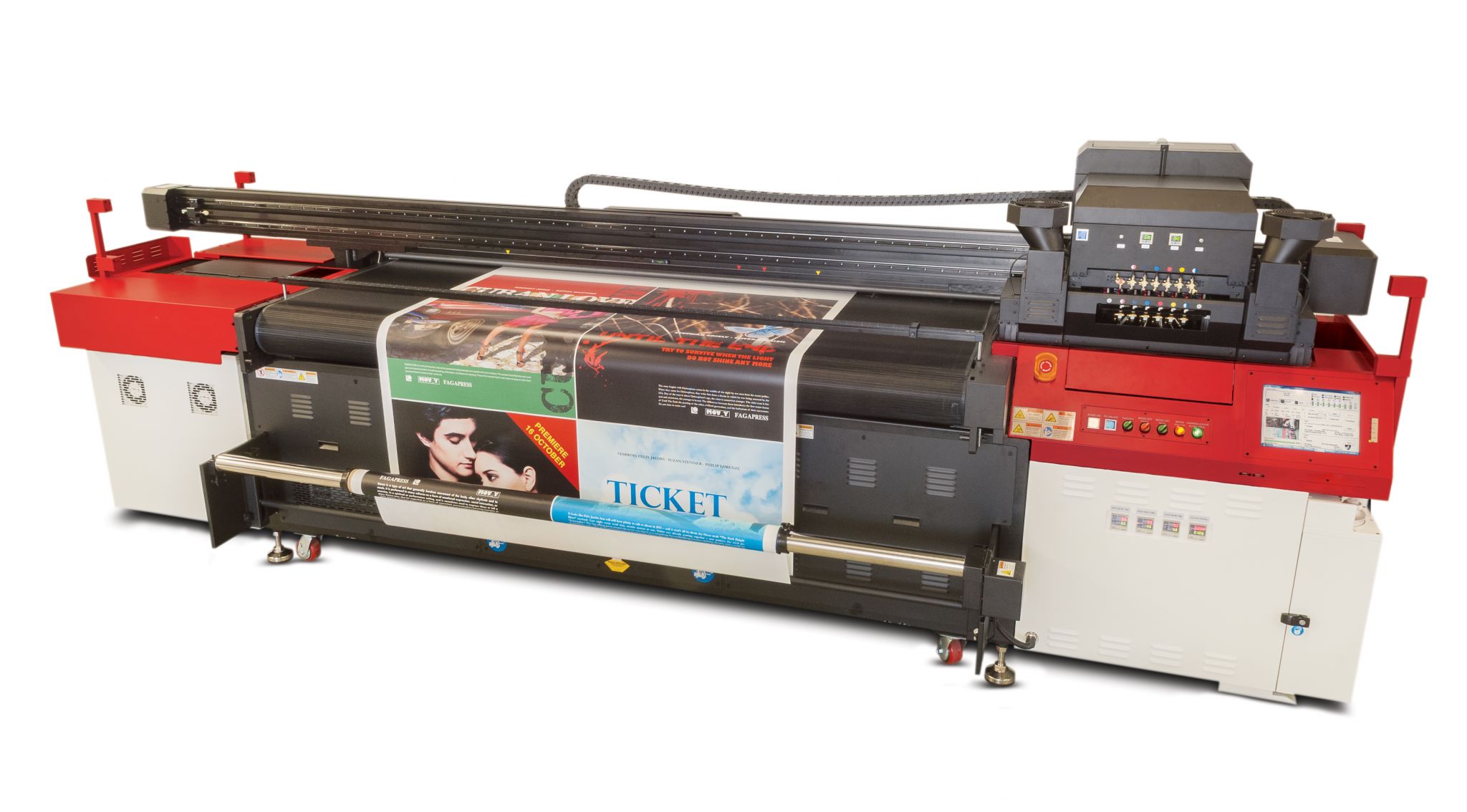
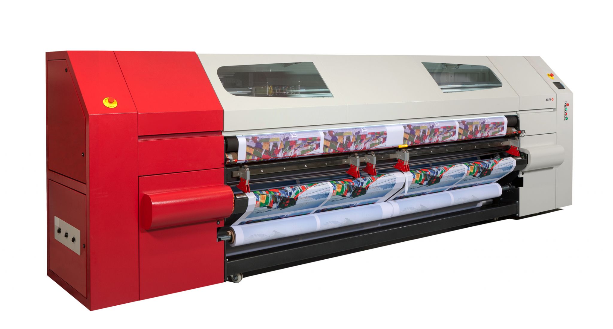
While there are many well-established rules and methodologies for web offset and sheetfed lithographic printing, there has been very little development of this type for colour management for wide- to grand-format production inkjet printers. In fact, no industry standards exist yet.
There is thus a need to introduce some ‘best practices’ to achieve consistent, predictable colours for wide-format graphics, regardless of which specific printer model is being used to create those graphics.
There are three main components to consider when attempting to develop consensus in the wide-format printing industry for colour management standards: expectations, output media and raster image processor (RIP) performance.
Expectations
When it comes to colours of printed graphics, expectations are the most difficult to agree upon. Everyone sees colours a bit differently, depending on their age, eye colour and angle of view, let alone reflections from the shirt they happen to be wearing that day or what they are standing next to. Consensus will require a lot of customer education and understanding.
There needs to be an agreed-upon measure of colour difference acceptability based on an ‘unbiased’ observer. This typically calls for an instrumental reading, using a spectrophotometer to determine the Delta E colour difference, as defined by the International Commission on Illumination (CIE). A Delta E metric of around three is usually considered acceptable for a colour match, but the lower the number and thus the closer the match, the better.
Further, unlike an offset lithographic press, most wide-format digital inkjet printers do not offer the ability to use special colours at will (in effect, to ‘substitute’ a specific colour in the inkwell on a per-job basis). So, it is advisable to define brands’ ‘spot colours’ early in the process.
It is important, for example, to check if the brand colour is (a) an actual spot colour or (b) a cyan, magenta, yellow and key/black (CMYK) ‘build’ of a Pantone spot colour. As a colour matching authority, Pantone issues two volumes of its formula colours, one for actual spot colours and one for CMYK reproductions. So, if a spot colour is really a CMYK ‘build,’ it is important to refer to the second volume to get the best match; or, if possible, change it to an actual Pantone spot colour.
One of the most overlooked aspects of colour management is how the final printed graphics will be viewed. The sign industry, after all, creates some prints that are glimpsed from across a busy street at 80 km/h (50 mph) and others that are stared at by customers as they wait in line in a store. These are certainly two very different viewing conditions, each with different quality requirements for wide-format graphics, but both require stable, predictable, repeatable output.
In some cases, print service providers (PSPs) install fluorescent overhead lighting in both their production areas and viewing booths, so illumination is controlled and standardized wherever their employees check on their graphics’ colours, which helps match them to brands and deliver finished jobs in a timely and cost-sensitive manner. The best way to achieve these objectives, however, is to develop profiles for the output media.
Output media
One of the blessings and curses of wide-format printing is the almost unlimited number of options for output media, including myriad flexible and rigid materials. Pretty much anything can be placed under the printhead carriage and decorated with graphics, so long as it is less than 51 mm (2 in.) thick.
These substrates all have unique ink absorption rates, which are also affected by the choice of solvent-based, durable aqueous ‘latex’ or ultraviolet-curable (UV-curable) inks. The best-case scenario for colour matching is to use coated media that can receive inks evenly, without pooling (beading) or bleeding (spreading).
The need to create customized media profiles cannot be stressed enough. The ability to recalibrate a printer each time a given material is used means output can remain consistent over time, no matter how many other ‘things’ get printed.
Sign up for our newsletter
Featuring breaking news from Canada's sign and graphics industry.
Products
Read the Latest Issue

