
Channel Letters: Ensuring sign legibility
By John Baylis
One simple way to increase the probability that a channel letter sign will be effective for a commercial client is to make sure it ranks high on the legibility scale. It is important, however, to first understand the difference between legibility and readability.
Legibility is the degree to which a chosen typeface makes it possible for someone to read something without effort. A highly legible typeface, therefore, is quickly comprehended by the reader without requiring a mental ‘translation.’ Legibility is also an informal method of measurement as how easy it is to distinguish one letter within a sign from the others next to it.
Readability, on the other hand, measures how well a given combination of words is read within a larger body of text. A common example would be a paragraph on the page of a book.
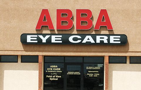
Sans serif fonts tend to offer stronger legibility, while serif fonts tend to offer better readability. With that in mind, the rule of thumb for effective signage is to configure the typeface for optimal legibility, which typically calls for a sans serif font.
Artistic fonts
Such definitions are important to keep in mind when customers ask for their signs to be produced in an ‘artistic’ font.
“Letterforms composed of unique shapes, artistic deformations, excessive ornamentation or other novel design elements cause the reader to have to process what they are looking at first, instead of just taking in the message,” wrote graphic designer Douglas Bonneville, author of The Big Book of Font Combinations, in 2011.
Compared to other written media, it is especially important with signs to place an emphasis on legibility, as they typically must be read quickly from a moving vehicle at some distance. When customers present a signage concept that is heavily artistic, but would not be highly legible in a visually competitive environment, signmakers should consider asking them to reconsider the value of their design. Would they prefer an artistic channel letter sign or a legible one that yields a 25 per cent increase in foot traffic for their business?
Many people find sans serif fonts lack a sense of excitement. They may not carry the same ‘flash’ as custom fonts, but when push comes to shove, most commercial sign customers will take foot traffic and higher revenues over pizzazz any day!
Legible fonts
Some basic sans serif fonts that offer high levels of legibility include:
- Arial.
- Calibri.
- Century Gothic.
- Verdana.

Sign up for our newsletter
Featuring breaking news from Canada's sign and graphics industry.
Products


Read the Latest Issue

