
Photo courtesy City of Toronto
By Peter Saunders
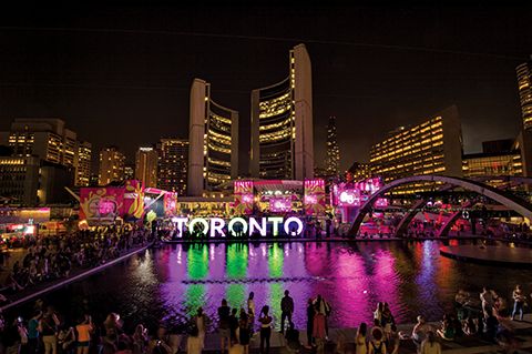
In mid-September, Toronto Mayor John Tory announced the city’s new—but already iconic—multicoloured illuminated channel letter sign, on display in Nathan Phillips Square in front of City Hall since July, would remain in place until at least the end of 2016. This decision would of course be less expensive than transporting the sign to other locations throughout the city, as had been discussed, but at the same time recognized how popular the sign has become, particularly in turning visitors’ photos of City Hall into virtual postcards promoting the city.
International inspiration
The sign was originally planned to serve only as a temporary public-art structure during the 2015 Pan Am and Parapan Am Games. And it was just one of four elements in the city’s ‘welcome and engagement’ campaign, the others being a giant ferry wrap, a street banner program and a series of out-of-home (OOH) sculptures and posters featuring the multi-sport competition’s mascot, Pachi the porcupine.
Indeed, when municipal government employees came up with the concept of spelling out the city’s name in oversized letters in a public space, they were inspired by other event-related ‘photo opp’ branding installations around the world, especially one set up in Guadalajara, Mexico, for the previous Pan Am Games in 2011, but also Vancouver’s giant rings during the 2010 Winter Olympic Games.
The city staff issued a request for proposals (RFP), specifying three-dimensional (3-D) letters in Azo Sans Bold font, each measuring about 3 x 3 m (10 x 10 ft), for a total sign area of 3 x 22 m (10 x 72 ft). They would be equipped with light-emitting diodes (LEDs) for the purpose of changing colours.
Staging the structure
The winning bid came from Unit 11, a local business perhaps best-known for building the current Hockey Night in Canada (HNIC) set for Rogers Communications.
“We’re not a sign company, but this project was a good fit because we build a lot of large structures full of LEDs,” explains Don Loughlin, Unit 11’s president. “We were also already doing other Pan Am-related work at the time.”
Working collaboratively with the city based on the given specifications, Unit 11 provided further designs and drawings. Of the three weeks available for the project, one full week was dedicated to production, which primarily involved computer numerical control (CNC) routing and welding.
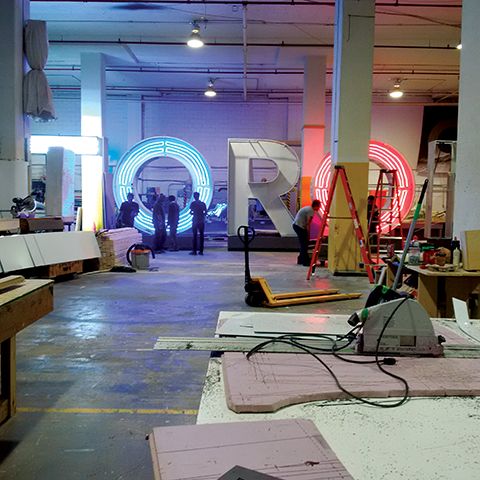
Tad Lighting Services worked in parallel with Unit 11 to customize the sign’s LED configuration. Photos courtesy Unit 11
“The construction was fairly straightforward, but the size was a challenge,” says Loughlin. “It’s a very big sign. It took up our whole shop.”
One new challenge for the company, given its previous focus on indoor sets, was ensuring the letters would stand up to the outdoor environment. The letters were built with a steel frame, aluminum panel cladding and translucent polycarbonate front and rear faces.
“The city wanted to make sure it would last up to three years,” says Loughlin. “We sprayed the steel frame to rustproof it. The polycarbonate material is tough as it gets; water can’t get in and you can’t break it. We even put bird repellant on at the end!”
The letters also featured colourful vinyl side wraps with Pan Am logos. These were designed to be removed after the games, so the letters can be ‘re-skinned’ with different designs in the future.


