
Wide-format Printing: Making colour universal
By Judy van de Langkruis
Brand owners have become much more discriminating today when it comes to the particular colours of their graphics. They use these colours to spread brand awareness, increase the perceived value of their products and imply a promise of consistent quality to their customers. As a consequence, consistency and accuracy of colour are paramount to any printing job.
Managing brand colours is strategically important, but very demanding, as it means matching colours on everything from textile-based banners to corrugated board displays to paper graphics to plastic packaging. Inconsistent colours risk losing consumer familiarity or confidence.
Colour roadblocks
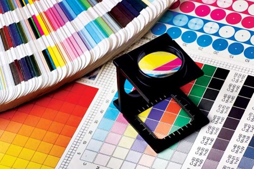
It has long been common for designers to communicate colours to print service providers (PSPs) by handing them physical samples. This can provide a good idea of what a final colour should look like, but is generally useless for the actual printing process.
For one thing, everyone sees colour slightly differently, making it difficult to communicate seamlessly. For another, some colours are harder than others to reproduce, especially across a wide range of applications on different substrates for different lighting conditions. Such difficulties during production represent potential loss of time and revenue.
Software can help, but not all systems are ‘open’ enough to facilitate colour communications. In many cases, professionals are speaking different languages—e.g. red, green and blue (RGB) versus the lightness, ‘a’ and ‘b’ (Lab) colour space.
The challenge of putting all of the different components together—from design concept to practical materials to economical production—to achieve a seamless process requires considerable technological aptitude.
For designers, the most frustrating part of the process is when a colour they have defined and created for a certain job cannot be reproduced by a given set of inks on a given substrate. It is therefore important for them to define not only a colour, but also a usable ink technology, right from the start. This means that beyond selecting the correct colour for a job, they must reference colour standards that are used throughout the graphics supply chain. Subsequently, they must also proof accurately and verify the quality of the finished products.
The best way to address the industry’s current roadblocks, then, is a complete colour communications platform that encompasses each step of the process, standardizes the definitions of and the specifications for colours and facilitates clarity throughout the supply chain.
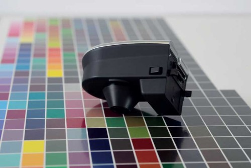
Photo courtesy Mutoh
Specifying, developing and monitoring colour
The idea of linking colours effectively to a central master standard is certainly a worthy objective. In the past, the aims of designing colours that were (a) ‘fit for use’ and (b) met the economic realities of the marketplace became intrinsically combined. If professionals throughout the value chain did not use exactly the same colour language, however, then each exchange or ‘translation’ of data had the potential to cause errors.
One way to reduce such errors is to limit the number of suppliers within the chain, but this is not viable in today’s market. Rather, a better option is for everyone to communicate with a more established and intrinsic language, i.e. the spectral curve of a colour.
Spectral multi-flux technology
Depending on the physical characteristics of colour pigments in ink, light can react differently and be broken into different spectral components, from red to violet. Some light may stay within the pigment layer. Some may be reflected from the surface—or absorbed and then reflected. Some may be transmitted, i.e. travelling completely through the pigment layer.
The spectral multi-flux model for colour has been developed to accurately describe how light is absorbed, scattered and/or transmitted within a layer of pigment. Using this model can calculate both colour and opacity in one step, even when using ‘special effect’ ink pigments, such as metallic and pearlescent variations. By understanding such data, the model can then determine the most cost-efficient method for loading ink pigments for a layer of a certain thickness. This process minimizes the number of errors, saving both preparation time and money.
Spectral curves offer a clear advantage from the design stage forward in offering consistent information all along the value chain. Coupled with colour matching software, they offer the opportunity to check the feasibility of a colour, including when strict criteria—such as resistance to heat, warp, light or weather—are required for the final printed product. The same model works for a wide variety of base materials, applications and industries, without the need for any colourants.
Sign up for our newsletter
Featuring breaking news from Canada's sign and graphics industry.
Products


Read the Latest Issue
