

Images courtesy GMG Americas
By Bart Fret
For a long time, colour management was only seldom used in large-format printing. Sign shop personnel would linearize and then send their cyan, magenta, yellow and key/black (CMYK) jobs to their digital printers. As such, they relied on these devices’ printable gamut, but this led to issues with colour consistency and repeatability.
More recently, colour management has gone mainstream in large-format printing, as it is seen to provide a lot of benefits to both print service providers (PSPs) and their customers. There is more than one way to implement it, however, depending on the approach a shop takes to standardization.
Standardizing colour management
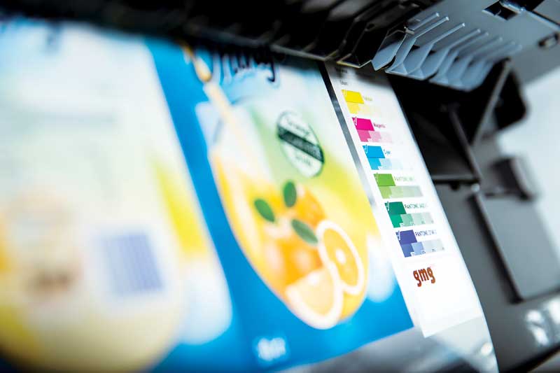
The operation of a large-format inkjet printer depends on a raster image processor (RIP). RIPs are always set up with printer profiles, which include ink limits, linearization and, optionally, an International Color Consortium (ICC) profile. When graphic files are submitted to the RIP, the input colours—whether CMYK or red, green and blue (RGB)—are converted to the printer’s output colours, based on tagged image and file elements of the input profiles.
This is the standard colour management process, but numerous problems are associated with it, as follow.
Colour differences
Printed colours may appear different than intended, particularly if the input profile used within the print shop does not match the profile the original designer used. If an image has text layered on top of it, for example, and the colour of the text is derived from a part of the image, then when the file is processed, any change to the profile or intent of the image will also change the colour relative to the text, in a way the designer likely did not intend.
Applying different profiles and/or render intents to different elements, such as images and vectors, can also significantly affect their printed appearance.
The goal of standardized printing is to reduce colour deviations and variations in graphics produced by different devices.
Overprints, transparencies and blends
Applying profiles can dramatically change overprinting elements. When converting the cyan and magenta (C+M) elements from the General Requirements for Applications in Commercial Offset Lithography (GRACoL) profile to the printer profile, for example, the conversion may result in not only C+M, but also a bit of black (K), due to the printer profile. At this point, any underlying black text would disappear, because K was generated in the C+M overprinting elements.
Colour differences can also occur with transparencies, as elements that would blend might end up being converted using different rendering intents. Overprints can seem to disappear and blends can look different when assigning profiles.
Colour mismatches
Perceptual intent changes all colours in a file, not just those that are out-of-gamut. So, colours might look very different, depending on whether they are converted to a standard such as GRACoL or to the printer profile. The same job printed on multiple machines will look very different, since the gamut of those devices will differ and the perceptual intent adjusts all colours to the printer’s output profile.


