
Photos courtesy Direct Sign Wholesale
By John Baylis
In recent years, light-emitting diodes (LEDs) have replaced neon as the dominant illumination method for channel-letter signage. Specific methods and principles need to be followed, however, to generate optimal results.
The following are some techniques that can assist in generating peak performance for LED-illuminated channel letters. Some apply to both front- and reverse-lit types of letters, while others are more particular to one than the other.
Front-lit letters
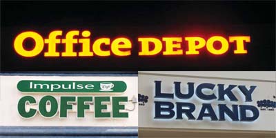
The colour of the acrylic face is an important variable in producing optimal illumination for a front-lit channel letter. Some colours will produce better results than others.
Red, for example, is usually an excellent option for an illuminated sign face. The human eye contains a higher concentration of red photoreceptor cells (i.e. cones) than those for other colours. This is one of the reasons red achieves a high degree of nighttime visibility for channel letters.
Another face colour with strong visibility characteristics for illuminated signs is white, which presents a clear nighttime appearance in part because it reflects all of the colours in the light spectrum. This is why government departments of transportation specify white letters on a green background for highway signs.
There are certain other acrylic face colours, however, that can prove problematic and may not present an optimal appearance at night, regardless of the configuration of the LEDs lighting them, because they tend to absorb—rather than emit—much of the illumination. These include dark blue and dark green.
When clients specify such colours for their channel letter faces, signmakers should inform them about the potential drawbacks in terms of appearance, before their orders are submitted.
With dark blue, by way of example, the eye tends to focus on it slightly in front of—rather than directly on—the retina, causing a ‘halo’ effect to appear around the lighting. This effect can make the illuminated letters difficult to read under certain circumstances.
Burgundy, which is typically specified as a vinyl rather than acrylic face colour, can also prove problematic. It is important to note, however, these guidelines only refer to darker shades of these colours and do not mean the lighter shades of the same should not be used. Indeed, light green can present a fine image for a sign.


