
Several diverse signs were required both indoors and outdoors to enhance the visibility and ambiance of Steve’s Poké Bar in downtown Vancouver’s Yaletown district. These signs played a crucial role in attracting patrons to experience authentic Hawaiian-style poké.
By Khuram Shahzad
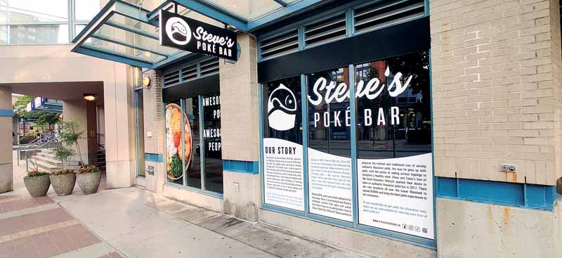
Restaurants in urban settings rely heavily on signage to establish their presence and identity. Photos courtesy Khuram Shahzad/Century Signs
In bustling urban landscapes, restaurants have evolved beyond mere businesses to become landmarks synonymous with the city’s pulse and culture. These establishments not only cater to daily needs, but also carve out a distinctive presence in the cityscape, blending business with the essence of urban identity. Steve’s Poké Bar is one such place.
Known for its authentic Hawaiian-style poké, it extended its presence into downtown Vancouver’s Yaletown district in late 2023, marking a milestone in its expansion across the Lower Mainland of British Columbia. Before 2016, poké was a relatively undiscovered culinary gem in Vancouver; however, Steve’s Poké Bar has not only introduced it to the local scene with several restaurants in the province, but has also pioneered innovative offerings. In the downtown Vancouver location, what began with “Coming Soon” window graphics, initially serving as hoarding during renovations, transformed into a fully operational restaurant adorned with detailed signage.
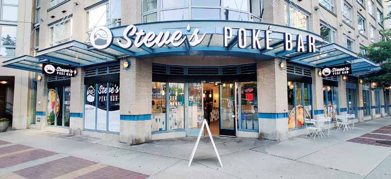
Central to Steve’s Poké Bar’s identity is its logo, a key identifier of the well-known chain. The simple yet effective logo of a fish serves as a beacon, inviting B.C. patrons into a familiar environment. Beyond its logo are signage solutions—channel letters, window graphics, and more—undertaken by Century Signs, the brand’s trusted partner in the region for some time. These signs played a crucial role in amplifying this presence in the downtown Vancouver location, ensuring the exterior and interior signage catches the eye of passersby. From the logo on the storefront to the interior accents evoking a sense of place, every detail contributes to the experience offered by Steve’s Poké Bar.
Overview
The task involved designing, fabricating, and installing both exterior and interior signage. It commenced a year prior to the restaurant’s opening, starting with a detailed site survey and obtaining necessary permits from the City of Vancouver. Construction phase installations began with exterior signage and progressed to interior elements after the building’s completion.
Scope
Exterior signage: This involved a storefront LED channel letter sign, two illuminated lightbox blade signs, and window graphics.
- Storefront LED channel letter sign: It was strategically mounted to an aluminum raceway on the building’s corner canopy. The logo features 76.2-mm (3-in.) channel letters with a white acrylic face and black vinyl graphics (the fish icon). The raceway itself is constructed from a 1.8- m x 0.6-m (6-in. x 2-in.) aluminum tube, painted to match the canopy.
- Illuminated lightbox blade signs: These feature edge-lit push-through acrylic letters. The 76.2-mm (3 in.) lightbox was crafted from aluminum, painted black, with a sign white acrylic diffuser on each side installed behind the 12.7-mm (0.5-in.) acrylic push-thru letters.
Both signs were suspended from the building’s canopy and connected to an exterior power supply for lighting.
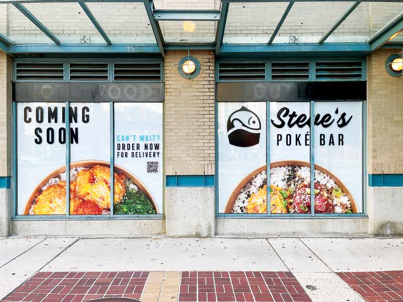
What began with “Coming Soon” window graphics, initially serving as hoarding during renovations, transformed into a fully operational restaurant adorned with detailed signage.
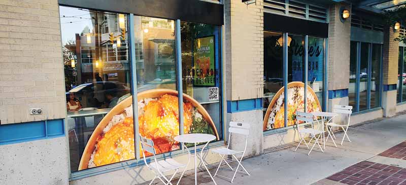
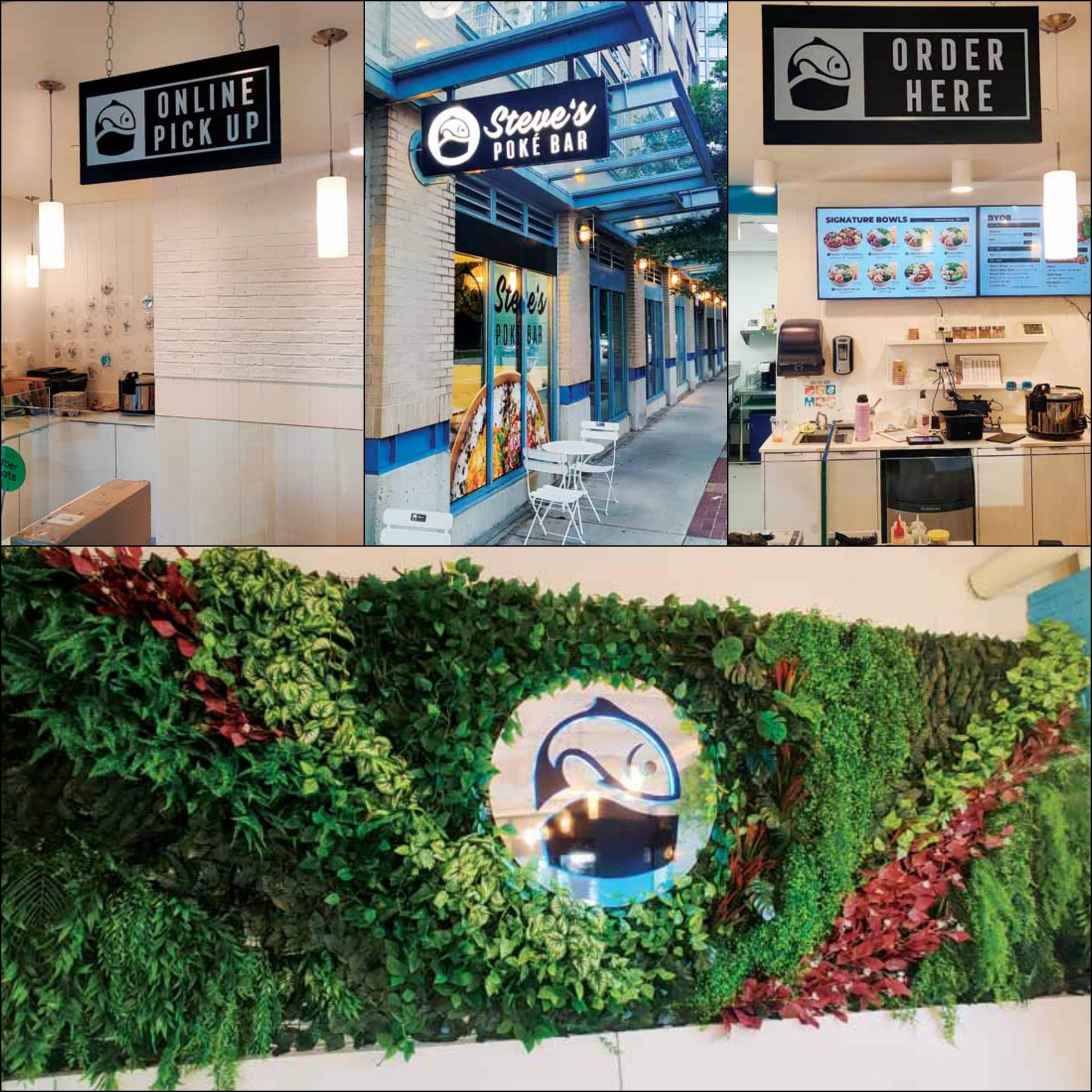
Interior signage: The interiors feature window coverage, cooler header decals, door decals, suspended signs, and an illuminated logo sign against a living wall backdrop.
- Cooler header decals were printed on self-adhesive vinyl with matte lamination and applied to the bulkhead of the coolers.
- The window graphics include images of the food offered at the restaurant and catchy phrases synonymous with the brand such as “awesome poké, awesome people”. The graphics also include the story of the restaurant—an integral part of its enduring appeal. Window graphics were printed on white adhesive vinyl with gloss lamination.
- Door decals showcase the restaurant’s name, social handles, and menu QR code, and were cut from white vinyl.
- “Order Here” and “Online Pick Up” suspended signs were crafted from 12.7-mm (0.5-in.) black polyvinyl chloride (PVC), with white cut cast vinyl forming the logo and copy.
- An illuminated logo sign was also set against a livable wall backdrop. The sign, made from acrylic with a chrome mirror face and a backlit black fish icon, stands out sharply against the green wall, lending the space a fresh and organic ambiance.

Construction phase installations began with exterior signage and progressed to interior elements after the building’s completion.
Installation
The installation involved careful planning to achieve optimal sign visibility and functionality for signs both inside and outside.
Exterior signs: Custom bracket lengths were adjusted to achieve the desired angle for the storefront sign. Power supplies were integrated into the restaurant’s infrastructure to ensure efficient operation.
Interior signs: Suspended signs were securely mounted under the canopy using minimal brackets, maintaining a clean and modern appearance.
The largest sign, spanning 6 m (20 ft) in width and 0.6 m (2 ft) in height, was the eye-catching storefront sign. Crafted using traditional methods, aluminum was cut to form the letters, then assembled with aluminum returns to add depth. LED lighting was installed within the letters, which were enclosed with a translucent acrylic face.
Likewise, the lightbox signs, measuring 1.8 m x 0.6 m (6 ft x 2 ft), were constructed with aluminum and LED lighting. However, instead of an acrylic face, they featured a painted aluminum surface with cutouts for the acrylic letters to be pushed through. These acrylic letters, fabricated separately, protrude slightly beyond the sign’s surface, creating a dimensional effect. LED lighting behind the letters further enhances visibility and esthetics, casting a soft glow around each character. The iconic interior logo, a standout feature, was crafted from chrome aluminum composite panel (ACP), acrylic shape, black vinyl, and LED lighting. The reflective back panel, cut from chrome ACP, showcases the fish-shaped acrylic icon. LED lighting behind the icon adds a subtle blue glow, accentuating its allure.
In contrast, the two suspended interior signs are non-illuminated, simplifying their fabrication. Made from solid PVC black panels with cut white vinyl lettering, these signs are lightweight and sleek.
Trials
The main challenge arose during the sign permit application process due to city bylaws restricting each elevation to one blade sign and one fascia sign. However, the team strategically argued that the store, situated on a corner, technically had three elevations or sides. This compelling point persuaded city authorities to approve the original design, permitting the installation of all three exterior signs as planned.
Conclusion
Restaurants in urban settings rely heavily on signage to establish their presence and identity. These signs aren’t just markers; they become recognizable features reflecting the character of the business within urban environments. They play a vital role in shaping the city’s visual identity while helping businesses stand out and connect with their community in meaningful ways.
With more than 18 locations spanning Burnaby, Surrey, Coquitlam, Langley, and Vancouver, and now as the sole branch in downtown Vancouver, Steve’s Poké Bar and its distinctive signage have become integral to the province’s landscape.
These signs aren’t just markers; they become recognizable features reflecting the character of the business within urban environments. They play a vital role in shaping the city’s visual identity while helping businesses stand out and connect with their community in meaningful ways.
Khuram Shahzad is a seasoned professional with over a decade of experience in the signage industry. As a marketer, he possesses a keen understanding of customer needs and excels at capturing their attention through both online and offline channels. His expertise in brand promotion has consistently driven increased revenues, showcasing his ability to effectively bridge the gap between customer expectations and business goals.


