
Photos courtesy Khuram Shahzad, Century Signs
How Century Signs transformed Fresh St. Market with more than 100 custom signs and unique metalwork, creating a vibrant and cohesive shopping experience.
By Khuram Shahzad
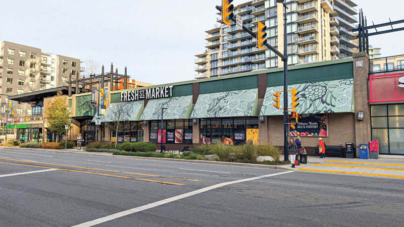
In November 2024, Fresh St. Market opened its doors in North Vancouver, taking over a location that had previously housed an Independent Grocers Alliance (IGA) store. The new grocery store, known for its commitment to fresh, local products, was designed to offer an updated experience for shoppers while retaining a connection to its community roots. This rebranding project was led by Century Signs, a long-time partner of Georgia Main Food Group, which owns both Fresh St. Market and IGA. Century Signs had been responsible for the initial branding of the IGA store, and this continued partnership made the sign shop the natural choice for the redesign.
The rebranding project kicked off in February 2024 and lasted nine months. Its phased approach allowed the store to remain operational throughout the process. While certain departments were temporarily closed to allow for updates, other parts of the store remained open, minimizing disruptions for shoppers. These phases focused on installing new signage, infrastructure, and decor to align with Fresh St. Market’s brand and vision.
Fresh features
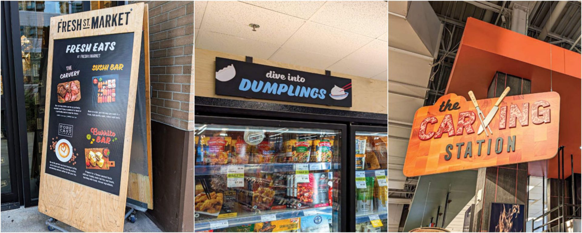
This was the largest project by Century Signs in 2024, comprising more than 100 different signs and a variety of fabricated metalwork. Each sign was designed to serve practical and esthetic functions, guiding customers through the store while enhancing the shopping experience. The list of extensive signage elements included storefront awnings, storefront channel letter signs, exterior window graphics, wall murals, wayfinding signs, hanging signs, freestanding signs, and parking lot signs.
While the signs were diverse, they all shared a common goal: to maintain the consistency and integrity of Fresh St. Market’s visual identity while offering a functional role in navigating the store.
The Fresh St. Market team provided the design work. Their vision for the space was clear, and their creativity in providing a strong set of designs helped guide the entire project. The challenge, then, was to translate those designs into physical elements, ensuring each sign was both visually appealing and well-crafted.
The rebranding project kicked off in February 2024 and spanned nine months, with a phased approach that allowed the store to remain operational throughout the process.
Flawless fabrication
From the outset, the project required a detailed fabrication process that used various materials and equipment. Century Signs completed all the fabrication work in-house. The team relied on their equipment, installers, and vehicles and rented only scissor lifts to access high ceilings during installation.
One of the project’s standout features was the storefront awnings. Originally created for the IGA store, these metal frames were refurbished and reinstalled for Fresh St. Market, with new custom-printed fabric designed to match the brand’s colours. The length of these frames exceeded 30.4 m (100 ft), and they served as a prominent feature in the store’s updated exterior.
A particularly striking element of the new storefront is a massive 9.14-m x 1.22-m (30-ft x 4-ft) channel letter sign. Constructed using aluminum, acrylic, and LED lights, the sign was mounted on a custom aluminum raceway and installed with metal spacers to ensure it fit the facade perfectly.
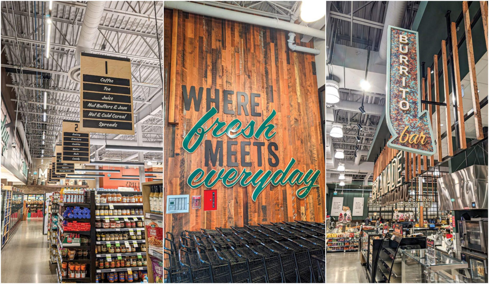
The interior signage featured various designs that showed craftsmanship and were tailored to suit the different departments within the store. For example, above the checkout counters, the marquee-style channel letter sign draws attention. The “ESLPANADE DELI” and “Good Bakes” signs feature medium-density fibreboard (MDF) dimensional letters and illuminated signs for a vibrant glow.
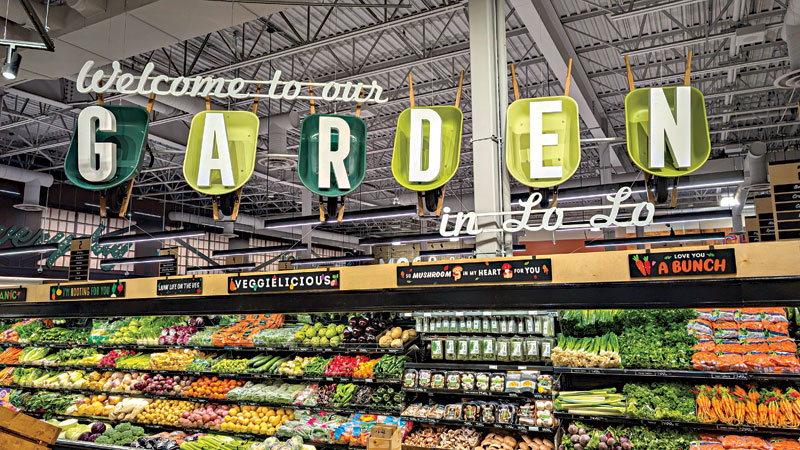
The produce section was highlighted by six wheelbarrows featuring 3D letters that spelled “GARDEN,” while the Kitchenware area was given a rustic touch with a hand-painted, corrugated “SHIPYARDS” sign. The use of foam letters and painted polyvinyl chloride (PVC) panels helped create a dynamic yet cohesive visual environment.
The meat section featured a distinctive “CHOP HOUSE” sign, designed with illuminated channel letters that created a consistent glow from every angle. In addition to the main sign, this section included a double-sided blade sign and a cow-shaped display made from coated foam—an element that added character and thematic relevance to the store.
This was the largest project by Century Signs in 2024, comprising more than 100 different signs and a variety of fabricated metalwork.
Another interesting aspect of the project was the large-scale mural behind the checkout counters. A hand-painted mural that had been a feature of the previous IGA store was preserved. To integrate it into the new design, a custom-fabricated metal window mullion structure was added, giving the impression that customers were looking at the mural through a window frame.
Fitting execution
The installation process was meticulously planned. Since the store remained open, the team began with exterior signage, which caused less disruption to customers. Once the exterior was complete, attention turned to the interior. Certain sections of the store were then temporarily closed off while work was being done, requiring careful co-ordination and scheduling. Century Signs and Fresh St. Market worked diligently to minimize disruption to the store’s daily operations. Each phase focused on updating a specific department, and over the course of nine months, departments like deli, produce, meat, and bakery were temporarily closed while new signage and infrastructure were installed.
All signs, awnings, and infrastructure were delivered by Century Signs’ fleet of vehicles and installed by their in-house team. Rented scissor lifts were used to install high-reaching interior signs, while the remaining equipment was handled by the company’s regular tools and vehicles.
The final product was a fully updated store that effectively communicated Fresh St. Market’s commitment to local products while creating a visually cohesive and inviting environment.
Facing forward
As with any large-scale project, challenges arose throughout the process. For the installation of large metal structures, such as the deli’s hanging bar system and the shipyard canopy, on-site assembly was required. This was due to the narrow entrance doors, which made moving the large components into place difficult. This meant redesigning some components to simplify on-site assembly, even though much of the work could have been completed in the shop.
The installation also presented a logistical challenge. To ensure the work was completed on time, the installation team often worked overnight to avoid interfering with store operations. The careful staging of the installation helped ensure that the signage was added efficiently, with minimal disruption.
Century Signs’ fleet of vehicles delivered all signs, awnings, and infrastructure and installed them by their in-house team.
Century Signs drew on its extensive experience in branding for large retail chains to keep the project on track. Careful planning and collaboration with the Fresh St. Market team—who came up with the innovative, out-of-the-box branding—ensured the transition was smooth and that all elements of the project were executed to a high standard.
Final flourish
Reflecting on the project, the team expressed satisfaction seeing the work come together. The complexity of the task was met with a high level of professionalism, and the result is a store that stands out in North Vancouver both for its design and selection of fresh, high-quality products.
Khuram Shahzad is a seasoned professional with more than a decade of experience in the signage industry. As a marketer, he possesses a keen understanding of customer needs and excels at capturing their attention online and offline. His expertise in brand promotion has consistently driven increased revenues, showcasing his ability to bridge the gap between customer expectations and business goals effectively.


