By Dave Miller
Unlike the U.S. and its well-established Americans with Disabilities Act (ADA), Canada does not have a single, consistent, national standard for accessibility signage. There is federal legislation that requires public spaces to be made accessible to people with disabilities, but provinces, localities and agencies are also allowed to design their own codes and guidelines, some of which relate to sign designs, materials and installation procedures. So, it is important for signmakers to know which guidelines are pertinent to their projects.
Many different groups throughout Canada that choose to build their own codes start with the guidelines established by the Canadian Standards Association (CSA), a non-profit, membership-based organization charged with developing standards that anyone can use.
Specifically, they have turned to CAN/CSA-B651-95, Barrier-Free Design. Section 6.4 focuses on signage, including character proportion, contrast, illumination, tactile characters and access symbols.
CSA highlights
CSA’s tactile sign guidelines are applicable to regulatory, warning and permanent room-identification signs, while its visual guidelines are applicable to orientation and information signs. This approach is similar to that of ADA’s guidelines.
On the other hand, CSA guidelines allow both upper- and lower-case tactile letters, as opposed to the American requirement for upper-case only. The characters can be anywhere from 16 to 51 mm (0.6 to 2 in.) high and should be smoothly edged—as should the sign itself.

CSA guidelines allow both upper- and lower-case tactile letters, as opposed to ADA’s upper-case-only approach in the U.S.
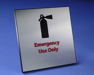
All characters, whether tactile or solely visual, should have minimum width-to-height ratios of 3:5 to 1:1 and must have a minimum stroke-width-to-height ratio of 1:5 to 1:10. All symbols should meet international standards and be displayed within a minimum 150-mm (5.9-in.) field, with corresponding text and braille below them.
Sign heights are recommended at 1.5 m (59 in.) off the ground or floor surface. If at all possible, the sign should be placed on the latch side of a door, with a minimum clear area of 76 mm (3 in.) from the door’s frame. The sign should also be, at minimum, 140 mm (5.5 in.) away from the adjacent wall surface.
There are no colour-specific contrast recommendations, but a minimum lighting level of 200 lumens per square metre (lm/m2) is required.
Developing codes
The following are some examples of current codes and guidelines that have been built off of CSA’s work:
ODA
In Ontario, the still-evolving Ontarians with Disabilities Act is currently in the process of developing sign guidelines that can be incorporated into municipal codes throughout the province. In the meantime, some municipalities have gone ahead and developed their own codes.


