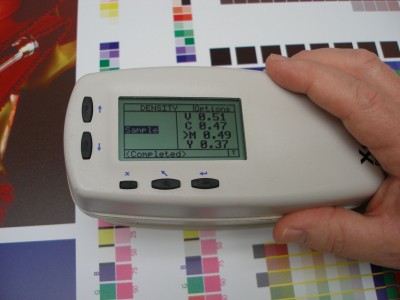
The G7 methodology still involves measuring colours with a spectrophotometer, which means first learning and understanding the L*a*b* colour space.
Instead, the goal is to reproduce an image in balance, without any unwanted colour shifts in any part of that image. And this is achieved by letting go of some areas of the image that may not be controllable. This is why G7 is defined as achieving a common appearance between images.
The G7 gift
G7 has made a significant difference in efficiency in printing, particularly screenprinting, where there was more to be gained, given previously slow processes. And for years, large-format screenprinting shops have struggled with customers demanding they print higher line half-tone counts, so their graphics will look better up close.
Further gains in production efficiency will continue to be made throughout the industry. Beyond production efficiency, however, the greatest gift offered by G7 is the concept of achieving a common appearance as the target, as opposed to trying to nail an exact match of a proof.
There are many reasons why both screenprinting and inkjet printing operations have struggled with that battle in the past and cannot win it. Quite simply, there are too many differences in their processes for them to ever match a commercial offset proof or even an internal inkjet proof.
With G7, they can achieve a common appearance with that proof.
 From proof to print
Proofing systems have always been designed to simulate a final print on a specific type of paper. Today, with almost all proofing being performed using digital inkjet printing systems, most proofs continue to be generated on very white paper, even though few wide-format graphics are ever printed on substrates that are similarly white.
The inkjet printers that dominate the proofing market do not use the same inks and pigments as the more durable wide-format inkjet printers that produce the final graphics. So, the hues of the inks are inherently different.
Even if all elements in a graphic were somehow identical with those in a proof, there is the issue of size. If a proof is only one-tenth the size of the final graphic, there is no way for the operator or customer to hold up and view the two items at the same proportional distance to ensure they appear the same. So, there is always some kind of visual translation going on between proof and print.
Various elements of proofs and prints can be extremely different from each other, including resolution or lines-per-inch (lpi) count, the media white point, the ink and overprint hues, formats, finishes and dot type. So, the introduction of a colour control method that does not force signmakers to try to match these elements, but rather to achieve a common appearance, is very much welcomed by the industry—and in itself makes pursuing G7 methodology worth the time and investment.
Further, even if some companies do not implement the methodology in-house, the increased acceptance of it throughout the printing community will benefit everyone, as the industry will finally accept the uncommon elements that cannot be matched.
Bruce Ridge is director of technical service for Nazdar, which manufactures inks for the wide-format printing industry. For more information, visit www.nazdar.com.


