Achieving common appearance
by Matthew | 24 January 2012 11:41 am
 [1]
[1]Photos courtesy Nazdar
By Bruce Ridge
While sign shops and other wide-format print providers have long offered colour matching capabilities, in most cases, the process remains impractical and inefficient. Today, the non-profit International Digital Enterprise Alliance’s (IDEAlliance’s) G7 methodology for calibration in four-colour process printing instead pursues the goal of ‘common appearance.’
This will offer significant benefits for both digital printing and analogue commercial printing, in terms of producing images more efficiently.
Industry endorsement
In January 2010, at the Specialty Graphic Imaging Association (SGIA’s) annual Congress of Committees, the graphic production group voted to recommend G7 as the preferred method for the reproduction of full-colour images through inkjet and screenprinting processes.
This was noteworthy because signmakers never had a process-colour printing method or specification before that could accommodate the varieties of media, substrates and inks used in their industry. The durable pigments in wide-format graphic inks, for example, can involve very different hues and densities compared to offset printing specifications for colour matching. Such issues had made it difficult to impossible for the industry to reproduce commercial proofing targets.
The SGIA endorsement also validated the efforts of early adopters, who had already invested time and money into learning and following the G7 process.
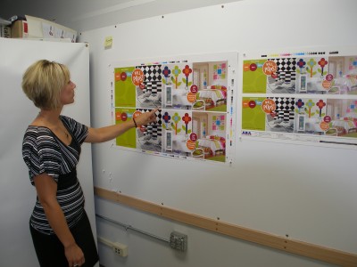
 [2]
[2]Signmakers have faced difficulties reproducing commercial proofing targets, due to differences in ink hues and densities compared to offset printing specifications for colour matching.
New motivation
Originally, one of the main motivations for print providers to commit to implementing the G7 methodology in their facilities was the notion that print buyers would soon be demanding it. After all, if a new colour control process could help make images appear similar across different printing platforms, formats, resolutions and substrates, who wouldn’t want that?
Initially, however, the customer demand did not emerge. Instead, what kept interest in G7 alive in the industry were the methodology’s immediate benefits in production efficiency and in providing a distinctive way to compare images. So, once these print providers were committed to the process, its true value to production became apparent.
The G7 methodology separates and controls the printing of process colour graphics by targeting a neutral print density in the 25, 50 and 75 per cent tonal areas of the image. The result is a common or shared appearance, but G7 is the first colour specification that does not dictate how to get to that final destination; it simply specifies what that destination is. How to get there is up to the print provider’s own process and procedures. Hence, G7 is not process-specific and can be applied to all types of printing.
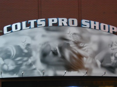 [3]
[3]For years, large-format printing companies have struggled with customers demanding they print higher line half-tone counts, so their graphics will look better up close.
A brief history
While some inkjet and screenprinting shops also handle offset lithography, most do not, so print standards like Specifications for Web Offset Publications (SWOP) and General Requirements for Applications in Commercial Offset Lithography (GRACoL)—which are designed specifically for offset printing’s paper, inks and dot gains—do not apply well to their in-house processes.
So, in the past, wide-format print houses spent a lot of time on colour matching, i.e. trying to get graphics to appear as close as possible to offset-printed proofs. Unless a graphic is printed with the same process and inks on the same substrate, however, there is always going to be some degree of deviation in colour.
Print shops established colour matching departments and hired specialists in an effort to support the industry-wide claim that any colour on a proof could be reproduced accurately. Production departments, however, worked with more toward achieving similar colour, due to restrictions and limitations in terms of time, materials and equipment.
This tradition of colour matching was focused on spot colours, based on fabric swatches or the Pantone Matching System (PMS). It became common for print shops to be asked to match very specific corporate colours, such as Coca-Cola red or Pepsi blue. And when directly comparing two solid or spot colours side-by-side, it is easy for the human eye—let alone a colour testing system—to discern subtle differences between them.
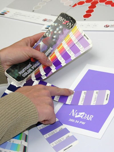 [4]
[4]In the past, colour matching has relied on swatches and the Pantone Matching System (PMS).
This evolved into a science of spot colour matching, requiring the removal of subjectivity from the process. The practice of measuring colours and ‘quantifying’ them by assigning numbers was developed and became known as spectrophotometry. Even then, however, the mathematical formulas allowed some tolerance of deviation from a standard within a limited range.
The L*a*b* colour space became the most common model used to measure colour. This involved assigning numbers to define a given colour’s location in the space. It remained difficult, however, to compare two colours within the space, so formulas were developed to help quantify the difference.
These formulas did not weigh various colours differently, though the human eye tends to perceive subtle variations at a lower or greater degree in different colours. Two measured greys, for example, will appear more visually different from each other than two bright reds. This is due to the way the human eye sees slight colour shift differences in neutral colours.
And this is why the G7 methodology is so effective: full-colour images are separated and controlled with neutral greys.
On the spot
G7 does not assist with spot colour matching or simulation, nor does it use the same substrate ‘white point’ solid ink densities, dot gain or tone value increase (TVI). Rather, it is designed to control process colour images by setting neutral density curves for cyan, magenta and yellow inks, based on how they are printed individually, as well as together to create the ‘overprint’ secondary colours. The methodology focuses on balancing the relationship between these three colours in an image where there may be thousands of colours.
Most spot colour matching information remains relevant, as G7 still requires the print provider to measure colours with a spectrophotometer, which means first learning and understanding the L*a*b* colour space. The spot colour ‘mentality,’ i.e. of matching one specific colour to another, however, is not usually the goal of the G7 process.
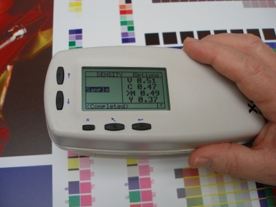 [5]
[5]The G7 methodology still involves measuring colours with a spectrophotometer, which means first learning and understanding the L*a*b* colour space.
Instead, the goal is to reproduce an image in balance, without any unwanted colour shifts in any part of that image. And this is achieved by letting go of some areas of the image that may not be controllable. This is why G7 is defined as achieving a common appearance between images.
The G7 gift
G7 has made a significant difference in efficiency in printing, particularly screenprinting, where there was more to be gained, given previously slow processes. And for years, large-format screenprinting shops have struggled with customers demanding they print higher line half-tone counts, so their graphics will look better up close.
Further gains in production efficiency will continue to be made throughout the industry. Beyond production efficiency, however, the greatest gift offered by G7 is the concept of achieving a common appearance as the target, as opposed to trying to nail an exact match of a proof.
There are many reasons why both screenprinting and inkjet printing operations have struggled with that battle in the past and cannot win it. Quite simply, there are too many differences in their processes for them to ever match a commercial offset proof or even an internal inkjet proof.
With G7, they can achieve a common appearance with that proof.
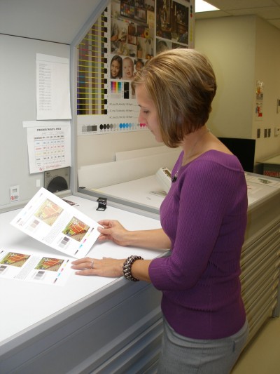 [6]From proof to print
Proofing systems have always been designed to simulate a final print on a specific type of paper. Today, with almost all proofing being performed using digital inkjet printing systems, most proofs continue to be generated on very white paper, even though few wide-format graphics are ever printed on substrates that are similarly white.
The inkjet printers that dominate the proofing market do not use the same inks and pigments as the more durable wide-format inkjet printers that produce the final graphics. So, the hues of the inks are inherently different.
Even if all elements in a graphic were somehow identical with those in a proof, there is the issue of size. If a proof is only one-tenth the size of the final graphic, there is no way for the operator or customer to hold up and view the two items at the same proportional distance to ensure they appear the same. So, there is always some kind of visual translation going on between proof and print.
Various elements of proofs and prints can be extremely different from each other, including resolution or lines-per-inch (lpi) count, the media white point, the ink and overprint hues, formats, finishes and dot type. So, the introduction of a colour control method that does not force signmakers to try to match these elements, but rather to achieve a common appearance, is very much welcomed by the industry—and in itself makes pursuing G7 methodology worth the time and investment.
Further, even if some companies do not implement the methodology in-house, the increased acceptance of it throughout the printing community will benefit everyone, as the industry will finally accept the uncommon elements that cannot be matched.
Bruce Ridge is director of technical service for Nazdar, which manufactures inks for the wide-format printing industry. For more information, visit www.nazdar.com[7].
- [Image]: http://www.signmedia.ca/wp-content/uploads/2014/02/Image-_4-Lady-looking-at-prints.jpg
- [Image]: http://www.signmedia.ca/wp-content/uploads/2014/02/C1-1Proof.jpg
- [Image]: http://www.signmedia.ca/wp-content/uploads/2014/02/a18.jpg
- [Image]: http://www.signmedia.ca/wp-content/uploads/2014/02/A-colormatch.jpg
- [Image]: http://www.signmedia.ca/wp-content/uploads/2014/02/PB030071.jpg
- [Image]: http://www.signmedia.ca/wp-content/uploads/2014/02/PA300025.jpg
- www.nazdar.com: http://www.nazdar.com
Source URL: https://www.signmedia.ca/achieving-common-appearance/