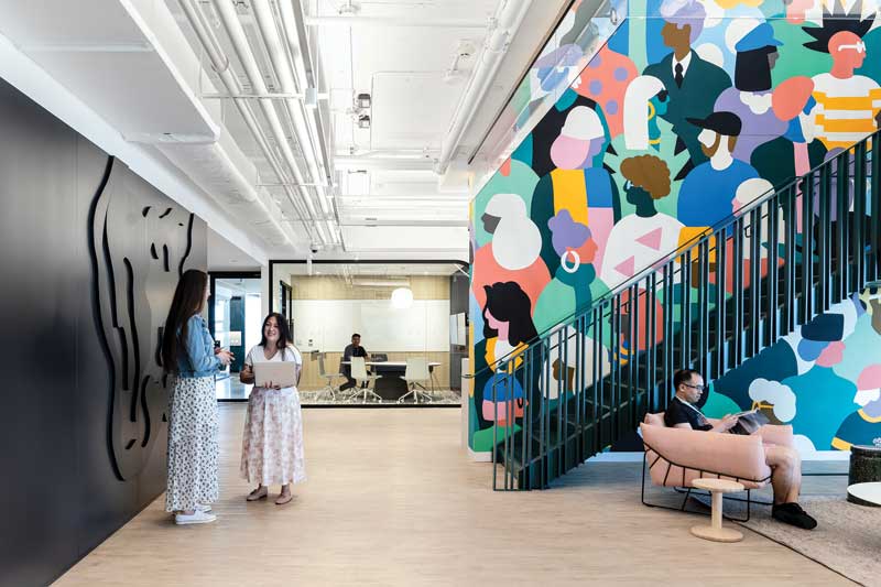
The reception area at Trulioo’s Vancouver headquarters features a 3D abstract world map and a two-storey, custom-designed mural. Photos courtesy Edit Studios
By Carly McHugh
Architectural signage has become more popular in recent years, not only as a way for businesses to express themselves through design, but also as a tool to bring their branding further into the modern era. A recent project from Vancouver’s Edit Studios exemplifies this growing trend.
In fall 2021, Trulioo, a financial tech firm based in Dublin, Ireland, sent out a request for proposals (RFP) to design their new Vancouver headquarters. The goal of the project was to encourage employees to return to the office following the COVID pandemic, by creating elements which would allure them away from the comfort of their own homes for a more collaborative, functional workspace.
The RFP process gained interest from a variety of firms, including architectural giants such as Gensler, Moser, and DIALOG. Each team was also required to submit a series of test fit plans, to showcase how their concepts would translate to the physical office space. Through this process, Edit spent a great deal of time perfecting their graphics, to visually portray Trulioo as a company that prioritized its people.
As a local firm, Edit had the advantage of more face time with their potential client. At first, Trulioo was not sure of which building they would be moving into, so the studio toured them through a series of spaces and helped them weigh the pros and cons to find the right fit. Ultimately, this helped Trulioo make their decision, not only on their desired office space, but also on which firm they were going to work with in realizing its design.
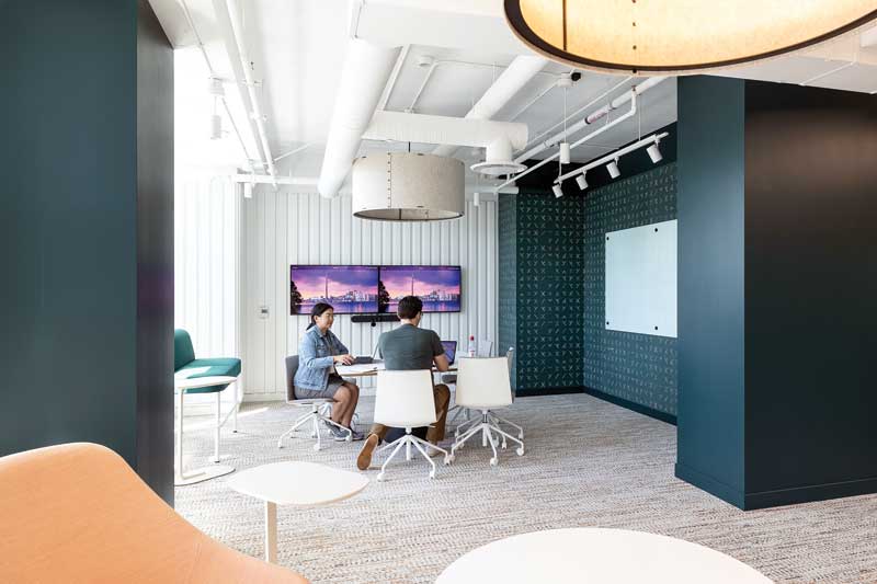
With the project secured, the design stage began, using existing elements of Trulioo’s branding, such as their signature fluorescent blue and green colours. Edit’s vision was to use toned down versions of these colours to make the design more hospitable, but not stray away from them, as their inclusion was essential. However, when the team was halfway through the design phase, Trulioo decided it was time for a rebrand, to better suit the new office space. During this process, Edit worked closely with the company’s branding agency, Pendo, to ensure the project stayed on track. With construction around the corner, the rebrand and the design needed to be conducted simultaneously. While Pendo and Trulioo developed new colours and ideas for signage to reinforce the brand, Edit was working behind the scenes to update the existing design. As a result of the detailed communication which followed each branding meeting, they were able to have the design completed in two weeks. All of the colours throughout the office were changed to softer tones, to relate directly to the new brand and website, and everything down to the acoustical light fixtures was modelled after Trulioo’s new branding.
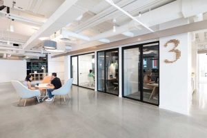
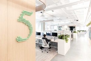
The 4,645.1-m2 (50,000-sf) space features a variety of different signage types—all used in similar ways throughout the design—which correspond with the collaborative, functional, and productive atmosphere the team set out to create.
A welcoming office environment
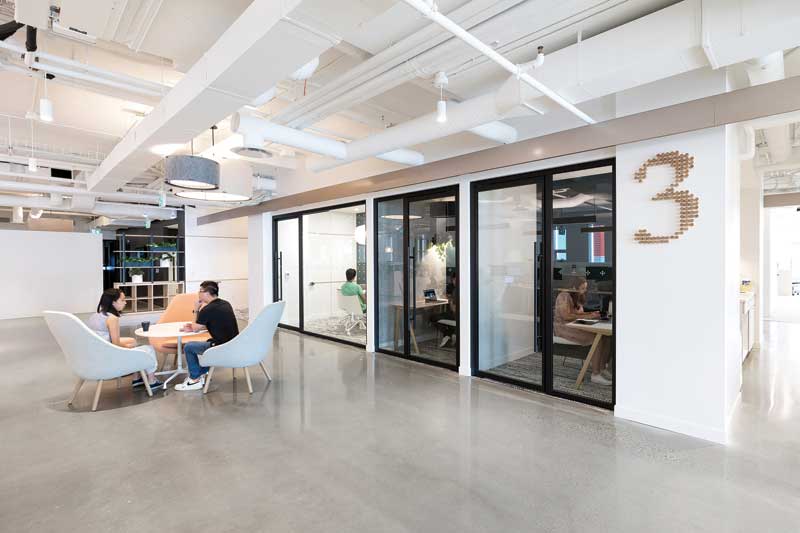
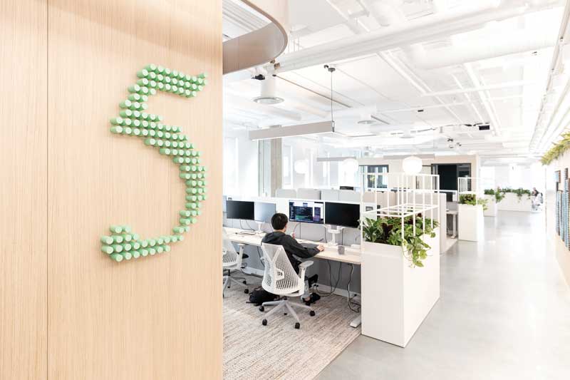
Rather than a traditional floor plan, employees are divided into sections called neighbourhoods. Each neighbourhood is marked with a 762-mm (30-in.), 3D number formed from a network of dots, which are among the symbols used in Trulioo’s branding. This type of signage was crafted using 25.4-mm (1-in.) diameter wood dowls with natural wood grain and colour-matched faces.
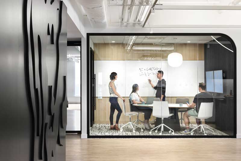
In each meeting room throughout the office space, the team also incorporated custom-designed feature wall coverings and vinyl patterns, using dots, crosshatches, and other symbols associated with the company. They also included film graphics on the glazing, which were directly based on the patterns from Trulioo’s new branding. For room names and visibility strips, FastSigns of Surrey, B.C., used various sizes of cut adhesive vinyl, which was colour-matched and applied to the glass.