
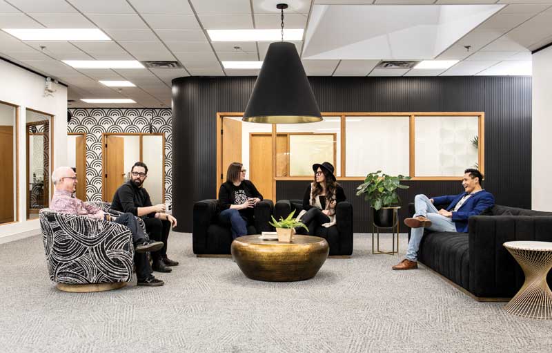
With a large, open common area, the company sought to bring congregation to a new level.
The team opened up the office walls to let sunlight in and added a touch of green with assorted live plants. They also leaned into the existing architecture of the building, some of which was unearthed during the renovation process. After removing the drop ceiling—which was capped at 2.4 m (8 ft) in certain areas—they discovered wood beams underneath. Hidden elements from previous renovations were also found behind the walls and became part of the new space. The team re-stained the wooden beams and cleaned up the electrical and plumbing, to bring these hidden gems back to life.
Originally, the renovation was intended to meet the needs of the company’s current staff, and this was not overlooked in the second round. Per the initial plan, the lunchroom was expanded to include extra fridges and dishwashers, triple banks of microwaves, and extra coffee stations.
One of the more interesting aspects of the renovation was how signage was used throughout the space. Before, it was on display to showcase previous projects to clients. However, the new office only features signs that are part of its artistry, to signify Hi Signs’ desire to be part of the first level of the design process and show customers the possibilities available beyond traditional signage.
“We’ve started to focus a lot more on design,” says Brennan. “We used to be well-known for building things, but when I joined a couple of years ago, I really identified that the design aspect of signage was very key in capturing major projects, or great projects we’re excited to work on before they get to a tendering process. Therefore, we started working with interior designers, architects, and design agencies, and I felt like the space we had would also need to reflect the level of client we were trying to serve.
With the renovation, we wanted to be able to attract a different level of customer—one that appreciates design more. We want them to see our new website, come in for a tour, and walk in and think, ‘Wow, this doesn’t feel like a sign company.’ Then, we can say, ‘Well, we build and design signs, but we’re really leaning more towards a design firm that has the capability to also produce those ideas.’”
Re-establishing natural connection
Along with reinventing their image, the team sought to reignite the desire for collaboration that faltered not only from social distancing requirements, but also the limitations of the old office space. While drafting the new floorplan, they considered both the esthetics and the image the company wanted to portray, as well as how its employees could establish better camaraderie within the space.
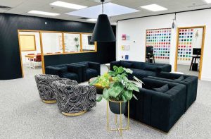
With a large, open common area, they sought to bring congregation to a new level. Before, when individual office doors were closed, no one could see each other, so it was harder to tell who was present in the office. Now, the bright, updated space features multiple pockets of seating, including a bar top table for 10, and a boardroom which accommodates 12. They have also added big, comfortable lounge chairs for their guests.


