
An architectural approach to signage
“Looking out into the office space, I hear a lot of laughter coming from different areas of the building, and it’s a good sign,” says Brennan. “It’s not something I had heard for the last two years, when I was sitting at home in an office by myself, so there’s a big change there.”
Indeed, the new space was created with a focus on energy, both positive and passive.
Similar to today’s architecture firms, who are actively considering net-zero and incorporating more natural products, Hi Signs has been mindful of their carbon footprint in both the new design and their current operations. Throughout the renovated space, they have integrated wood accents using mahogany, oak, and cedar, which hearkens to Banff Sign Co.’s specialization in cedar and sustainable products. Additionally, last year, the company and its affiliated businesses reduced their natural gas usage inside the building by 30 per cent.
“It’s a big aspect for us to minimize waste wherever we can,” says Brennan. “Not only that, but if sign companies were to be aware of something, it would be to make their products built to last. If you upgraded your products to be able to sustain for 20 or 25 years, then you’d be reducing your footprint from future wastage. That’s also something we’re leaning into. We’re looking for clients who are willing to spend a bit more to make sure their signs last longer. The race to the bottom in terms of pricing is not the market we cater to. We’re appealing to a customer base that wants to spend a bit more, in order to come up with a design that’s a little bit more timeless, so they don’t feel dated. I’d rather lean into designs that are traditional and products that are actually going to last a long time.”

Putting themselves into the project
Throughout the renovation, Hi Signs continued to find ways to add personal touches to the space. Among the collection of signs on the wall are small ones which hang above each employee’s door. However, rather than having the job title or the name of the person who occupies the office, the team chose to use a system called Clifton Strengths. Each employee took a test and received a list of their top five strengths. Not only did it help the team identify how best to work with each other, but it also identified their best qualities, giving meaning to the people who work there.
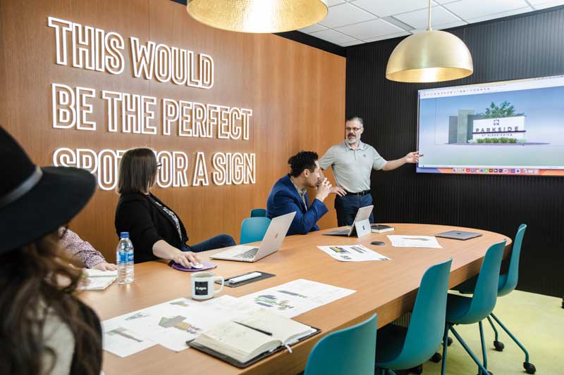
The sign on the boardroom wall was born from an exercise to find an inspirational quote, which would be impactful for anyone sitting in there.
“We kept coming up with these cliche types of mottos, something success or results driven,” recalls Brennan. “Then, out of frustration, I finally said, ‘I don’t know what’s going on there. All I know is this would be the perfect spot for a sign.’ Then, I said, ‘You know what? Just put that.’ It’s fitting, and when we bring customers in, they always have a good laugh about it.”
Sign up for our newsletter
Featuring breaking news from Canada's sign and graphics industry.
Products
Read the Latest Issue
