An architectural approach to signage
by carly_mchugh | 6 September 2023 5:07 pm
 [1]
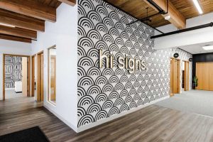
[1]Hi Signs embarked on a renovation to reawaken their front office, reimagine the possibilities for the company and its projects, and create the fear of missing out (FOMO). Photos courtesy Hi Signs
By Carly McHugh
Without a doubt, the age of COVID changed how businesses view their office spaces. However, for Hi Signs of Edmonton, it also served as a springboard to reinvent their shopfront, as well as how customers see
their brand.
The company has been operating within the city since 1974, and out of its current 5,109.6-m2 (55,000-sf) space for the past 20 years. Five years ago, it acquired 310 Sign and Banff Sign Co., and amalgamated all three businesses under the Hi Signs banner.
When the pandemic hit, the company’s front office staff followed suit with the rest of the world and adapted to the concept of working from home. However, managing director Kelso Brennan was determined to get his colleagues back into the office as soon as possible. For the creative team, the virtual workplace created roadblocks for collaboration, not to mention anxiety from the myriad of resulting emails. The days of visiting each other’s offices to answer questions and gather ideas were indefinitely on hold.
Once restrictions lifted, Hi Signs sought to bring more of their employees back into the space. Thus, they began a renovation to reawaken their front office, reimagine the possibilities for the company and its projects, and create the fear of missing out (FOMO) for those who still wished to work from home.
Turning crisis into opportunity
The initial work began last May and was originally intended to be a smaller renovation. However, these plans changed in August, when Hi Signs received a call from their security company to inform them of water coming through their front doors. Upon further investigation, it was discovered a sprinkler head had malfunctioned and caused a flood within the 1,393.5-m2 (15,000-sf) office space. As a result, the company needed to start their renovation from scratch—this time, cutting open the walls to remove the wet drywall as well as replacing the flooring.
While not all of the offices were affected by the flood, Hi Signs thought they would make the best of the unfortunate situation. They decided to completely redesign the entire front area of the shop, so it could best serve their needs for another 10 to 20 years. After settling up with the insurance company, they worked to procure new materials, including desks, office furniture, chairs, and tables. Some of these items would arrive late due to supply chain issues, but the team’s experience with operating from home proved to be an advantage. Within 24 hours of the flood, they had adapted to their new situation once again, while they waited for their workspaces to be restored. The team was also able to secure some top-notch contractors, as well as leverage their own creativity to decide what portion of the renovations they could take on themselves.
An architectural reawakening
The goal of the new renovation was to serve as a reawakening for Hi Signs. Not only did they have the chance to reimagine their office space in the wake of the flood, but they also had the opportunity to rebrand the company as a high-end architectural signage provider. This was reflected in the design of the space, which incorporated mid-century modern elements, complemented by natural accents.
 [2]
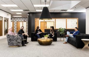
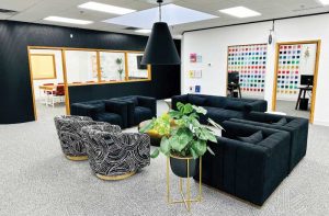
[2]With a large, open common area, the company sought to bring congregation to a new level.
The team opened up the office walls to let sunlight in and added a touch of green with assorted live plants. They also leaned into the existing architecture of the building, some of which was unearthed during the renovation process. After removing the drop ceiling—which was capped at 2.4 m (8 ft) in certain areas—they discovered wood beams underneath. Hidden elements from previous renovations were also found behind the walls and became part of the new space. The team re-stained the wooden beams and cleaned up the electrical and plumbing, to bring these hidden gems back to life.
Originally, the renovation was intended to meet the needs of the company’s current staff, and this was not overlooked in the second round. Per the initial plan, the lunchroom was expanded to include extra fridges and dishwashers, triple banks of microwaves, and extra coffee stations.
One of the more interesting aspects of the renovation was how signage was used throughout the space. Before, it was on display to showcase previous projects to clients. However, the new office only features signs that are part of its artistry, to signify Hi Signs’ desire to be part of the first level of the design process and show customers the possibilities available beyond traditional signage.
“We’ve started to focus a lot more on design,” says Brennan. “We used to be well-known for building things, but when I joined a couple of years ago, I really identified that the design aspect of signage was very key in capturing major projects, or great projects we’re excited to work on before they get to a tendering process. Therefore, we started working with interior designers, architects, and design agencies, and I felt like the space we had would also need to reflect the level of client we were trying to serve.
With the renovation, we wanted to be able to attract a different level of customer—one that appreciates design more. We want them to see our new website, come in for a tour, and walk in and think, ‘Wow, this doesn’t feel like a sign company.’ Then, we can say, ‘Well, we build and design signs, but we’re really leaning more towards a design firm that has the capability to also produce those ideas.’”
Re-establishing natural connection
Along with reinventing their image, the team sought to reignite the desire for collaboration that faltered not only from social distancing requirements, but also the limitations of the old office space. While drafting the new floorplan, they considered both the esthetics and the image the company wanted to portray, as well as how its employees could establish better camaraderie within the space.
With a large, open common area, they sought to bring congregation to a new level. Before, when individual office doors were closed, no one could see each other, so it was harder to tell who was present in the office. Now, the bright, updated space features multiple pockets of seating, including a bar top table for 10, and a boardroom which accommodates 12. They have also added big, comfortable lounge chairs for their guests.
 [3]
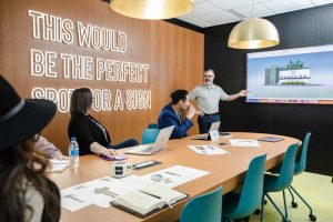
[3]The new boardroom decor was intended to be impactful and inspiring for anyone sitting or working in there.
“Looking out into the office space, I hear a lot of laughter coming from different areas of the building, and it’s a good sign,” says Brennan. “It’s not something I had heard for the last two years, when I was sitting at home in an office by myself, so there’s a big change there.”
Indeed, the new space was created with a focus on energy, both positive and passive.
Similar to today’s architecture firms, who are actively considering net-zero and incorporating more natural products, Hi Signs has been mindful of their carbon footprint in both the new design and their current operations. Throughout the renovated space, they have integrated wood accents using mahogany, oak, and cedar, which hearkens to Banff Sign Co.’s specialization in cedar and sustainable products. Additionally, last year, the company and its affiliated businesses reduced their natural gas usage inside the building by 30 per cent.
“It’s a big aspect for us to minimize waste wherever we can,” says Brennan. “Not only that, but if sign companies were to be aware of something, it would be to make their products built to last. If you upgraded your products to be able to sustain for 20 or 25 years, then you’d be reducing your footprint from future wastage. That’s also something we’re leaning into. We’re looking for clients who are willing to spend a bit more to make sure their signs last longer. The race to the bottom in terms of pricing is not the market we cater to. We’re appealing to a customer base that wants to spend a bit more, in order to come up with a design that’s a little bit more timeless, so they don’t feel dated. I’d rather lean into designs that are traditional and products that are actually going to last a long time.”

Putting themselves into the project
Throughout the renovation, Hi Signs continued to find ways to add personal touches to the space. Among the collection of signs on the wall are small ones which hang above each employee’s door. However, rather than having the job title or the name of the person who occupies the office, the team chose to use a system called Clifton Strengths. Each employee took a test and received a list of their top five strengths. Not only did it help the team identify how best to work with each other, but it also identified their best qualities, giving meaning to the people who work there.
The sign on the boardroom wall was born from an exercise to find an inspirational quote, which would be impactful for anyone sitting in there.
“We kept coming up with these cliche types of mottos, something success or results driven,” recalls Brennan. “Then, out of frustration, I finally said, ‘I don’t know what’s going on there. All I know is this would be the perfect spot for a sign.’ Then, I said, ‘You know what? Just put that.’ It’s fitting, and when we bring customers in, they always have a good laugh about it.”
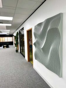
The space also features various other custom signs, as well as art focused on parametric design.
The space also features various other custom signs, as well as art focused on parametric design. They are all aimed at conveying to customers that Hi Signs is willing to push the boundaries of what is possible with architectural signage. They also highlight their attention to detail, as the black, brass, and gold accent pieces all match with the architecture of the door handles and other elements inside the space.
A great deal of the manufacturing and the work within the space—including the installation of the signage and office lights—was done in-house by the Hi Signs team. They also designed and fabricated the graphics and pieces on the walls. The boardroom sign, as well as the Hi Signs logo at the front of the office, features faux LED neon, which is wired into the lighting system. The electrical work also brought power to spots which previously did not have any, including the illuminated signs above the washrooms.
For assistance with decorating, the team recruited Brennan’s wife, Ashley. Her background in interior design helped bring the finished space closer to their vision.
However, like most renovations in the age of COVID, this project was not without its challenges. One of the key roadblocks was lead time on products due to specific shortages. For example, the flooring—an important aspect of the renovation—took 10 weeks to arrive and ended up being one of the last elements added into the space. Another challenge was juggling the team’s workflow, as well as their projects in the back, and delegating a lot of their own resources for the renovation. On average, Brennan estimates Hi Signs utilized at least five to 10 of their own resources at any given time, for tasks such as painting.
Despite these hiccups, the renovation was completed within six months, in February 2023.
Looking towards the future
With the front office completed and its employees settled into the new space, Hi Signs has been able to put more energy into promoting itself as an architectural signage provider. According to Brennan, there have already been some notable benefits coming out of the rebrand, including higher-calibre job candidates and higher-end sign projects.
“The big thing was the crossover from the design of the space into architectural signage and wayfinding,” he says. “The first couple of tours we brought people in for, we were typically experiencing multiple bid situations, where the client would interview us for a fairly large project—maybe half a million dollars or a million dollars. They would plan on interviewing multiple companies, but instead, they came in, and through the conversation, seeing the space, and sitting down and being collaborative with us, they would make the decision on the spot. We probably landed five major projects in the first 45 days of having people come through, which I would be confident to say we would not have gotten before. The space is helping us attract a different level of client, and I think that was the whole intended purpose.”
- [Image]: https://www.signmedia.ca/wp-content/uploads/2023/09/1E2A2927.jpg
- [Image]: https://www.signmedia.ca/wp-content/uploads/2023/09/1E2A3121.jpg
- [Image]: https://www.signmedia.ca/wp-content/uploads/2023/09/1E2A3036.jpg
Source URL: https://www.signmedia.ca/an-architectural-approach-to-signage/