
Brightening up the AGO
The bold and the elegant
The designers strove to develop a sign system that would be highly visible, clear, bold and even ‘in-your-face,’ but also appropriately elegant and sophisticated. Realizing the system would need to be very different from the subtle wayfinding signs that had already been installed elsewhere in the AGO following Toronto-born architect Frank Gehry’s ‘Transformation AGO’ redesign, they sought a new esthetic balance for visitors moving off the beaten path.
They felt large, colourful elements would be necessary to draw in passersby, identify the bright new spaces in what were previously considered the ‘bowels’ of the AGO and guide large groups of visiting children during the day, while elegant features would be appreciated in the evening by adult classes or during social functions.
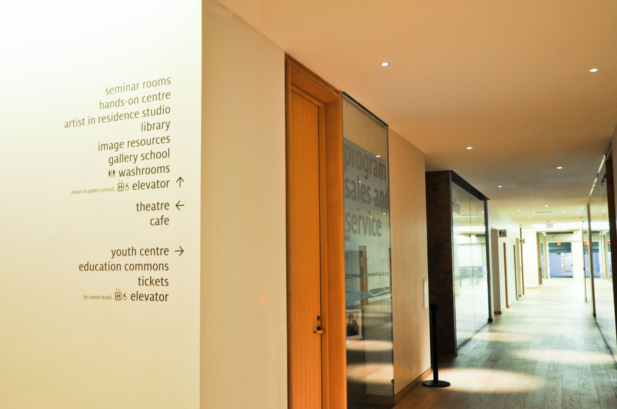
To achieve these multiple purposes at an appropriate scale with a minimal budget, Entro G+A used mostly vinyl graphic applications of a large-scale typography with rounded edges, all in lower-case lettering. Milo Sans was chosen as the font, as its lower-case letters are quite tall compared to common fonts like Futura, so they would be more easily readable.
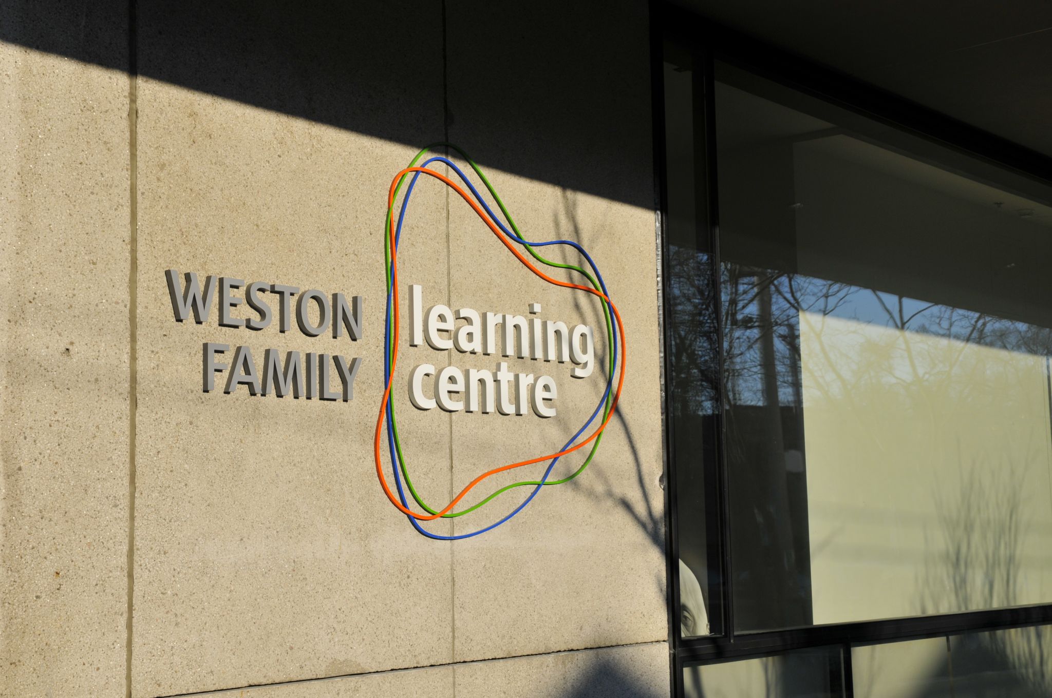
Upper-case lettering, meanwhile, was only used for the donor recognition signs indicating room names, where acrylic dimensional letters were painted for a metallic appearance. A contrast was intended between vibrantly coloured place names and grey-toned donor names.
HPA’s architectural design for the WFLC was open-concept, helping reduce the need for an overabundance of signage—but this also created some challenges for even a minimal sign system. With rooms defined by large glass panels so visitors would not feel like they were in a basement, there was almost nowhere to mount signs except on the glass itself.
This was another reason to go with vinyl applications, including not only sign graphics, but also ‘frosted glass’ effects to serve as distraction marks for safety purposes. The donor names could be displayed above the room entrances. With many groups using the space, the large glass panels also meant banners could be displayed through the windows and short-term graphics could be adhered directly to them.
HPA approved of the simple, large-scale typography concept. Some indoor walls were covered with painted letters and small, dark grey vinyl accents, a few of which can be seen from outside. Meanwhile, acrylic letters were also mounted directly onto the AGO’s western precast wall.
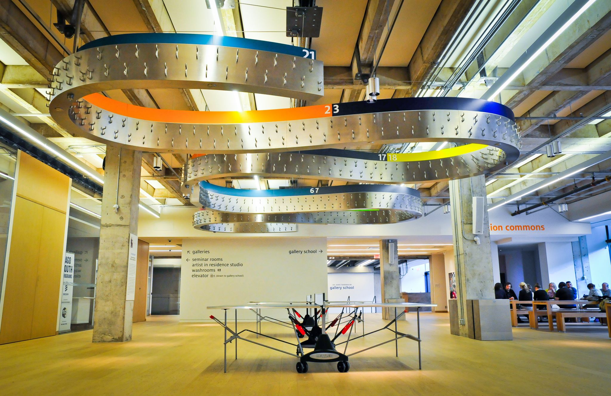
In keeping with the project’s whimsical sensibility, HPA designed a hanging metal ‘ribbon’ rack for children’s coats, which can be raised or lowered to save space. As its different sections needed to be identified, G+A added a painted metal strip with various colours and numbers, which was mounted along the ribbon.
Finally, wall-mounted washroom signs used acrylic components for tactile features and braille characters. They were complemented by more subtle, oversized ‘man’ and ‘woman’ symbols applied to the drywall in vinyl form.
Digital flux
Information was organized and grouped according to its importance. As is often the case in museums, the AGO’s programs are constantly in flux, with spaces frequently reorganized and reassigned for new purposes. Keeping the sign system correspondingly flexible and expandable, in the end, meant some information did not even need to be displayed on wayfinding signs, but instead could be made available via digital signage, with information screens displaying schedules and other dynamic content in portrait mode.
Another digital display was integrated into the WFLC’s main outside-facing sign. It comprises three horizontal LCDs with thin bezels in between them and advertises the facility with footage showing children engaged in hands-on artistic experiences.
Overall, however, everyone involved in the project wanted to keep digital signage to a minimum, so as to avoid letting dynamic content distract students from those hands-on activities.
Sign up for our newsletter
Featuring breaking news from Canada's sign and graphics industry.
Related Products

Read the Latest Issue
