Brightening up the AGO
by all | 7 February 2014 8:30 am
 [1]
[1]Photos by Gerald Querubin, courtesy Entro G+A
By Udo Schliemann
The Art Gallery of Ontario (AGO) recently developed a new facility with Toronto-based Hariri Pontarini Architects (HPA) to expand its ability to serve the public through art education. Representing the renovation of approximately 3,252 m2 (35,000 sf) of the AGO’s space in downtown Toronto, the Weston Family Learning Centre (WFLC) is designed to serve as a social hub for creativity, community and education, providing direct and hands-on encounters for visitors young and old with art, artists and the creative process in a studio setting.
Specifically, the project was intended to allow the AGO to extend the range and reach of its educational programs to larger and more diverse audiences through the following means:
- A new profile, with a dedicated public entrance at the building’s western corner on Dundas Street ensuring a highly visible presence for the WFLC, most of which is in a basement.
- Direct gallery access from the WFLC for students and teachers who would not otherwise be able to participate.
- Double the previous capacity for students, by creating a new, larger entrance and exit ramp.
- Custom-designed, dedicated spaces to welcome students and teachers, including lockers, lunch facilities and orientation room.
- Corresponding online educational programs and resources to reach audiences throughout Ontario, especially teachers and students.
- The new Neighbourhood Access program, offering free admission to schools within walking distance of the AGO.
- A public showcase for community-created art, including the In Your Face exhibition of portraits submitted by people around the world.
- An artist-in-residence program with master classes and instruction for advanced students and fellow artists.
- Direct public access to practising artists at work in a studio space.
- Expanded research and program evaluation practices to measure results.
Toronto-based design firm Entro G+A was tasked with developing an environmental graphic design (EGD) scheme for the vibrant and elegant yet also highly functional space. In keeping with the aforementioned project goals, the signs and other elements would need to be durable, flexible, accessible and well-integrated, welcoming visitors into the space and inviting them behind the scenes.
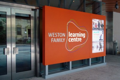 [2]
[2]A dedicated public entrance provides visibility for the Weston Family Learning Centre, most of which is in a basement of the AGO.
From fundraising to wayfinding
At the outset of the project, a team of designers at Toronto-based Gottschalk+Ash International (G+A) won a competition to design the AGO’s fundraising brochure and the identity for the new learning centre. Once they started working on the book, the client suggested it would simply be natural for them to handle the wayfinding design as well.
Work on the learning centre’s identity was complete by June 2010, followed by the brochure in September and wayfinding development in November. It was a somewhat challenging transition. The logo on the brochure had been devised to express openness and experimentation, with a sketchy sensibility for finding one’s way, so it was not easy to turn that loose shape into an actual, dimensional sign.
Also, whereas the brochure was geared to catching the attention of high-profile donors, the wayfinding system would need to speak to a broad audience in a very functional manner.
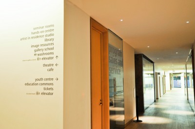 [3]
[3]Wayfinding signs were mostly accomplished by applying vinyl letters directly to the walls.
The bold and the elegant
The designers strove to develop a sign system that would be highly visible, clear, bold and even ‘in-your-face,’ but also appropriately elegant and sophisticated. Realizing the system would need to be very different from the subtle wayfinding signs that had already been installed elsewhere in the AGO following Toronto-born architect Frank Gehry’s ‘Transformation AGO’ redesign, they sought a new esthetic balance for visitors moving off the beaten path.
They felt large, colourful elements would be necessary to draw in passersby, identify the bright new spaces in what were previously considered the ‘bowels’ of the AGO and guide large groups of visiting children during the day, while elegant features would be appreciated in the evening by adult classes or during social functions.
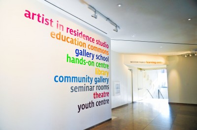
To achieve these multiple purposes at an appropriate scale with a minimal budget, Entro G+A used mostly vinyl graphic applications of a large-scale typography with rounded edges, all in lower-case lettering. Milo Sans was chosen as the font, as its lower-case letters are quite tall compared to common fonts like Futura, so they would be more easily readable.
Upper-case lettering, meanwhile, was only used for the donor recognition signs indicating room names, where acrylic dimensional letters were painted for a metallic appearance. A contrast was intended between vibrantly coloured place names and grey-toned donor names.
 [4]
[4]Acrylic letters were also mounted directly onto the AGO’s western wall.
HPA’s architectural design for the WFLC was open-concept, helping reduce the need for an overabundance of signage—but this also created some challenges for even a minimal sign system. With rooms defined by large glass panels so visitors would not feel like they were in a basement, there was almost nowhere to mount signs except on the glass itself.
This was another reason to go with vinyl applications, including not only sign graphics, but also ‘frosted glass’ effects to serve as distraction marks for safety purposes. The donor names could be displayed above the room entrances. With many groups using the space, the large glass panels also meant banners could be displayed through the windows and short-term graphics could be adhered directly to them.
HPA approved of the simple, large-scale typography concept. Some indoor walls were covered with painted letters and small, dark grey vinyl accents, a few of which can be seen from outside. Meanwhile, acrylic letters were also mounted directly onto the AGO’s western precast wall.
In keeping with the project’s whimsical sensibility, HPA designed a hanging metal ‘ribbon’ rack for children’s coats, which can be raised or lowered to save space. As its different sections needed to be identified, G+A added a painted metal strip with various colours and numbers, which was mounted along the ribbon.
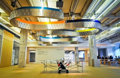 [5]
[5]A metal ‘ribbon’ serves as a coat rack that can be raised or lowered when needed. A painted metal strip was mounted onto it to identify different sections with colours and numbers.
Finally, wall-mounted washroom signs used acrylic components for tactile features and braille characters. They were complemented by more subtle, oversized ‘man’ and ‘woman’ symbols applied to the drywall in vinyl form.
Digital flux
Information was organized and grouped according to its importance. As is often the case in museums, the AGO’s programs are constantly in flux, with spaces frequently reorganized and reassigned for new purposes. Keeping the sign system correspondingly flexible and expandable, in the end, meant some information did not even need to be displayed on wayfinding signs, but instead could be made available via digital signage, with information screens displaying schedules and other dynamic content in portrait mode.
Another digital display was integrated into the WFLC’s main outside-facing sign. It comprises three horizontal LCDs with thin bezels in between them and advertises the facility with footage showing children engaged in hands-on artistic experiences.
Overall, however, everyone involved in the project wanted to keep digital signage to a minimum, so as to avoid letting dynamic content distract students from those hands-on activities.
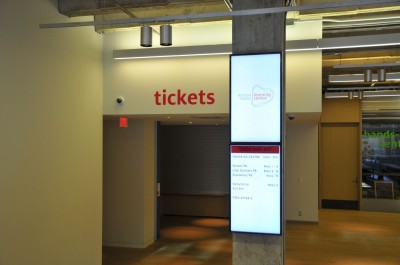 [6]
[6]Digital signs are used to display schedules and other dynamic content.
Coming together
Most of the signage elements were manufactured by WSI Sign Systems in nearby Bolton, Ont., which also installed them in July and August of 2011. The WFLC opened shortly thereafter, in October. The only exceptions were the custom-designed distraction markers, which were instead fabricated and installed by Marvel Sign & Display, based in Vaughan, Ont.
“I just want to say how elegant the design is and, above all, how beautifully visible it is,” said one associate at the AGO Design Studio.
As it turned out, that same month, Entro Communications announced it had acquired G+A. Most of G+A’s associates moved over to the newly combined company, Entro G+A, which ensured continuity for both the AGO and HPA as the WFLC project reached completion.
At press time, a main donor recognition wall is still being planned, pending fundraising updates. It may be completed and installed by the end of January 2013.
Udo Schliemann is principal creative director at Entro G+A, a design firm specializing in branding, EGD and wayfinding systems. He worked on the WFLC project with Tobias Mikl, Darren Rodenkirchen, Ian White and Emese Unger. For more information, visit www.entro.com[7].
- [Image]: http://www.signmedia.ca/wp-content/uploads/2014/02/101_GDQ7309-1.jpg
- [Image]: http://www.signmedia.ca/wp-content/uploads/2014/02/Entrance-screen.jpg
- [Image]: http://www.signmedia.ca/wp-content/uploads/2014/02/GDQ7341-1.jpg
- [Image]: http://www.signmedia.ca/wp-content/uploads/2014/02/GDQ7295.jpg
- [Image]: http://www.signmedia.ca/wp-content/uploads/2014/02/GDQ7416-1.jpg
- [Image]: http://www.signmedia.ca/wp-content/uploads/2014/02/GDQ7328.jpg
- www.entro.com: http://www.entro.com
Source URL: https://www.signmedia.ca/brightening-up-the-ago/