Channel Letters: Common signage configurations
by all | 19 June 2017 9:45 am
 [1]
[1]Photos courtesy Direct Sign Wholesale
By John Baylis
As channel letters are highly customized signage products, specifying their design can become an information-intensive process. While it is impossible to address and prepare for all potential developments, it can be helpful for sign shops to refer to a ‘fast-track’ guide to some of the most common options and configurations, as follows.
Front-lit
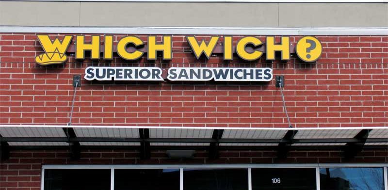
One of the most important variables for front-lit letters is their colour combination. Some retailers, by way of example, are not aware of the three separate colour elements of a front-lit channel letter: the acrylic face, the return—with a standard depth of 76 or 127 mm (3 or 5 in.)—and the trim cap. The specific combination of these three elements can significantly affect the overall effectiveness of a letter set.
The colour selection and combination should be based not only on the original branding, artwork and design, but also on the colour and material of the mounting location (e.g. the building façade). Indeed, a common mistake among clients is to commission the production and installation of channel letters in their basic branding colours without regard for the site’s characteristics; this can easily lead to poor sign visibility, with too little background contrast (see Figure 1).
Vinyl-faced
While many channel letters feature basic acrylic faces, vinyl offers another option, with the capability to completely change the appearance of a front-lit letter set.
For one thing, vinyl is available in many hues outside the standard acrylic colour selection. For another, vinyl can also be used to outline a letter within the face, using either a border or ‘reveal’ configuration, which can help ensure excellent legibility at night in comparison to a ‘full cover’ configuration (see Figures 2 and 3).
Day/night vinyl
So-called ‘day/night’ perforated vinyl is an innovative technology for channel letters, providing a method for changing the colour of a front-lit face when it is illuminated. As the name suggests, it allows the letter faces to exhibit one colour for daytime and another for nighttime.
As shown in Figures 4 and 5, perforated vinyl can thus solve the common contrast problem where the colour of a letter face may be optimal by day, but much less visible at night.
 [2]
[2] [3]
[3] [4]
[4] [5]
[5] [6]
[6]


Halo-lit
Reverse or ‘halo-lit’ channel letters are fabricated entirely of aluminum, with no acrylic involved. One advantage of this configuration is the aluminum can be painted in any colour to match the client’s branding and/or to optimize the sign’s daytime visibility.
There are some common misconceptions about reverse channel letters. Some people, for example, mistakenly assume white is the only possible colour for halo illumination, as in Figure 6. On the contrary, reverse lighting can be provided effectively in many different colours. Indeed, depending on the installation environment, a halo colour other than white can be helpful in attracting more attention to the sign. Figures 7 and 8 feature examples of this effect.
Reflective backer panels
Reverse channel letters are often mounted directly to a building façade, which can be appropriate in many situations, but can also be detrimental in others; these are cases where reflective backer panels can be useful additions.
For a sign mounted directly to a façade, both the colour and the texture of that façade can influence the halo lighting’s appearance. If white light-emitting diodes (LEDs) are used to halo-light letters on a red brick wall, for instance, the halo itself may take on a somewhat reddish tinge at night.
A backer panel is simply a formed aluminum sheet, painted in any colour, in front of which the reverse channel letters are mounted. The reflective nature of the panel takes fuller advantage of the lighting by amplifying it in the direction of the viewer, while also creating a smoother, more even, clearer and ultimately more visually compelling sign (see Figures 9 and 10).
Logo boxes
The addition of a logo box is another way to help make a channel letter set more visually conspicuous.
A logo box is essentially a contoured channel letter. In some cases, its shape is sufficient to communicate a certain message (see Figure 11). In others, the application of either coloured vinyl or a digitally printed graphic is also necessary.
In this context, vinyl is primarily used for simple colour changes, with signs where no more than three additional face colours are needed (see Figure 12). Digitally printed graphics are generally preferable in other cases where the logo box image requires more than three colours (see Figure 13).
Cost is another factor to consider with these situations. When basic vinyl is used, each of the desired face colours requires its own ‘drop’—i.e. manual placement—of vinyl onto the logo box. A full-colour digital print, by comparison, requires only one drop, as the entire image is a single piece of translucent film with an ultraviolet-resistant (UV-resistant) laminate coating.
So, when a design involves multiple colours or gradients, a digital print is typically the simplest and least expensive option.
 [7]
[7] [8]
[8] [9]
[9] [10]
[10] [11]
[11] [12]
[12] [13]
[13] [14]
[14]


Material grades
Outdoor channel letters are continually exposed to direct sunlight and harsh weather. This exposure can have a significant impact on the effectiveness of a sign over time, particularly if the sign uses poor material grades.
Low-quality acrylic has a tendency to fade in colour, which can lead to an unsightly appearance in terms of accurately reflecting the client’s brand (see Figure 14). Instead, 4.8-mm (0.19-in.) thick colourfast acrylic is recommended, as it will help prevent damage from sunlight and other environmental factors, ensuring a bright, vibrant appearance for a longer term.
Further, some colours of acrylic and vinyl can be illuminated more effectively than others. Dark blue and dark green, for example, are generally not good colour choices for a channel letter face, as they can absorb much of the light, rather than emitting it (see Figures 15 and 16). Blue light also tends to focus just in front of the viewer’s retina, causing an undesirable halo to appear around the sign, such that legibility is reduced.
Heights and strokes
Some clients are not aware standard channel letters have specific minimum and maximum heights and stroke widths. Letter sizes outside these parameters are sometimes possible, but will often require customized fabrication.
A common minimum channel letter height is 203 mm (8 in.), while a corresponding minimum stroke width is typically 38 mm (1.5 in.). Letters that are shorter than 208 mm tend to have channels so tight, the LED modules cannot be properly installed inside. It is therefore important for sign shops to watch out for customer orders specifying a letter height less than 203 mm, as many wholesale channel letter producers will not build to that specification.
At the other end of the spectrum, channel letters can only be made so tall before they need custom structural reinforcement work. A good rule of thumb is any letters taller than 1.8 m (72 in.) will need to be custom-reinforced and are not considered standard channel letters.
 [15]
[15] [16]
[16] [17]
[17]


John Baylis is marketing director for Direct Sign Wholesale, a channel letter vendor. For more information, contact him via e-mail at jb@directsignwholesale.com[18].
- [Image]: https://www.signmedia.ca/wp-content/uploads/2017/06/Which-Wich-003-e1497623637478.jpg
- [Image]: https://www.signmedia.ca/wp-content/uploads/2017/05/Goodwill-Ronkonkoma-donation-xpress-channel-letters.jpg
- [Image]: https://www.signmedia.ca/wp-content/uploads/2017/05/Vinylconfigs.jpg
- [Image]: https://www.signmedia.ca/wp-content/uploads/2017/05/Letter-A.jpg
- [Image]: https://www.signmedia.ca/wp-content/uploads/2017/05/IMG_7679.jpg
- [Image]: https://www.signmedia.ca/wp-content/uploads/2017/05/IMG_7690.jpg
- [Image]: https://www.signmedia.ca/wp-content/uploads/2017/05/European-Wax-Center-007.jpg
- [Image]: https://www.signmedia.ca/wp-content/uploads/2017/05/RucciSalon_2colourhaloreverselitletterset.jpg
- [Image]: https://www.signmedia.ca/wp-content/uploads/2017/05/ResidenceInn.jpg
- [Image]: https://www.signmedia.ca/wp-content/uploads/2017/05/IMG_7792.jpg
- [Image]: https://www.signmedia.ca/wp-content/uploads/2017/05/IMG_7717.jpg
- [Image]: https://www.signmedia.ca/wp-content/uploads/2017/05/MAPLE-BOX.jpg
- [Image]: https://www.signmedia.ca/wp-content/uploads/2017/05/IMG_7725.jpg
- [Image]: https://www.signmedia.ca/wp-content/uploads/2017/05/IMG_7704.jpg
- [Image]: https://www.signmedia.ca/wp-content/uploads/2017/05/Info-Guide-013.jpg
- [Image]: https://www.signmedia.ca/wp-content/uploads/2017/05/Great-Play.jpg
- [Image]: https://www.signmedia.ca/wp-content/uploads/2017/05/Impulse-Coffee.jpg
- jb@directsignwholesale.com: mailto:jb@directsignwholesale.com
Source URL: https://www.signmedia.ca/channel-letters-common-signage-configurations/