Channel Letters: Creating the key to celebrate Lock’s heritage
by | 10 September 2020 9:41 am
By Tristan Allan and Matt Rempel
 [1]
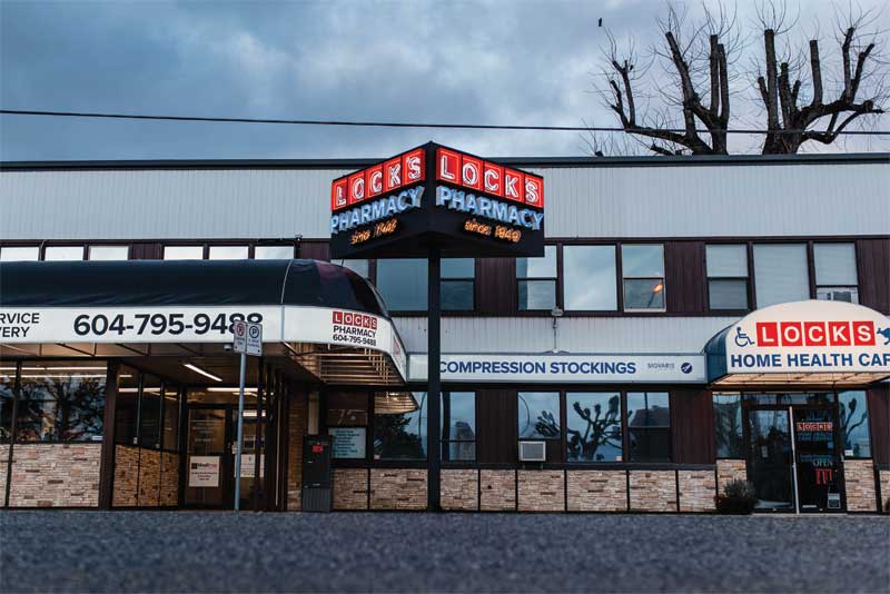
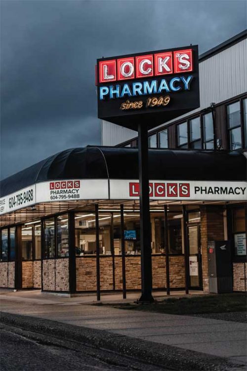
[1]To commemorate the history of the pharmacy and its status as a community institution, TDH fabricated a sign that incorporates the store’s founding year into the logo.
Success in business is never guaranteed. Offering something of value and building lasting trust with clients may sound simple in theory, but is not necessarily easy when put into practice.
Amidst the surge of industrial innovation, brutally competitive marketplaces, and the shifting uncertainty of economic climates, it takes something extraordinary to stand the test of time. Moreover, longevity in business is one of the true markers of success.
Coming up with a concept
When Lock’s Pharmacy, located in Chilliwack, B.C., was approaching its 70th anniversary, the owner, David Lock, decided to pay homage to the history of the pharmacy and its status as a community institution.
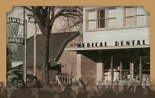
“My parents started this pharmacy in 1949, when the roads were dirt out front, and there was a barn next door,” recalls Lock. “I wanted to celebrate and honour them for building this drugstore by throwing a big community party, and by putting up a brand new sign.”
For many years, Lock Drugs, as it was known at the time, had a free-standing neon sign installed in front of the store—a stylized prescription bottle that made the store instantly recognizable.
The sign, although iconic for its time, had long since been lost to the development of the area. As a result, when Lock approached TDH Experiential Fabricators with some hand-sketched ideas for a new sign that was as visually striking as the original, the Surrey, B.C.-based sign shop immediately rose to the challenge and embarked on a creative journey to fabricate a product that could capture the history and nostalgia of the pharmacy.
The owner’s initial thought was to mount a three-dimensional sign to the parapet wall over the pharmacy’s entrance. However, after discussing the structural concerns as well as some bylaw limitations with TDH, Lock realized the solution was even better than what he had hoped for. The sign team proposed a free-standing pylon sign rising above the canopy—visible from 180 degrees—with a unique wedge-shaped design and, of course, neon.
 [2]
[2]For many years, Lock Drugs, as it was known at the time, had a free-standing neon sign installed in front of the store—a stylized prescription bottle that made the store instantly recognizable.
Overcoming one challenge at a time
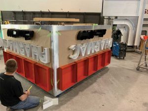
Building a structurally sound sign full of neon, mounted on a single 203- x 203-mm (8- x 8-in.) wide post, was definitely not an easy task.
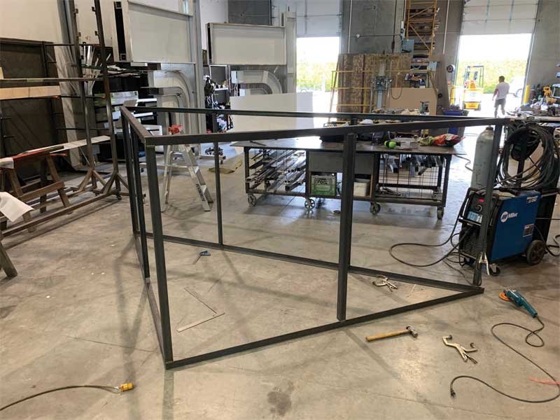
The team started by creating the frame from a 51- x 51-mm (2- x 2-in.) steel angle to provide a rigid structure, with added cross bracing. Central to the build was a slip-tube system to support the sign—a steel tube centred inside the structure that also matched the post to which it would be mounted. Further, a steel plate was welded to the post, which ensured the sign could be installed on-site at the correct height.
Next, a work platform was constructed inside the sign to stand on should a repair to internal components ever be required. Individual shelves were also built for each of the seven neon transformers to keep the wiring organized.
TDH’s lead fabricators patiently worked through the layout, one item at a time, until the wiring and attachments were secure, and the internal elements were concealed.
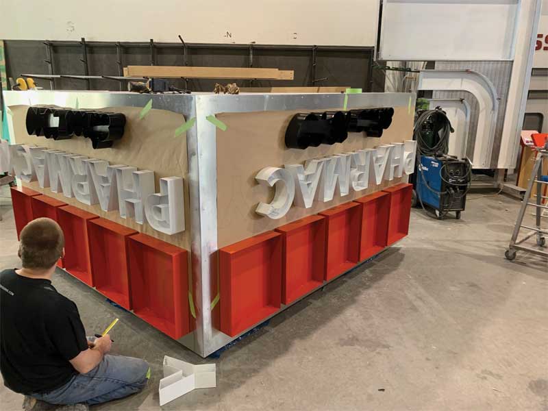
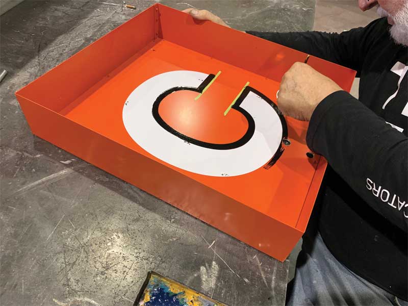
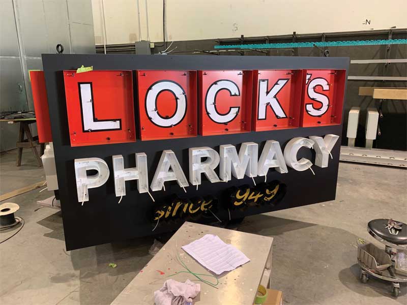
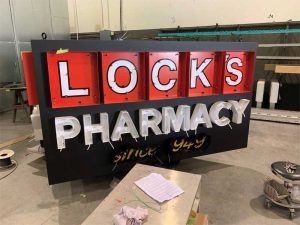
For the sign faces, 72-mm (3-in.) deep open channel logo squares were painted red and installed with matching trim cap retainers and clear acrylic faces to protect against any vandalism. The letters in the logo squares were hand painted white with a black keyline for additional contrast against the red. The keyline and paint together provided increased definition to the letters against the 12-mm (0.5-in.) designer white neon tubes. The look was completed with similar-sized ruby red neon borders to mimic Lock’s logo.
The lettering for ‘Pharmacy’ was created with hand-bent 76.2-mm (3-in.) deep open channel letters, each 254 mm (10 in.) tall. The letters—this time painted white and installed with matching trim caps and clear acrylic faces—were contrasted with 12-mm (0.5-in.) horizon blue neon.
For the last set of letters, which read ‘since 1949,’ 72-mm (3-in.) deep open channel letters were hand painted yellow and finished with 10-mm (0.4-in.) gold neon.
Fits like a glove
The finished sign was installed on a custom-engineered concrete base with an internal rebar support cage. Next, the steel tube support post was installed, with the baseplate anchored to the concrete. Finally, the triangular sign was lifted into place with a crane truck. The whole process took more than an hour. Once all the elements slid into their proper place, the power was connected and the neon came to life, displaying ‘Lock’s Pharmacy since 1949.’
Despite several challenges, including four months of design, securing permits, fabrication, and installation, the TDH team was successful in crafting an eye-catching sign that represents the long history of a business with a bright future in Chilliwack.
Tristan Allan is the owner of TDH Experiential Fabricators, an architectural signage, display, and industrial art fabrication company based in Surrey, B.C. Allan leads a talented team of designers and fabricators to create stunning signs, displays, and industrial art. He can be reached via email at tristan@tdhsigns.com[3]. For more information on TDH, follow the company on Instagram @tdhxfab[4].
Matt Rempel has been with TDH Experiential Fabricators since 2015. Starting as an install assistant before transitioning to sales lead in 2016, Rempel enjoys the diversity in custom signs, and values the contribution a great sign can make to his clients’ projects. He can be reached via email at matt@tdhsigns.com[5]. For more information on TDH, visit www.tdhsigns.com[6].
- [Image]: https://www.signmedia.ca/wp-content/uploads/2020/09/TDH-LOCKS-1029.jpg
- [Image]: https://www.signmedia.ca/wp-content/uploads/2020/09/LocksPharm_ThankYou20.jpg
- tristan@tdhsigns.com: mailto:tristan@tdhsigns.com
- @tdhxfab: https://www.instagram.com/tdhxfab/?hl=en
- matt@tdhsigns.com: mailto:matt@tdhsigns.com
- www.tdhsigns.com: https://tdhsigns.com/
Source URL: https://www.signmedia.ca/channel-letters-creating-the-key-to-celebrate-locks-heritage/
