
Channel Letters: Designing for LED illumination
By Tim Bauer
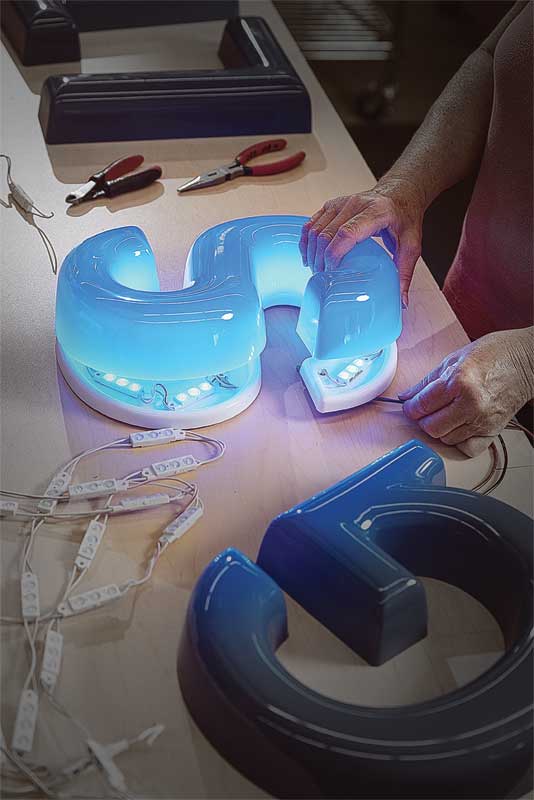
Sign designers and specifiers now have more ways than ever to add dramatic lighting effects to their creations. Gone are the days where illuminated signs had to be produced with metal cans at least 127 mm (5 in.) deep to allow sufficient space for high-voltage neon lighting and wiring. With today’s widespread availability of light-emitting diodes (LEDs), the landscape for channel letters has been revolutionized. Much shallower designs are now possible, down to 38 mm (1.5 in.) deep for face-lit letters and less than 25 mm (1 in.) deep for halo-lit letters, in a variety of metal or plastic materials.
Visual context
When designing an illuminated sign, there are a number of factors to consider and evaluate throughout the process.
For one thing, there should be a full review of the planned installation site. There may be local factors, such as space restrictions or existing lighting in the surrounding area, that could negatively impact the visibility of the sign.
The context of the installation site will also determine whether the sign will be viewed up close or from a distance. The channel letters will need to be sized and spaced properly to ensure they are easily readable. To further increase legibility, the colour of the mounting surface should be contrasted strongly with the colours of the letters.
Another factor is how much of the sign will be directly illuminated. Some letters might be face-lit while others are halo-lit, for example, or perhaps only specific areas will need to be lit at all.
All of these considerations will help identify the optimal materials to use for the sign and how best to illuminate it, with which types and colours of LEDs.
Materials and finishes
Illuminated sign faces can be specified with translucent materials in any desired colour or with so-called ‘day/night’ acrylic, which—as the term suggests—allows channel letters to showcase one colour by day and another by night. For more detailed designs, sign faces can be printed with special translucent inks, applied with vinyl or coated with translucent paints for illuminated portions and opaque paints or vinyl for unlit portions.
For a halo-lit design, the faces can be nearly any type of metal or pigmented plastic finish. They can also be printed, applied with vinyl or painted in any combination of colours.
With this freedom, the designer’s primary focus should be identifying which colour, finish and illumination will work best for the sign, given the surrounding visual context, to achieve the desired look.
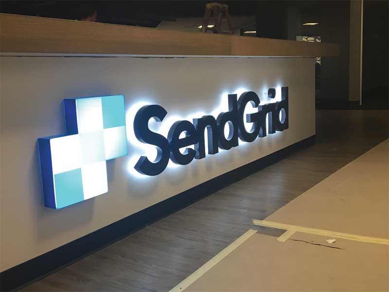
Halo-lighting considerations
If the surface of an installation site for halo-lit letters is dark and glossy, it will absorb light and create a mirror effect with the LEDs. A matte sheen with proper colour contrast, on the other hand, can support a stronger halo effect.
Another question is how far the letters should stand off of the surface. The closer they are to the wall behind them, the less lighting will be emitted around the perimeter of the letters, thus limiting the intended effect.
The best halo illumination effect is produced with a letter-to-wall distance of about 38 mm (1.5 in.), i.e. the minimum depth for a face-lit sign, but the designer will need to decide just how wide and bright an illuminated outline is desired around each letter or other visual component and around the sign as a whole. The spacing between the letters may need to be adjusted, for example, to prevent the appearance of the letters ‘blending’ when lit.
Sign up for our newsletter
Featuring breaking news from Canada's sign and graphics industry.


Read the Latest Issue
