
Photo by Peter Saunders
By Sal Passanisi
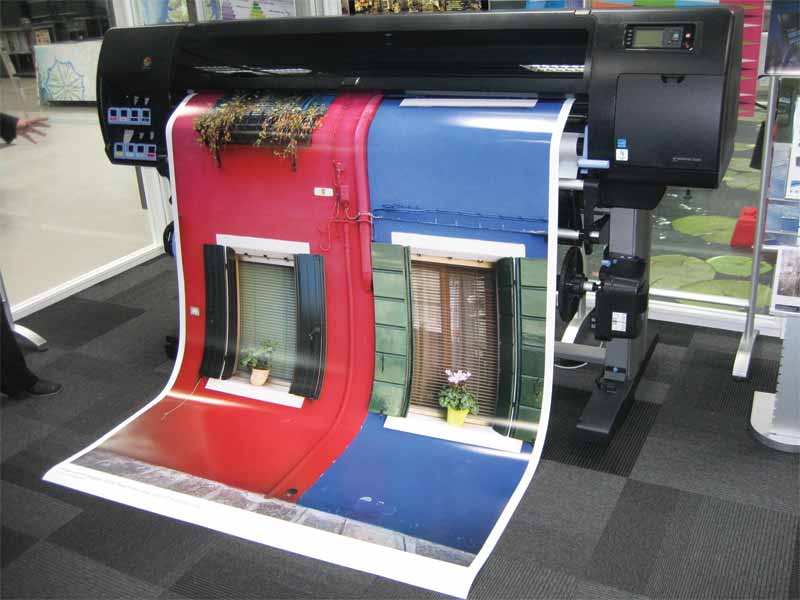
The short runs—and even shorter lead times—of today’s wide-format printing market can pose quality challenges for the sign and display graphics industry. To meet these challenges without compromise, sign shops’ operations must evolve to support a completely colour-managed workflow, from raster image processor (RIP) software to digital inkjet printer to roll or rigid media.
Fortunately, achieving this goal is easier now than ever for both sign shops and commercial printing companies. The following are some of the insights they have gained from this experience over the past several years.
Begin at the beginning
Where possible, sign shops should ensure all of their image capture and display devices, including cameras and monitors, are correctly colour-profiled and calibrated, so as to ensure the printed cyan, magenta, yellow and key/black (CMYK) graphics match the originally captured and displayed colours as closely as possible. There are numerous tools available today for developing and implementing International Color Consortium (ICC) profiles and for calibrating devices.
Colour matching can be a weak link in the workflow process because many companies are still using colour profiles from offset printing, which follow offset plate curve principles. Today’s digital printers—from small-format inkjet proofers to grand-format presses—can achieve a much wider colour gamut than offset and flexographic printers and, thus, can achieve results that were previously constricted by technology.
It is particularly important to optimize the calibration of computer monitors, so what is seen on the screen reflects exactly how the output will appear when digitally printed with CMYK inks. By getting the right colour profiles in place from the start and implementing a quality control program, signmakers can minimize the need for additional work ‘down the line.’
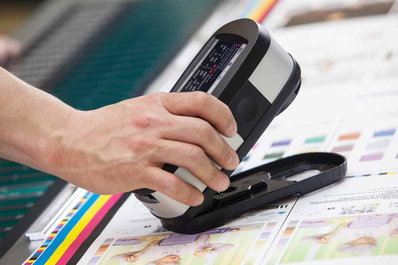
Designers can measure colours with a visualization tool before using software to match them in printed graphics.
Photo courtesy X-Rite Pantone
Consider the substrates
A trade show booth is an excellent example of the complexity involved in today’s sign and graphics production environments, as it may involve the inkjet printing of graphics on a wide variety of substrates, from polyvinyl chloride (PVC) and other plastics for rigid components to paper and textiles for flexible signage. The white point of each base substrate can significantly affect the appearance of the printed output, so it is extremely important to take each material into account when developing and communicating colour specifications for a given project.
The most obvious examples where issues can arise are substrates that carry their own non-white base colour, such as brown kraft paper. Even backlit graphic substrates, however, may have varying white points.
Experts recommend establishing a digital master standard, assigning a spectral value for each colour. From there, other dependent standards can be created that reflect the spectral value differences for each given substrate. This way, sign shops can come as close to achieving the master standard as possible when targeting colours for various materials.
By taking each substrate into consideration during the graphic design and specification process, all colours can be aligned for an entire trade show booth, whether they are individually intended for digitally printed vinyl graphics, soft signage or even accompanying brochures.


