
Today’s digital printers can achieve a much wider colour gamut than the offset and flexographic printers that preceded them.
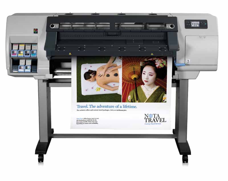
Photo courtesy HP Canada
A digital workflow
Beginning right at the design phase, a digital workflow has become preferable in today’s industry. While graphic designers love to not only see their work, but also touch and feel it, and there is still a need for physical standards in terms of colour guides, digital tools have become increasingly capable of allowing users to select colours and visualize them as they will appear on target substrates.
A designer can now measure a colour with a visualization tool before using a software plug-in like Adobe Illustrator’s to pull that colour into a graphic and finding the closest match for the intended substrate, all without having to wait for physical samples to be produced to see how far off-target the printed colours could be. Some visualization tools, for example, create a ‘soft proof’ that allows designers to check colours accurately on-screen. They even simulate the dot gain of the final printing process.
Designers also appreciate the opportunity to choose and add spot colours to their graphics, but they should be able to do so in a context that allows them to easily see (a) whether or not and, if so, (b) how those spot colours can be reproduced with CMYK inks on the substrate. The inks used in digital wide-format printers have a much higher pigment load than those used in offset or flexographic printing and, therefore, can achieve a higher percentage of colour matches.
Regardless of which model of printer will be used, everyone involved in the workflow should be able to know the optimal CMYK breakdown of
a spot colour for a specific substrate.
Ensuring print perfection
If all of the devices have been colour-profiled and calibrated accurately beforehand, then the design, pre-press and pre-media steps will all go more smoothly. This is important because today’s compressed production cycles do not allow for the production of numerous proofs, for samples to go back and forth with the client, for long setup times at the printer and then for the testing of materials to get tricky brand colours right.
Instead, today’s inkjet printers offer digital front ends (DFEs) with ICC colour profiles. In most cases, these profiles can be fine-tuned within the RIP software for the production environment with the specific ink set and substrate in mind.
A standard set of master parameters will minimize the need for corrections and reduce errors, as well as save time and money. By using the appropriate tools and techniques at the beginning to ensure files are optimized for printing, a sign shop can implement an entire ‘RIP-to-roll’ production workflow, increasing its throughput and improving its profitability.
Measuring before managing
As business management consultant Peter F. Drucker famously put it, “you can’t manage what you don’t measure.” Instruments for colour measurement are critically important parts of a colour management workflow.
Using a properly calibrated spectrophotometer at various steps, from design through pre-press and production, will help ensure colour standards are being communicated and the desired results are achieved. And if multiple spectrophotometers are being used across the production environment or throughout the supply chain, then additional tools should be used to ensure they are aligned with each other.
That said, even when one user measures a colour via spectrophotometer and finds it within tolerance, while another does the same elsewhere, the results may still fall far apart within the colour spaces; this difference is known as Delta E. Visual evaluation alone can be even more subjective.
This is why the common practice is not necessarily the best practice when it comes to colour accuracy. Instead of producing a new, physical sample to work with at each step of the workflow, it is preferable to provide access to the original colour data—whether a master or dependent standard—to be measured against.
A digital workflow makes this possible, whereby the exact colour specified by the designer can be accessed and used at each stage of production, from proofing to printing. This is the best possible approach for improving colour consistency all the way down the line, for everything from trade show booths to packages on retail shelves.
This technique also offers simplicity and efficiency when tackling a complicated colour management project. By way of example, it was used in 2016 with wide-format graphics for the U.S. College Football Playoffs, which were produced using a broad variety of printing technologies and substrates. As everyone involved was able to work from the same set of master standards, they could quickly determine which colour effects could or could not be achieved. This was important because there would be very little time to specify colours based on the outcomes of the games along the way.


