
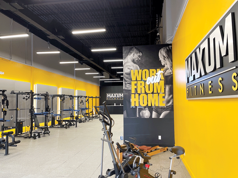
The goal for this point-of-purchase (POP) display at Maxum Fitness was to create a sleek environment which allowed the product to shine alongside the brand. Photos courtesy DNS Industries
By Jay Dover
The retail landscape is always evolving, and we are in some exciting times when it comes to showcasing brands and their products. In the post-COVID era, retailers and manufacturers have continued to pursue many creative ideas that came to fruition from the inability to connect in a physical space. With the adoption of growing technology, and the blending of online and offline experiences, the opportunity for in-person connection is narrowing. As such, brands are compelled to make a lasting impression at first sight.
Whether it is making statements with experiential events and pop-up shops or designing mixed-use spaces that connote a lifestyle associated with a brand, the lines have begun to blur when it comes to defining retail. Even large, big-box retailers are experimenting with these small-store market concepts.
With all of this competing messaging vying for consumer attention, one important question comes to mind. How do brands stand apart from the crowd in a more traditional retail environment?
It is a real challenge for manufacturers and brand owners to convey product and brand experience, while ensuring their voice is louder than their competitors.
By using point-of-purchase (POP) and display fixtures to create micro-environments, brands can go beyond their packaging to create a true extension and authentic connection to the product, while sustaining visibility and relevance to the consumer. Defining this type of visual space is one way savvy brands can stand out amongst their competition.
Cannabis retail
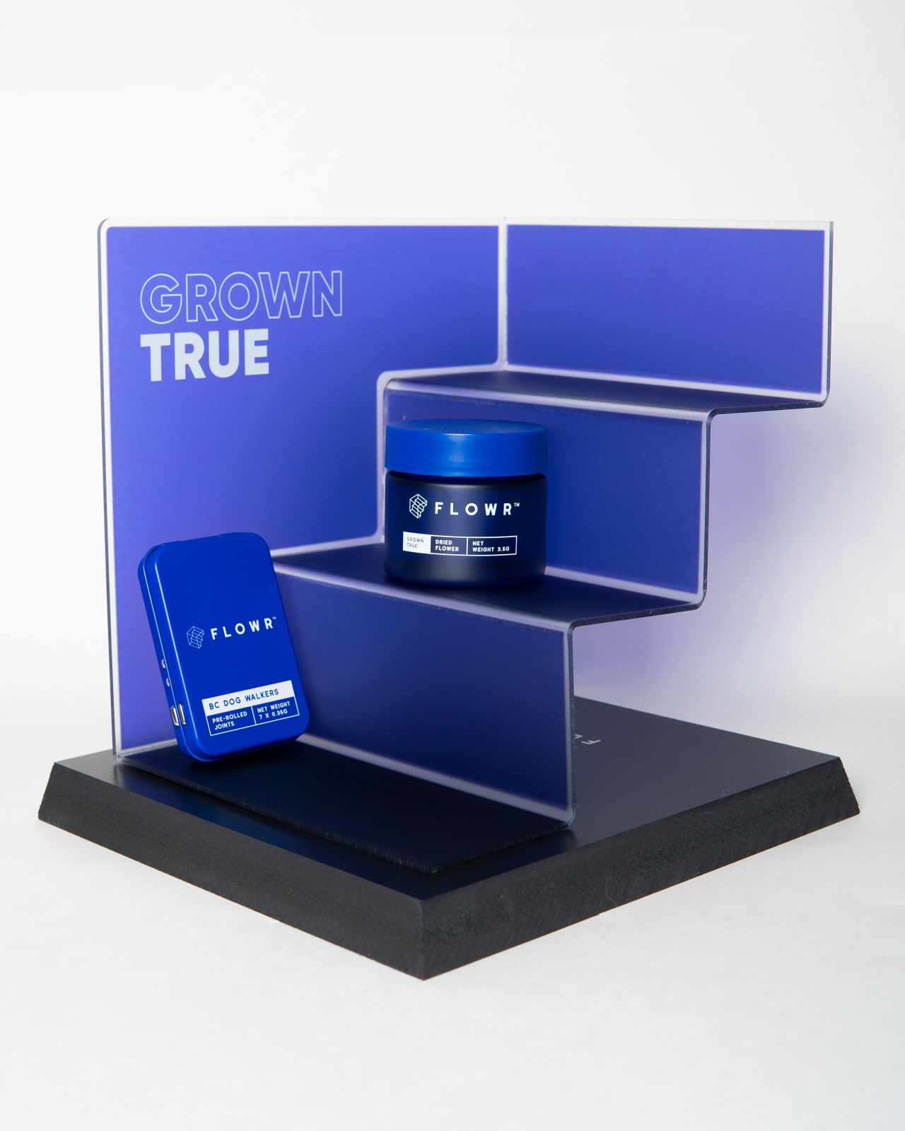
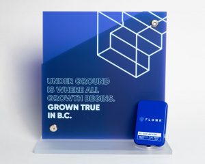
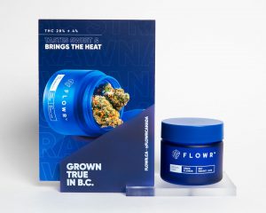
Cannabis company FLOWR sought a POP display with a luxury finish and a homogenous colour connection to the brand packaging, which allowed the product to be an extension of its holder.
With the legalization of cannabis in Canada, many independent and large-group retailers have begun to pop up across the country. The market is expected to continue its growth in the coming years, as legislation expands.
In the current cannabis retail climate, consumers already have a variety of products to choose from at their local stores. However, for today’s innovators looking to stand apart from the crowd, a thoughtfully designed, well-executed fixture and signage may be the final tipping point in the purchase decision process. Below are two examples of companies DNS Industries (DNS) has worked with to develop cannabis retail fixtures that create a micro-environment which is true to each brand, using simple execution and luxury, tactile finishes.
FLOWR
Cannabis company FLOWR, based in Kelowna, B.C., approached us with a solution that could work in any environment, while showcasing its branding and conveying the superior quality of its products.
The company had a very specific vision: a luxury finish with homogenous colour connection to the brand packaging, allowing the product to be a true extension of its holder. Of course, our team was up to the challenge. We worked with FLOWR to refine their existing design and make it production ready.
Fixtures and signage should be an expansion of the larger brand experience. When designing or producing these components, we look to the brand itself to ensure an authentic connection to the product featured in the display. With many players now in the Canadian cannabis market, there is an exciting opportunity for brands looking to differentiate themselves and capture the attention of consumers. The pieces included in this project work well individually, making a maximum impact with a minimum footprint.
To achieve a high-end finish, we used a dual-print process: printing on the second surface to capture the background colour, while allowing the crisp, white text with the brand’s messaging to stand out alongside the product.
A clean-line acrylic was the medium of choice to achieve a clean, high-touch look and feel that works as a stand-alone showcase for the product amongst the many competing cannabis brands.


