
Specifying a system
McClinton worked with QHC throughout much of 2011 to design the new signage. The most important guidelines were for the system to orient, direct and identify.
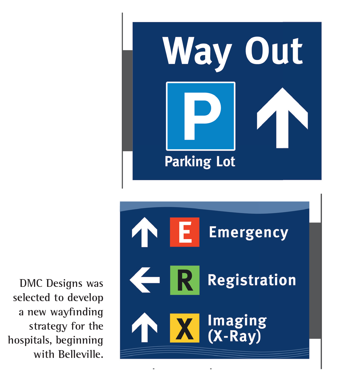
As soon as visitors arrived, they would be oriented through the display of an easy-to-understand schematic layout of the facility and its wings. This would be accompanied by simple, structured and logical terminology to direct them further, with large, bold, high-contrast graphics to aid in legibility and comprehension. Destinations were also identified clearly when visitors got to them. And lastly, it was important to make it easy for them to find their way back out of the facility to the same points where they parked and entered.
 “I developed the designs, wrote the specifications and went through a testing phase with QHC, choosing the colours and overall scheme for the system,” says McClinton. “They had already developed a new corporate identity, but not yet implemented it in signage at these sites. They decided Belleville would be the test bed.”
He helped QHS develop a hierarchy of primary, secondary and tertiary destinations within Belleville General Hospital. They identified the patient registration desk, the emergency room (ER) and the X-ray/imaging zone as the most important areas.
The three primary destinations would be isolated on projecting wall signs and given the highest ‘value’ by using primary colours and pictograms of sorts, marking them as R, E and X, respectively. These were followed by a breakdown of group information according to various floors and wings.
The signs had to be identifiable in a busy and sometimes cluttered environment, using strong colours that were also harmonious with QHC’s new corporate identify. Meta Bold was selected for the font, as it was considered very clean and legible, meeting standards for stroke width and height.
Only patient and visitor services would be displayed, with employee services removed to keep the signs less cluttered. It was also important to use common, everyday language on the signs, rather than Latin-based medical terminology.
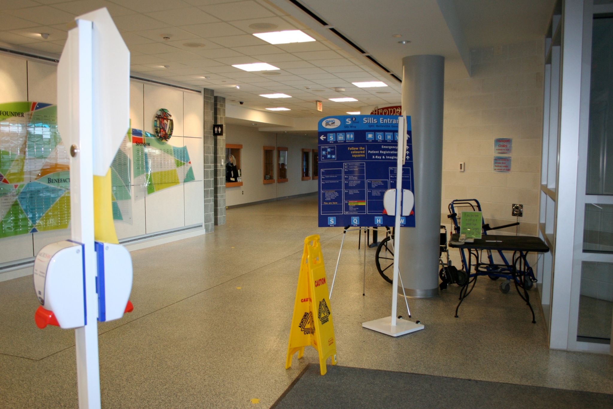
Temporary signs were produced and installed throughout Belleville General Hospital for several months of testing. Feedback was collected from both employees and visitors.
Further, because services would continue to be shifted frequently within the hospital, it was considered necessary for the interior sign system to be modular, supporting digitally printed updates.
“The use of a modular system with low-cost prints was a big factor, because they’re constantly moving departments,” says McClinton. “They used to have fixed signs, with vinyl letters on plastic boards. Every time these were changed, it ruined the wall, which then had to be replastered and repainted. So, they were looking for a more flexible system. And eventually, they plan to purchase a digital printer and maintain the signs themselves.”
QHC ended up using Vista System International’s modular curved frame technology (MCFT) products, along with digitally printed inserts that are laminated for durability and easy cleaning.
An initial series of disposable signs were chosen, printed and installed on-site for several months to test the effectiveness of their design. Both employees and visitors provided comments and insight that influenced the final versions.
“Digital printing is so good today, the temporary models looked almost identical to the final product,” says McClinton. “By checking with managers, employees and visitors across different demographics, we learned more about how to address message sizes, contrast levels and glare issues.”


