Developing Quinte Health Care’s new signs
by Matthew | 20 February 2012 11:24 am
 [1]
[1]Images courtesy DMC Designs
By Peter Saunders
Quinte Health Care (QHC), which manages four hospitals in Eastern Ontario, recently developed a strategy to renew its facilities with improved indoor and outdoor signage. This ongoing project is seen as an opportunity both to improve wayfinding for each hospital and to unify all of them under the QHC banner.
The organization runs Belleville General Hospital, Trenton Memorial Hospital, Prince Edward County Memorial Hospital and North Hastings Hospital. Together, these facilities employ approximately 1,600 staff and 280 physicians, serving up to 255 inpatients at a time and more than 300,000 outpatients every year. They house emergency departments, operating rooms, ambulatory care clinics, a daytime rehabilitation facility, a children’s treatment centre, mental-health programs and a range of diagnostic services.
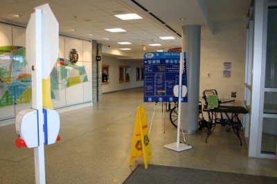
Belleville’s is the largest of the sites and presented a particularly immediate concern, as visitors were confused and many temporary signs had been posted during various department moves and continuous renovations.
“There have been a lot of changes at Belleville over the years, but we haven’t updated our wayfinding signs and people are often getting lost,” community relations director Susan Rowe told The Intelligencer before the project began. “A lot of people coming to the hospital are elderly or have mobility issues. We want to make their experience as comfortable and easy as possible.”
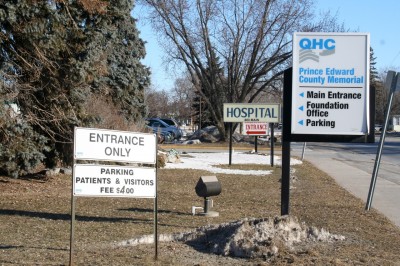 [2]
[2]Quinte Health Care manages four hospitals in Eastern Ontario, all of which will be renewed with improved outdoor and indoor signage.
Another issue was visitors could find themselves on the first, second or third floor upon arriving at the hospital, depending on which entrance they used.
So, QHC sought the advice of professional wayfinding consultants to help develop a new system. A request for service (RFS) for the public-tender project was posted in early 2011, calling for expert consideration of sign design, placement, colours and wording, particularly with accessibility in mind.
Selecting a strategy
Ottawa-based DMC Designs, which had experience with hospital wayfinding, was selected to help develop the new sign strategy.
“I had submitted the proposal myself and it went directly to QHC, whereas in most cases I have to work as a subcontractor to engineering and construction firms,” explains Daniel McClinton, DMC’s senior sign designer and wayfinding consultant. “They required lots of written theory.”
McClinton’s educational background was in industrial design. He began his career in the mid-1980s as a sign designer for the now-defunct Canadian Government Expositions Centre (CGEC) in Ottawa, where his responsibilities involved implementing the Federal Identity Program (FIP), including the Canada wordmark. This work gave him experience with the fundamentals of wayfinding and sign design.
 [3]
[3]At Belleville General Hospital, Quinte Health Care’s largest site, many temporary signs had been posted during various department moves and renovations, leading to confusion for visitors.
Indeed, the term ‘wayfinding’ was still somewhat in its infancy when McClinton worked with renowned graphic designer Paul Arthur’s team, collaborating on a new corporate identity for Canada Post within the FIP system. The writings of both Arthur and wayfinding researcher Romedi Passini helped McClinton develop a further awareness of the principles of effective wayfinding.
When he sent his proposal to QHC, he had recently worked with two major Ottawa health-care facilities: Élisabeth Bruyère Hospital and Saint-Vincent Hospital.
“I had heard about the QHC project in late 2010,” he says. “I sent along my proposal in early 2011 and, a week or two later, I was in.”
Specifying a system
McClinton worked with QHC throughout much of 2011 to design the new signage. The most important guidelines were for the system to orient, direct and identify.
As soon as visitors arrived, they would be oriented through the display of an easy-to-understand schematic layout of the facility and its wings. This would be accompanied by simple, structured and logical terminology to direct them further, with large, bold, high-contrast graphics to aid in legibility and comprehension. Destinations were also identified clearly when visitors got to them. And lastly, it was important to make it easy for them to find their way back out of the facility to the same points where they parked and entered.
 [4]“I developed the designs, wrote the specifications and went through a testing phase with QHC, choosing the colours and overall scheme for the system,” says McClinton. “They had already developed a new corporate identity, but not yet implemented it in signage at these sites. They decided Belleville would be the test bed.”
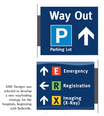
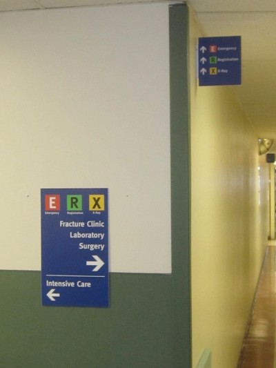
He helped QHS develop a hierarchy of primary, secondary and tertiary destinations within Belleville General Hospital. They identified the patient registration desk, the emergency room (ER) and the X-ray/imaging zone as the most important areas.
The three primary destinations would be isolated on projecting wall signs and given the highest ‘value’ by using primary colours and pictograms of sorts, marking them as R, E and X, respectively. These were followed by a breakdown of group information according to various floors and wings.
The signs had to be identifiable in a busy and sometimes cluttered environment, using strong colours that were also harmonious with QHC’s new corporate identify. Meta Bold was selected for the font, as it was considered very clean and legible, meeting standards for stroke width and height.
Only patient and visitor services would be displayed, with employee services removed to keep the signs less cluttered. It was also important to use common, everyday language on the signs, rather than Latin-based medical terminology.
 [5]
[5]Temporary signs were produced and installed throughout Belleville General Hospital for several months of testing. Feedback was collected from both employees and visitors.
Further, because services would continue to be shifted frequently within the hospital, it was considered necessary for the interior sign system to be modular, supporting digitally printed updates.
“The use of a modular system with low-cost prints was a big factor, because they’re constantly moving departments,” says McClinton. “They used to have fixed signs, with vinyl letters on plastic boards. Every time these were changed, it ruined the wall, which then had to be replastered and repainted. So, they were looking for a more flexible system. And eventually, they plan to purchase a digital printer and maintain the signs themselves.”
QHC ended up using Vista System International’s modular curved frame technology (MCFT) products, along with digitally printed inserts that are laminated for durability and easy cleaning.
An initial series of disposable signs were chosen, printed and installed on-site for several months to test the effectiveness of their design. Both employees and visitors provided comments and insight that influenced the final versions.
“Digital printing is so good today, the temporary models looked almost identical to the final product,” says McClinton. “By checking with managers, employees and visitors across different demographics, we learned more about how to address message sizes, contrast levels and glare issues.”
Turning designs into reality
The next step was to issue another tender, but this time for sign fabrication and installation. And in contrast with the earlier RFS, this time the signs were separated into interior and exterior categories.
“One of the important features of this tender was establishing a relationship between the fabricator and the client for the next three years, to provide signs for the other facilities as well,” says McClinton. “So, they had to be well-established.”
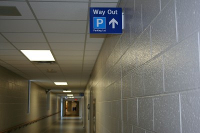
 [6]
[6]One of the wayfinding advantages of Belleville General Hospital is its layout of long, straight corridors, which enable visibility for several projecting signs in a row, helping to reassure visitors they are on the right path.
The winning proposals were from The Brothers Markle in Toronto to handle the exterior signs and Ottawa-based Hawley Signs & Graphics to provide the indoor components.
“I couldn’t fully detail the engineering of the illuminated exterior signs,” says McClinton, “so it was up to the Markles to come back with fully engineered drawings. There’s a lot of responsibility there, as they handle everything from the concrete foundations to making the electrical connections.”
The interior signs, meanwhile, will be printed by Hawley using McClinton’s files, scaled up to fit the Vista modules at the right proportions.
Future phases
At press time, the Markles were in the midst of producing and installing the exterior signs for Belleville, with Hawley’s interior signs to follow shortly. The next step will be to extend the sign concepts to Trenton, followed by Prince Edward County and finally North Hastings, the smallest of QHC’s hospitals.
“We’re in the testing phase for Trenton now,” says McClinton. “We’ll soon mount the digital prints onto foamboards and check how the information will be seen throughout the hospital, making sure it is legible in the proper locations.”
While the sign designs will be similar to Belleville’s, the layout will not, as it needs to take into account the hospital’s architecture.
“At Belleville, the corridors are long and straight, so you can see three or four projecting signs in a row,” McClinton explains. “Trenton is totally different, as you’re always turning corners, so it’s easy to lose a sense of where you came in and how to get back out. We can’t just transfer the same sign system there.”
With files from DMC Designs. For more information, contact Daniel McClinton via e-mail at rundmc@sympatico.ca[7].
- [Image]: http://www.signmedia.ca/wp-content/uploads/2014/02/testsignage2.jpg
- [Image]: http://www.signmedia.ca/wp-content/uploads/2014/02/before3.jpg
- [Image]: http://www.signmedia.ca/wp-content/uploads/2014/02/before4.jpg
- [Image]: http://www.signmedia.ca/wp-content/uploads/2012/02/SM_Feb_2012_HR-62.jpg
- [Image]: http://www.signmedia.ca/wp-content/uploads/2014/02/testsignage3.jpg
- [Image]: http://www.signmedia.ca/wp-content/uploads/2014/02/testsignage.jpg
- rundmc@sympatico.ca: mailto:%20rundmc@sympatico.ca
Source URL: https://www.signmedia.ca/developing-quinte-health-cares-new-signs/