Photos courtesy Ampco Grafix
By Jane Rogers
Wide-format graphic treatments are increasingly being worked into the architecture of interior spaces to enhance, divide or ‘theme’ a given area. This type of work can attract new and different clients who may not otherwise think of using a traditional sign shop’s services. Signmakers and customers alike stand to benefit by becoming more aware of the creative possibilities.
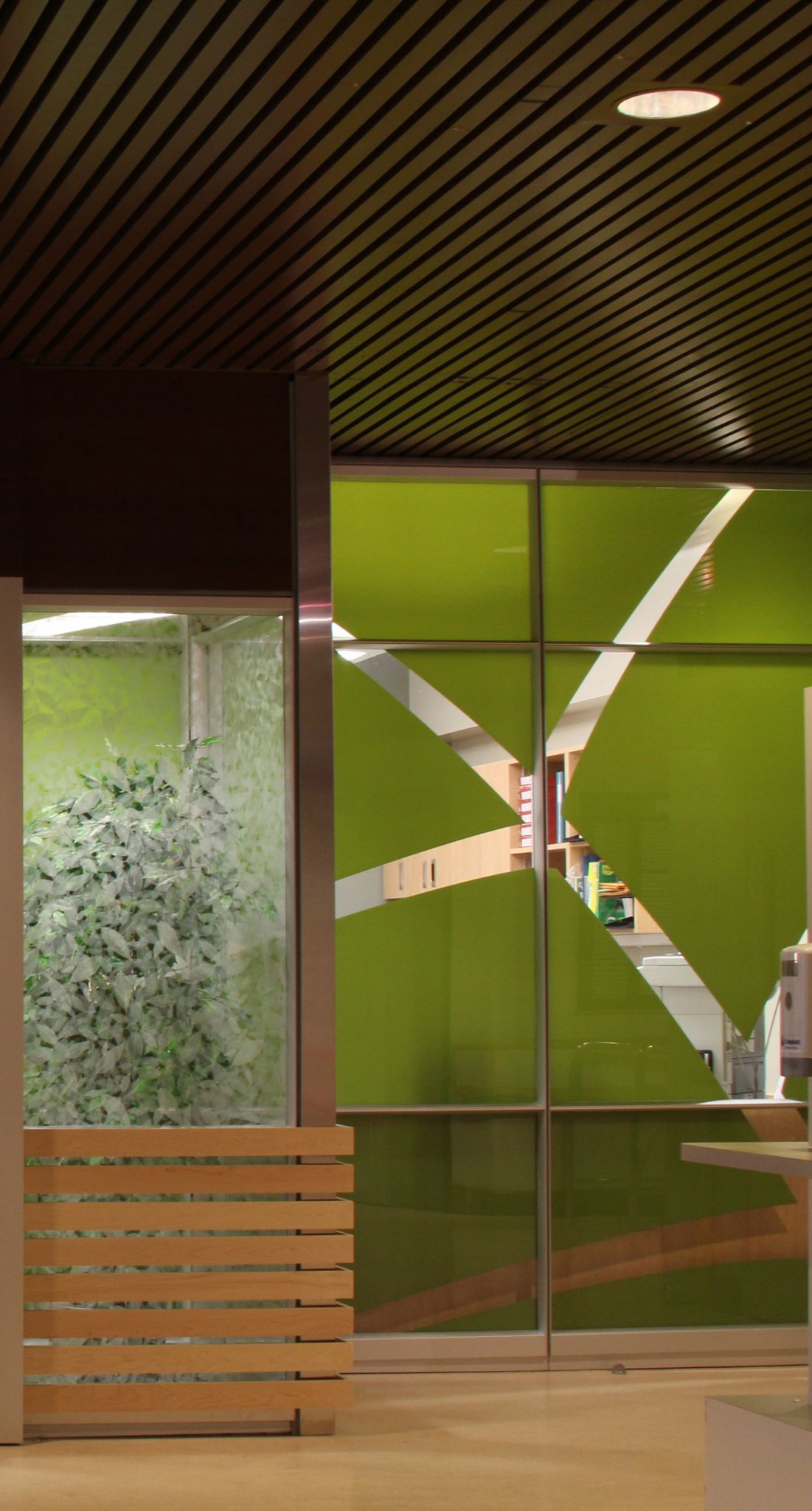
Beyond simple functionality, digitally printed graphic treatments for walls and windows have evolved to become key elements of interior design. Whether they are dividing a room by controlling the infiltration of light or theming a room with colourful images, wide-format printed graphics can not only establish what people see when they enter a space, but also how they feel within that environment.
Printed graphics and architectural-finish films have become particularly fashionable in open-concept corporate offices, where there may be no other physical definition of the distinction, for example, between an individual’s workspace and a meeting room. In such instances, a simple change of colour or style through window graphics can be used to signify the separation of different areas. A work zone, for instance, might use more neutrally coloured corporate graphics than a more social zone.
People feel better when they are in an esthetically pleasing setting, rather than surrounded by flat, featureless backgrounds. This is one reason for creating the right esthetics for a corporate space; another is branding, by theming a space to make it uniquely identifiable.
Indeed, the primary appeal of wide-format graphics for corporate clients is the opportunity to completely customize their environment. They can extend their commercial branding to all areas, from corporate interior offices to spaces where their products are showcased.
Common colours
Vancouver-based Stockhouse Publishing, which offers web-based investment management tools and related news, advice and market insight, is one of the companies to catch on to this trend. In 2012, a series of new wall and window treatments were integrated into the company’s offices, tied together with a common colour scheme.
The graphics were designed by Vancouver-based Fusion Projects, which specializes in construction and project management, and then printed and installed by Ampco Grafix, a wide-format graphics provider in nearby Coquitlam, B.C.
The project used dimensional lettering to clearly distinguish the entrance area. This added a level of style and sophistication to the space, with the letters applied to a background of Stockhouse’s Pantone branding colours.
Ampco Grafix produced the lettering with 12.7-mm (0.5-in.) thick Komacel rigid polyvinyl chloride (PVC), using a Vutek Ultra Vu II 150sc grand-format solvent-based inkjet printer. It was complemented by a reception wall and TV wall panel produced using white polymethyl methacrylate (PMMA), with the material continuing throughout the open office area to define it physically and to ensure a consistent brand identity.
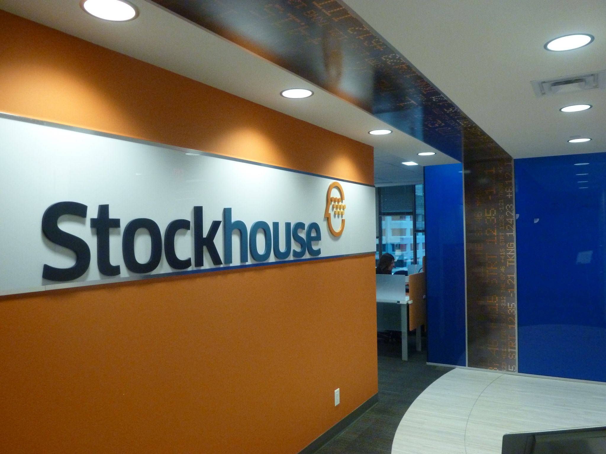
In 2012, Vancouver-based Stockhouse Publishing integrated a series of wall and window treatments into its offices, tying them together with a common colour scheme.