
In a way, this marks a return to the historic past. In architecture, before the Renaissance, art and technology were seen as being linked together in a harmonic ideal. After the invention of the printing press with moveable type in the mid-15th century, an explosion of printed ideas and thoughts helped spread knowledge in science, math and technology, but also fostered a schism between them and art. Logical, quantifiable, ‘hard’ thinking was given preference over emotional, esthetic, ‘soft’ thinking. Today, both types of thinking are converging again as the importance of placemaking is played out in work environments, better connecting employees with what is important to them.
Branded and themed environments are developed in tandem with orientation and identity, putting wayfinding sign designers in a strong position to take on new opportunities if they can see well beyond the sign panel. By valuing the power of their imagination and seeing their task holistically, they may find their field suddenly become wide open, with new chances to engage audiences and build in unexpected areas. Wayfinding is not merely a matter of installing signs at eye level—light, sounds and digital media can also become surprising and bold elements of the same system.
RBC Tower
By way of example, when EGD firm Entro Communications was commissioned to develop a touch-screen directory system for the elevator lobbies of downtown Toronto’s Royal Bank of Canada (RBC) Tower, which would help visitors find and call the people they were supposed to meet, the client happened to mention the dissatisfaction many employees had expressed with their new but barren offices. After looking at the tower’s large, undifferentiated, open-concept office plan, it was clear why the employees had complained, as they faced a sea of grey cubicles, grey-blue walls and exposed grey concrete ceilings and columns.
Entro proposed themed wall graphics, with a unique geometrical motif for each floor, space dividers built using translucent sign panels and large floor numbers for each elevator lobby. These designs, which included graphics painted directly onto walls by Acumen Visual Group from nearby Markham, Ont., increased employee satisfaction, earning an approval rating of 95 per cent. As a result of this project’s success, RBC turned to Entro to develop a wayfinding style guide for its future buildings and to develop individual graphic programs for various other existing office towers.
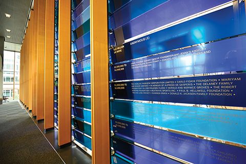
Blue glass panels at the Peter Gilgan Centre for Research and Learning serve as both a divider wall and a donor recognition system.
Peter Gilgan Centre for
Research and Learning
Similarly, when Entro was asked to design a wayfinding system for the Peter Gilgan Centre for Research and Learning, a tower designed by Diamond Schmitt Architects for Toronto’s Hospital for Sick Children, its team saw an opportunity to enhance the building’s three-storey high lounges—whose curved bay windows overlook Bay Street—with themed graphics referring to corresponding research areas. Based on scientific images of brain cells, genomic patterns and cancer cells, among others, the graphics were interpreted as artistic abstractions.
The designs resonated positively with the client, including both administrative and scientific staff. The graphics were subsequently printed on vinyl and applied to the curved walls by Toronto-based PCL Graphics.
Further, a fruitful collaboration with architects Mike Szabo and Duncan Higgins produced a divider wall for the centre’s lobby. Made of blue glass panels, with multiple hues achieved by integrating coloured interlayers, the wall contrasts the otherwise wooden interior of the lobby, but the rear sides of the glass panels also serve another purpose as a donor recognition wall, displaying names of individuals and groups in a grid system to thank them for their contributions to the centre.


