Environmental Graphic Design: Beyond the sign panel
by all | 16 July 2015 10:40 am
 [1]
[1]Photos by Gerald Querubin and Udo Schliemann
By Udo Schliemann
‘Placemaking’ is the act of making
a space one’s own. This may seem obvious and logical with relation to people in their homes, but it becomes more of a challenging task for graphic designers, signmakers, architects, planners and other designers when it is applied to public spaces, large workplaces, hospitals, educational environments and large transportation hubs like airports.
The public is probably most familiar with the concept of placemaking for theme parks, like Canada’s Wonderland and Walt Disney World, as well as sports arenas, where the environment has been purposefully designed to excite and entertain the audience. Elsewhere, however, the need for placemaking may seem less apparent.
Given today’s trends of globalization, dependence on technology speed of communication and transportation, there has been an emphasis in modern societies—particularly in bustling cities—on the aspects of mobility, flexibility and functionality in human life. This emphasis has reflected a culture of restlessness, which can make it more difficult than in the past to build a sense of place and community.
The combination of efficiency, progress and economic growth has been a tremendous success story, creating a world of unprecedented wealth and abundance, but has also involved unsustainable development and a neglect of people’s well-being. Consider the common example of employees working long hours in drab, grey offices.
With technological advances, especially ubiquitous computing, there has been a reorientation of how people live, play and work. Now, a focus on urbanity is renewing an emphasis on place—including how to improve the visual appeal of spaces where people live, play and work.
Signmakers often assume this task is the job of architects, but this is only a partial answer. Architects aim to create spaces that are functional and help people interact and feel comfortable, based on how spaces are organized, how light streams into buildings and which materials are chosen, among other examples, but in general, they do not handle aspects of communications within a building. Rather, signmakers and other designers provide the wayfinding, orientation, branding and artwork that are added as the last ‘layers’ to a building’s sense of place and identity. These layers represent the field of environmental graphic design (EGD), which looks well beyond the sign panel.
 [2]
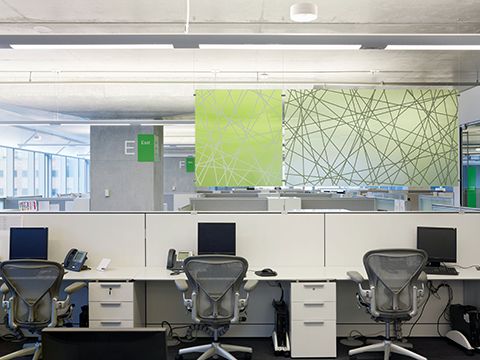
[2]Wall graphics and translucent space dividers bring colour to previously grey working spaces in RBC Tower.
Opportunities for signmakers
With respect to the aforementioned example of offices, today’s multinational, high-tech, service-oriented and consulting companies that typically operate in large towers have recognized a need to move from traditionally hierarchical structures to ‘agile’ work environments to support greater innovation. As they have noticed, a better-designed built environment—with variable workplace configurations—can improve internal communications and employee performance.
Such changes are also driven by today’s young workforce, innovation-centric business models and disruptive technologies. Physical designs are being informed by how data and social media have triggered a revolution in organizational structures. Not only offices, but also laboratories, research facilities, libraries, educational buildings, community centres and even transit hubs have seen the same eagerness to build a sense of place, authenticity and belonging.
In a way, this marks a return to the historic past. In architecture, before the Renaissance, art and technology were seen as being linked together in a harmonic ideal. After the invention of the printing press with moveable type in the mid-15th century, an explosion of printed ideas and thoughts helped spread knowledge in science, math and technology, but also fostered a schism between them and art. Logical, quantifiable, ‘hard’ thinking was given preference over emotional, esthetic, ‘soft’ thinking. Today, both types of thinking are converging again as the importance of placemaking is played out in work environments, better connecting employees with what is important to them.
Branded and themed environments are developed in tandem with orientation and identity, putting wayfinding sign designers in a strong position to take on new opportunities if they can see well beyond the sign panel. By valuing the power of their imagination and seeing their task holistically, they may find their field suddenly become wide open, with new chances to engage audiences and build in unexpected areas. Wayfinding is not merely a matter of installing signs at eye level—light, sounds and digital media can also become surprising and bold elements of the same system.
RBC Tower
By way of example, when EGD firm Entro Communications was commissioned to develop a touch-screen directory system for the elevator lobbies of downtown Toronto’s Royal Bank of Canada (RBC) Tower, which would help visitors find and call the people they were supposed to meet, the client happened to mention the dissatisfaction many employees had expressed with their new but barren offices. After looking at the tower’s large, undifferentiated, open-concept office plan, it was clear why the employees had complained, as they faced a sea of grey cubicles, grey-blue walls and exposed grey concrete ceilings and columns.
Entro proposed themed wall graphics, with a unique geometrical motif for each floor, space dividers built using translucent sign panels and large floor numbers for each elevator lobby. These designs, which included graphics painted directly onto walls by Acumen Visual Group from nearby Markham, Ont., increased employee satisfaction, earning an approval rating of 95 per cent. As a result of this project’s success, RBC turned to Entro to develop a wayfinding style guide for its future buildings and to develop individual graphic programs for various other existing office towers.
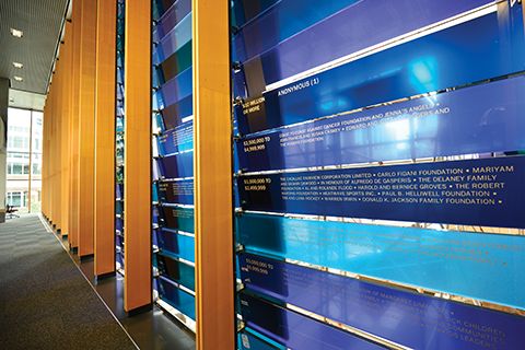 [3]
[3]Blue glass panels at the Peter Gilgan Centre for Research and Learning serve as both a divider wall and a donor recognition system.
Peter Gilgan Centre for
Research and Learning
Similarly, when Entro was asked to design a wayfinding system for the Peter Gilgan Centre for Research and Learning, a tower designed by Diamond Schmitt Architects for Toronto’s Hospital for Sick Children, its team saw an opportunity to enhance the building’s three-storey high lounges—whose curved bay windows overlook Bay Street—with themed graphics referring to corresponding research areas. Based on scientific images of brain cells, genomic patterns and cancer cells, among others, the graphics were interpreted as artistic abstractions.
The designs resonated positively with the client, including both administrative and scientific staff. The graphics were subsequently printed on vinyl and applied to the curved walls by Toronto-based PCL Graphics.
Further, a fruitful collaboration with architects Mike Szabo and Duncan Higgins produced a divider wall for the centre’s lobby. Made of blue glass panels, with multiple hues achieved by integrating coloured interlayers, the wall contrasts the otherwise wooden interior of the lobby, but the rear sides of the glass panels also serve another purpose as a donor recognition wall, displaying names of individuals and groups in a grid system to thank them for their contributions to the centre.
Public Health Ontario
Another Toronto medical research lab—spanning four floors occupied by Public Health Ontario in the Medical and Related Sciences (MaRS) Centre—features an abstract image of bacteria, rendered in a dot grid of metal tubes of various sizes and thicknesses and topped off with a multi-coloured acrylic disc. Conceived and developed by Peggy Theodore and Thom Pratt of the aforementioned Diamond Schmitt Architects, the installation runs along the lab’s main feature staircase that joins all four floors.
With this visual style set in place, Entro complemented the architectural installation with wayfinding signs that also featured dot patterns and integrated acrylic. Further, with the goal of honouring the past within the new space, the company designed a timeline about and portrait of Dr. Donald Low, who was the leading scientist in Toronto’s fight against a severe acute respiratory syndrome (SARS) outbreak in 2003 and passed away in 2013.
Entro again worked with Acumen Visual Group to turn its concepts into physical reality. Acumen’s expertise was key in determining the right techniques for layering the right materials to create the facility’s room signs with tactile and braille characters.
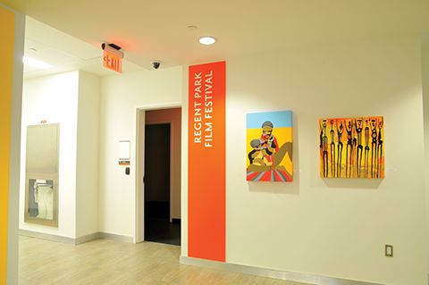
Daniels Spectrum
Storytelling can be a key component in the development of holistic sign programs. The story of more than 80 different nationalities represented within Toronto’s Regent Park, for example, became the leading theme in the design of the neighbourhood’s Daniels Spectrum Building[4], a 5,574-m2 (60,000-sf) Artscape community cultural hub that opened in 2012, offering event, performance and exhibition spaces.
Coloured bands displayed on both the exterior and interior of the building were developed by abstracting and condensing the flags of the 80 different nations, representing people from Asia, Africa, South America and Canada’s First Nations. While these design elements are no longer recognizable as flags, the vibrant colours shine through and resonate with an almost regal quality.
Incorporating these colours into the façade not only signified the building would serve a different function than the condominiums surrounding it, but also became the Daniels Spectrum’s primary visual identity.
 [5]
[5]The University of Waterloo’s School of Pharmacy is wrapped in a floral theme, representing ingredients in medicines.
Entro—which had previously worked on Artscape’s Wychwood Barns—partnered with WSI Sign Systems in Bolton, Ont., to design and fabricate, respectively, the Daniels Spectrum’s wayfinding signs and branding elements. The facility was immediately successful and went on to win several international awards; it was named ‘Best New Venue in Canada’ in 2013 at the BizBash National Event Style Awards in New York, N.Y. received the Good Design is Good Business Award in 2014 and won a U.K. Civic Trust Award in 2015.
University of Waterloo School of Pharmacy
A different kind of storytelling was used for the University of Waterloo’s School of Pharmacy in Kitchener, Ont. The anchor institution for the university’s health sciences campus takes a natural approach to healing, using ingredients from medicinal flowers, so Gottschalk + Ash International (G+A)—which would later become part of Entro—worked with HPA Architects to develop a floral theme for the building.
First, the company researched flowers from botanical drawings dating back to the 17th century. Next, an artist from London, Ont., repainted them so they would have a more artistic esthetic than a digital reproduction. Finally, the images were increased in scale and wrapped around the entire surface of the building’s curtain wall.
When the building opened in 2008, it was one of the first in downtown Kitchener’s ‘innovation district.’ Today, the district has been completely transformed, with the School of Pharmacy embedded among other buildings that have also helped create buzz for the area.
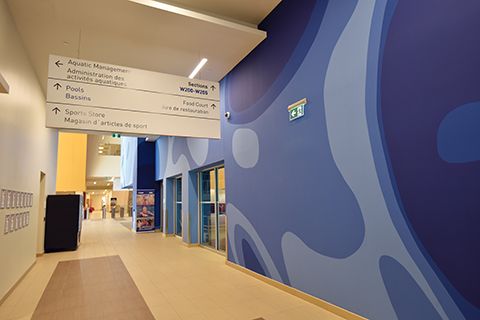 [6]
[6]Themes of water and movement appear in wall graphics throughout the Toronto Pan Am Sports Centre (TPASC)
Toronto Pan Am Sports Centre
Visual expression in placemaking can stimulate redevelopment, identity programs and—at the new aquatic centre built for the 2015 Pan American and Parapan American Games[7] at the University of Toronto’s Scarborough Campus—high-profile photo opportunities.
Norr Architects was selected to design the Toronto Pan Am Sports Centre (TPASC), which includes the aquatic facility and a field house, and Entro became involved with developing the wayfinding system. In addition to directional signs, an opportunity was found to express the theme of water and movement in wall graphics. Specifically, the graphics formed a large backdrop behind the diving towers and, thus, were displayed prominently on TV during the games’ swimming and diving competitions.
The signage system, meanwhile, included pylons with offset panels, referencing the shifting planes of Norr’s architectural design. All signs were manufactured and installed by Gregory Signs & Engraving of Vaughan, Ont.
Contributing to reorientation
Places change, sometimes rapidly, but outside cultural, economic or political transformations can also destroy an existing sense of place and belonging. Indeed, it is all the more difficult to maintain a sense of place in a postmodern society where change seems to be the only constant.
Nevertheless, many recent efforts to restore identity and a sense of belonging—whether within workplaces or communities—have served as strong examples of ‘reorientation’ in today’s society. If sign designers and fabricators can assist in the identification of places, memorable storytelling and experiential engagement, then they can make a significant contribution well beyond the sign panel.
Udo Schliemann is principal creative director at Entro Communications, an environmental graphic design (EGD) firm based in Toronto. For more information, contact him via e-mail at udo@entro.com[8].
- [Image]: http://www.signmedia.ca/wp-content/uploads/2015/07/Daniels-Spectrum_Interior-2nd-Floor_2011.jpg
- [Image]: http://www.signmedia.ca/wp-content/uploads/2015/07/RBC-Dexia_Translucent-Divider-Panel_2012.jpg
- [Image]: http://www.signmedia.ca/wp-content/uploads/2015/07/SickKids-Research-and-Learning-Tower_Donor-Wall_2013.jpg
- Daniels Spectrum Building: http://www.kenilworth.com/publications/smc/de/201304/20.html
- [Image]: http://www.signmedia.ca/wp-content/uploads/2015/07/School-of-Pharmacy_U-of-Waterloo_1_2009.jpg
- [Image]: http://www.signmedia.ca/wp-content/uploads/2015/07/PanAm-Aquatic-Centre_6_2015.jpg
- 2015 Pan American and Parapan American Games: http://www.kenilworth.com/publications/smc/de/201505/26.html
- udo@entro.com: mailto:udo@entro.com
Source URL: https://www.signmedia.ca/environmental-graphic-design-beyond-the-sign-panel/