

Photos courtesy Signage Foundation
By Craig Berger and Sapna Budev
The history of typography can be thought of as the 5,000-year history of written languages and alphabets that combined letterforms into words. Most of that history, however, was dedicated to the refinement of written language on paper when it could be read by only a small minority of the most highly educated people. Typography for signage and elsewhere in the broader environment, on the other hand, only began at the dawn of the first century A.D., and helped lead to the promotion of large-scale literacy and technological advancement in mobility and communications.
Empire-wide signage
The Roman Empire had been in existence for more than 500 years before these first experiments in ‘environmental typography’ began. The complexity of managing a far-flung empire had grown easier with the use of a common language, currency and legal system, but low rates made communication difficult on a mass scale.
The Romans resolved this problem with two inventions that helped pushed type from parchment into the urban environment. Metal stamps allowed for the development of watermarks and coins with numerical values that could be easily learned; and stencils allowed for the consistent application of type to posters and signs.
This first Latin alphabet type style, Trajan, was named after the emperor in power when it first appeared on monuments (though it had evolved over the previous 100 years). Using simple serifs and only capital letters, it created a communications revolution across the Roman Empire.
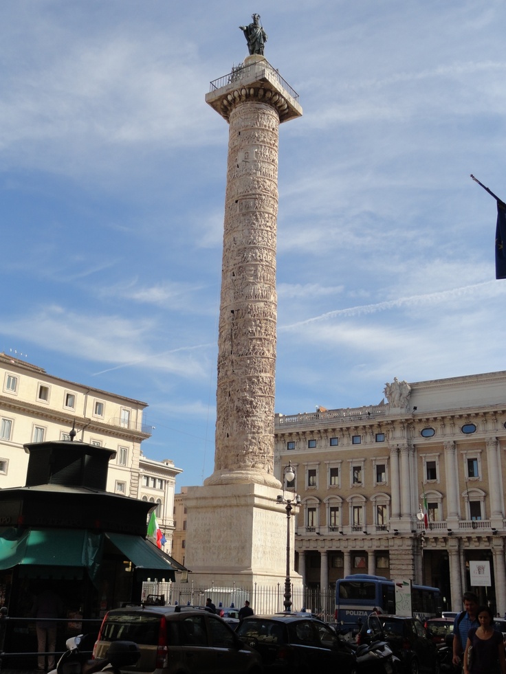
Trajan’s Column in Rome features the first Latin alphabet style, using simple serifs and only capital letters.
Lettering was used to mark political and historical events, such as major victories and landmarks. Trajan’s Column in Rome, for example, told the story of the emperor’s military victories in Dacia. More importantly, the type style was used to indicate store locations, road names and street numbers, which helped ‘rationalize’ cities while promoting simple language skills.
Pressed to communicate
The flowering of signage during the Roman era was short-lived, however, and the collapse of the empire reverted typography back to its key use in religious documents. Calligraphy became a core academic skill, but produced documents that were all but unintelligible. It was not until the 15th century that typographical innovation resumed with the development of the printing press and moveable type.
Nicholas Jensen looked back to the clarity of the Romans’ original typeface when he developed one of the first fonts designed for the printing press. This design sparked an industry, as printers developed their own typefaces, many of which are still commonly used today.
Unfortunately, literacy in this era remained very low. Cities and towns were still too small to demand rationalization with letters and numbers.
Nevertheless, advances in metalworking and woodcarving led to the rise of commercial signage, with a mix of pictograms and simple messages. With limited literacy before the Industrial Revolution, these signs had to combine iconography, pictograms and simple typographical messages to convey meaning.
 Signs and industry
Fonts were continually refined for the next 300 years, parallel to a continuous rise of new technologies for printing and a growing need for signs and other environmental typography.
In 1757, English printer John Baskerville developed a new typeface with varying thick and thin elements, high contrast and variable spacing, allowing it to be seen clearly from greater distances. As such, the resulting Baskerville font was well-suited for environmental communications.
Tools like the tracing pantograph and router made it much easier to create unique signs with new and different fonts. Colour lithographic printing reached mass-production scale by the mid-19th century, facilitating large-scale billboards and signs (the need for which was also brought about by mass production, as it led to greater product advertising and promotion). Cities began to fill up with posters, handbills, banners and billboards featuring multiple fonts and styles.


