
Further, the cities themselves exploded in size with new offices, train stations and municipal buildings, all of which required signs for identification and wayfinding purposes. Typography continued to customize classical fonts until the 20th century, simplifying them for use on signs.
As the Industrial Revolution’s increasingly commercial cities became messy and cluttered, many European designers responded by attempting to integrate their discipline better with the mechanization of society. These efforts culminated in the Bauhaus movement of the 1920s, which would have a significant influence on architecture for the next 40 years.
In 1927, for example, Paul Renner designed Futura, a font stripped of all classical adornment so it could integrate seamlessly with simple, modular buildings. And in the U.S., the Art Deco movement yielded sleek, streamlined typography, which was a perfect fit for advances in metal routing and cutting, the commercialization of neon lighting for signs and the evolving designs of airplanes, trains and cars.
Commercial signs for stores and restaurants soon reflected the sleek lines of skyscrapers and government buildings. By the 1950s, the Moderne font adorned hotels and other buildings.
Reading for the road
With the rise of the automobile came a push for more legible environmental typography. After all, unlike material in print which people can focus on, road signs must compete with other visual distractions while the viewer is in motion.
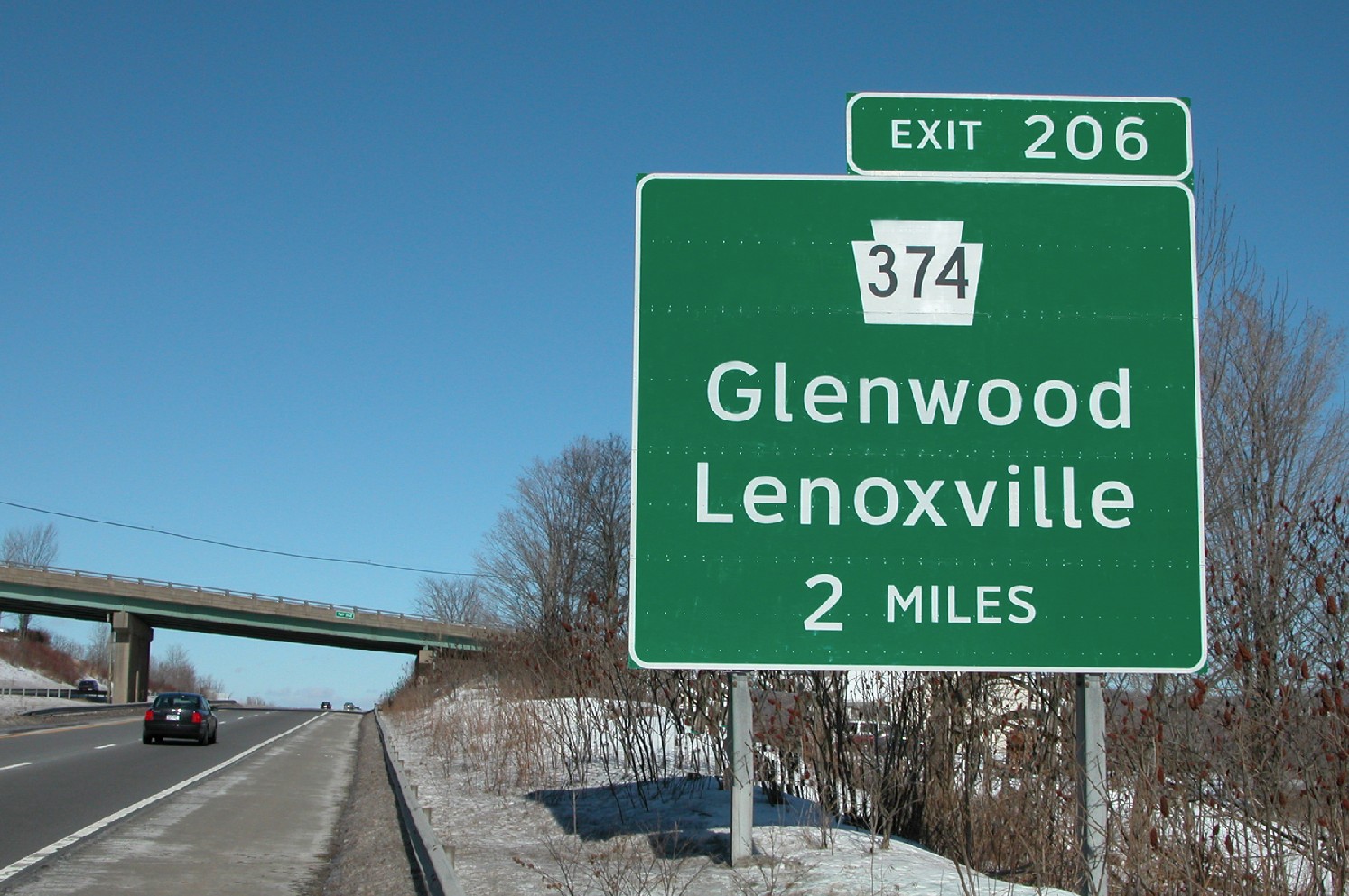
As highway signs adopted reflective vinyl, the Clearview typeface was developed with thinner strokes and open counterforms for greater visibility.
In the U.S., specific sans-serif characters were mandated for road signs that could be both easily painted and easily read at high speeds. After the Second World War, an interstate highway standard was introduced, promoting the Highway Gothic font.
Some other countries adopted Highway Gothic with only minor changes. In the U.K., however, a research study into type legibility led to graphic designer Jock Kinneir’s development of the British Transport font, with more rounded letters and the use of both upper and lower case, which had tested well at high speeds. Indeed, research in the 1950s and ‘60s by both the British Transport Authority and the California Highway Commission showed the combination of upper- and lower-case type was about 10 to 15 per cent more effective than upper-case only.
Later, with the addition of reflective vinyl on highway signs, a new typeface was needed to minimize blurring and hazing. Reflective vinyl letters become so bright under the glare of headlights that their counterforms (i.e. the spaces inside the letters) appear to shrink, especially for older drivers.
With this in mind, Donald Meeker and James Montalbano developed Clearview, advancing many of Kinneir’s concepts and incorporating years of testing and advocacy with thinner stroke widths and more open counterforms. It was approved in the U.S. in 2004 and has since found its way into airport and train station wayfinding systems.

The most significant font developed for branding and advertising is Helvetica, which was designed to appear truly neutral for maximum legibility.
Today, legibility testing has become an integral part of typographical design, leading to new fonts like Wayfinding Sans Pro.
Building brands
In the first half of the 20th century, while modern typographical developments were affecting art, architecture and publishing, the advertising of products and services continued to rely on more traditional brand identification. After the Second World War, though, rapidly growing multinational companies developed corporate iconography and typography to convey their messages to a wide variety of cultures, under a wide variety of environmental conditions.
In the 1950s, ‘type foundries’ arose in Europe to develop fonts specifically for branding and advertising applications. The most significant of these was Helvetica, developed by Max Miedinger and Edouard Hoffmann to be truly neutral with maximum legibility. In the 1960s, it was incorporated into branding for General Motors, 3M and American Airlines, among other corporations.
In the sign industry, advances in plastics and fluorescent lighting led to the development of cut vinyl and internally illuminated signs, respectively, both of which proved most effective with high colour contrast levels and simple typography.


