
Typography for the masses
The biggest advance yet in the development of environmental typography, however, came with the software innovations of the 1970s and ‘80s. Apple’s Macintosh computer was complemented by desktop publishing software for manipulating type and graphics. Following a rapid evolution of this software, True Type Fonts were created in 1991, which could be scaled up or down in size without a loss of clarity. By combining True Type Fonts with drawing software like Corel Draw and Freehand, even small design firms could incorporate sophisticated type into their work.
Meanwhile, the introduction of computer-aided design and manufacturing (CAD/CAM) software brought previously specialized routing and cutting capabilities to thousands of sign shops and other small fabrication firms around the world. A greater ability to visualize end products added visual effects to a nearly immeasurable degree.
Routed raised letters and braille dots, for example, enabled the development of accessibility signage. This has entailed an entirely new set of dilemmas for typography, however, as early codes offered one-size-fits-all guidelines, even though there is very little in common between the needs of blind people who read through touch and visually impaired people who read through sight.
The blind cannot detect contrasting colours, require a narrow range of simple san-serif letter heights to appear in predictable locations and can only read capital letters. The visually impaired and everyone else who navigates visually, on the other hand, benefit from high colour contrast levels and large letter sizes.
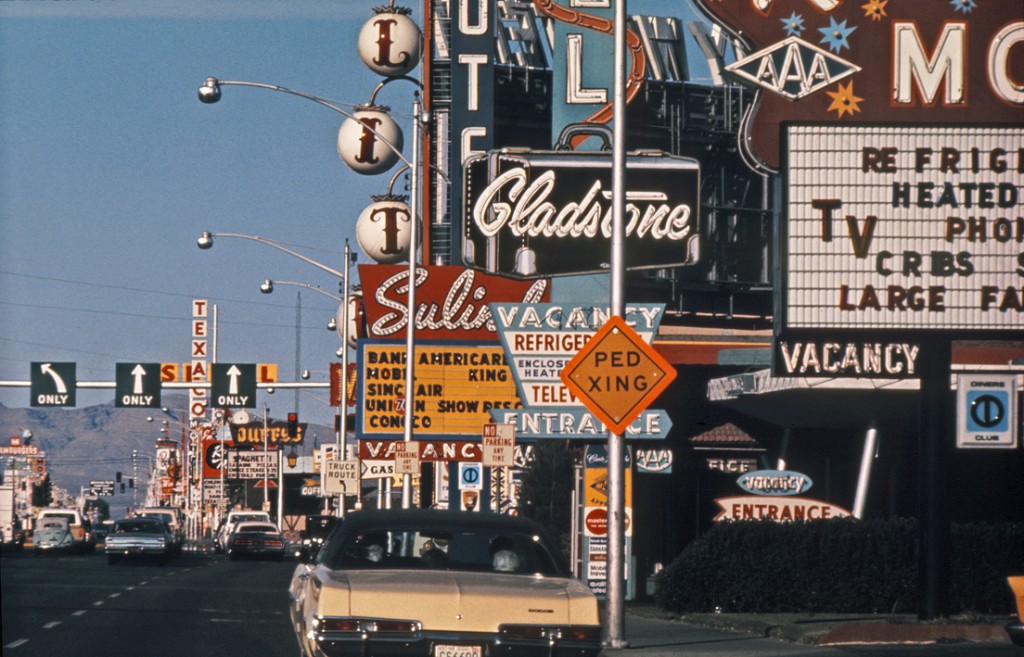
As increasingly commercialized cities have become cluttered, designers have had to think carefully about how to get their signs detected and read by the public.
That said, everyone benefits from simplicity—when sans serif tactile fonts are spaced adequately and clutter is reduced, they benefit the blind and the visually impaired alike. Accordingly, there is a greater emphasis today on developing ‘universal design’ standards.
“Inevitably, but not always, what works best for people with disabilities works better for everybody,” designer Roger Whitehouse told Communication Arts magazine.
Future possibilities
The future of environmental typography could move in any number of directions, yet it will not necessarily yield greater design freedom. Increases in legibility research, for example, have led to more effective typefaces, but also more restrictive design codes. Digital signage offers dynamic type, yet has seen even greater forces of standardization in many transportation systems.
In other words, with technological innovations and the creation of new typefaces has come systemic rationalization. This balance will always exist, even in a future of limitless possibilities.
Craig Berger is a management consultant and chair of the visual presentation and exhibition design department at the Fashion Institute of Technology (FIT). Sapna Budev is director of strategic initiatives for the International Sign Association (ISA). This article is based on a series of white papers they wrote and edited for the Signage Foundation, sponsored by Nova Polymers and Dixie Graphics, accompanied by an ongoing series of webinars, the next of which will take place on July 24, 2014. For more information, contact Sapna via e-mail at sb@signs.org and visit www.thesignagefoundation.org.


