Environmental Graphic Design: The history of typography and signs
by all | 11 August 2014 1:30 pm
 [1]
[1]Photos courtesy Signage Foundation
By Craig Berger and Sapna Budev
The history of typography can be thought of as the 5,000-year history of written languages and alphabets that combined letterforms into words. Most of that history, however, was dedicated to the refinement of written language on paper when it could be read by only a small minority of the most highly educated people. Typography for signage and elsewhere in the broader environment, on the other hand, only began at the dawn of the first century A.D., and helped lead to the promotion of large-scale literacy and technological advancement in mobility and communications.
Empire-wide signage
The Roman Empire had been in existence for more than 500 years before these first experiments in ‘environmental typography’ began. The complexity of managing a far-flung empire had grown easier with the use of a common language, currency and legal system, but low rates made communication difficult on a mass scale.
The Romans resolved this problem with two inventions that helped pushed type from parchment into the urban environment. Metal stamps allowed for the development of watermarks and coins with numerical values that could be easily learned; and stencils allowed for the consistent application of type to posters and signs.
This first Latin alphabet type style, Trajan, was named after the emperor in power when it first appeared on monuments (though it had evolved over the previous 100 years). Using simple serifs and only capital letters, it created a communications revolution across the Roman Empire.
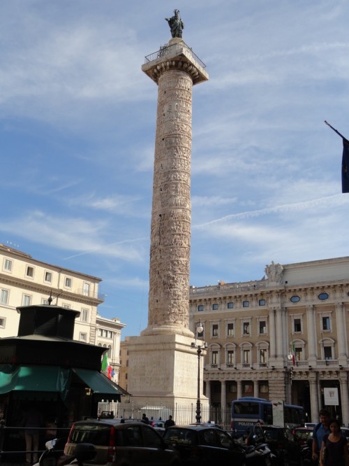 [2]
[2]Trajan’s Column in Rome features the first Latin alphabet style, using simple serifs and only capital letters.
Lettering was used to mark political and historical events, such as major victories and landmarks. Trajan’s Column in Rome, for example, told the story of the emperor’s military victories in Dacia. More importantly, the type style was used to indicate store locations, road names and street numbers, which helped ‘rationalize’ cities while promoting simple language skills.
Pressed to communicate
The flowering of signage during the Roman era was short-lived, however, and the collapse of the empire reverted typography back to its key use in religious documents. Calligraphy became a core academic skill, but produced documents that were all but unintelligible. It was not until the 15th century that typographical innovation resumed with the development of the printing press and moveable type.
Nicholas Jensen looked back to the clarity of the Romans’ original typeface when he developed one of the first fonts designed for the printing press. This design sparked an industry, as printers developed their own typefaces, many of which are still commonly used today.
Unfortunately, literacy in this era remained very low. Cities and towns were still too small to demand rationalization with letters and numbers.
Nevertheless, advances in metalworking and woodcarving led to the rise of commercial signage, with a mix of pictograms and simple messages. With limited literacy before the Industrial Revolution, these signs had to combine iconography, pictograms and simple typographical messages to convey meaning.
 [3]Signs and industry
Fonts were continually refined for the next 300 years, parallel to a continuous rise of new technologies for printing and a growing need for signs and other environmental typography.
In 1757, English printer John Baskerville developed a new typeface with varying thick and thin elements, high contrast and variable spacing, allowing it to be seen clearly from greater distances. As such, the resulting Baskerville font was well-suited for environmental communications.
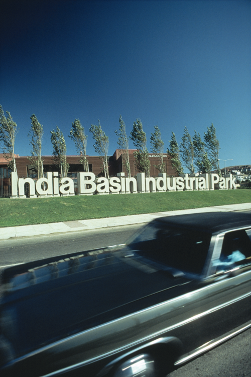
Tools like the tracing pantograph and router made it much easier to create unique signs with new and different fonts. Colour lithographic printing reached mass-production scale by the mid-19th century, facilitating large-scale billboards and signs (the need for which was also brought about by mass production, as it led to greater product advertising and promotion). Cities began to fill up with posters, handbills, banners and billboards featuring multiple fonts and styles.
Further, the cities themselves exploded in size with new offices, train stations and municipal buildings, all of which required signs for identification and wayfinding purposes. Typography continued to customize classical fonts until the 20th century, simplifying them for use on signs.
As the Industrial Revolution’s increasingly commercial cities became messy and cluttered, many European designers responded by attempting to integrate their discipline better with the mechanization of society. These efforts culminated in the Bauhaus movement of the 1920s, which would have a significant influence on architecture for the next 40 years.
In 1927, for example, Paul Renner designed Futura, a font stripped of all classical adornment so it could integrate seamlessly with simple, modular buildings. And in the U.S., the Art Deco movement yielded sleek, streamlined typography, which was a perfect fit for advances in metal routing and cutting, the commercialization of neon lighting for signs and the evolving designs of airplanes, trains and cars.
Commercial signs for stores and restaurants soon reflected the sleek lines of skyscrapers and government buildings. By the 1950s, the Moderne font adorned hotels and other buildings.
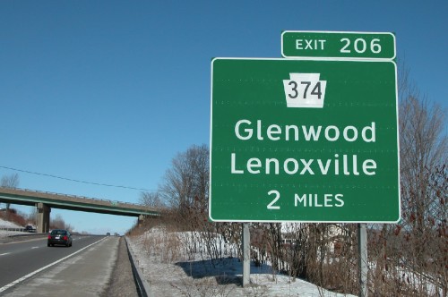
Reading for the road
With the rise of the automobile came a push for more legible environmental typography. After all, unlike material in print which people can focus on, road signs must compete with other visual distractions while the viewer is in motion.
 [4]
[4]As highway signs adopted reflective vinyl, the Clearview typeface was developed with thinner strokes and open counterforms for greater visibility.
In the U.S., specific sans-serif characters were mandated for road signs that could be both easily painted and easily read at high speeds. After the Second World War, an interstate highway standard was introduced, promoting the Highway Gothic font.
Some other countries adopted Highway Gothic with only minor changes. In the U.K., however, a research study into type legibility led to graphic designer Jock Kinneir’s development of the British Transport font, with more rounded letters and the use of both upper and lower case, which had tested well at high speeds. Indeed, research in the 1950s and ‘60s by both the British Transport Authority and the California Highway Commission showed the combination of upper- and lower-case type was about 10 to 15 per cent more effective than upper-case only.
Later, with the addition of reflective vinyl on highway signs, a new typeface was needed to minimize blurring and hazing. Reflective vinyl letters become so bright under the glare of headlights that their counterforms (i.e. the spaces inside the letters) appear to shrink, especially for older drivers.
With this in mind, Donald Meeker and James Montalbano developed Clearview, advancing many of Kinneir’s concepts and incorporating years of testing and advocacy with thinner stroke widths and more open counterforms. It was approved in the U.S. in 2004 and has since found its way into airport and train station wayfinding systems.
 [5]
[5]The most significant font developed for branding and advertising is Helvetica, which was designed to appear truly neutral for maximum legibility.
Today, legibility testing has become an integral part of typographical design, leading to new fonts like Wayfinding Sans Pro.
Building brands
In the first half of the 20th century, while modern typographical developments were affecting art, architecture and publishing, the advertising of products and services continued to rely on more traditional brand identification. After the Second World War, though, rapidly growing multinational companies developed corporate iconography and typography to convey their messages to a wide variety of cultures, under a wide variety of environmental conditions.
In the 1950s, ‘type foundries’ arose in Europe to develop fonts specifically for branding and advertising applications. The most significant of these was Helvetica, developed by Max Miedinger and Edouard Hoffmann to be truly neutral with maximum legibility. In the 1960s, it was incorporated into branding for General Motors, 3M and American Airlines, among other corporations.
In the sign industry, advances in plastics and fluorescent lighting led to the development of cut vinyl and internally illuminated signs, respectively, both of which proved most effective with high colour contrast levels and simple typography.
Typography for the masses
The biggest advance yet in the development of environmental typography, however, came with the software innovations of the 1970s and ‘80s. Apple’s Macintosh computer was complemented by desktop publishing software for manipulating type and graphics. Following a rapid evolution of this software, True Type Fonts were created in 1991, which could be scaled up or down in size without a loss of clarity. By combining True Type Fonts with drawing software like Corel Draw and Freehand, even small design firms could incorporate sophisticated type into their work.
Meanwhile, the introduction of computer-aided design and manufacturing (CAD/CAM) software brought previously specialized routing and cutting capabilities to thousands of sign shops and other small fabrication firms around the world. A greater ability to visualize end products added visual effects to a nearly immeasurable degree.
Routed raised letters and braille dots, for example, enabled the development of accessibility signage. This has entailed an entirely new set of dilemmas for typography, however, as early codes offered one-size-fits-all guidelines, even though there is very little in common between the needs of blind people who read through touch and visually impaired people who read through sight.
The blind cannot detect contrasting colours, require a narrow range of simple san-serif letter heights to appear in predictable locations and can only read capital letters. The visually impaired and everyone else who navigates visually, on the other hand, benefit from high colour contrast levels and large letter sizes.
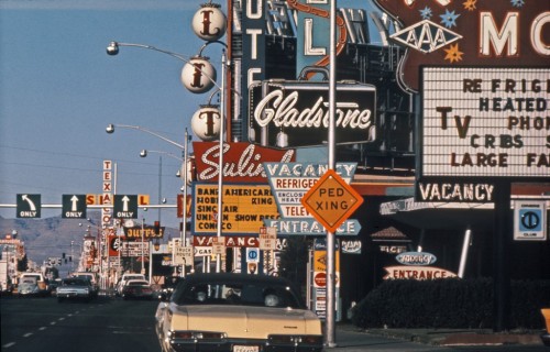 [6]
[6]As increasingly commercialized cities have become cluttered, designers have had to think carefully about how to get their signs detected and read by the public.
That said, everyone benefits from simplicity—when sans serif tactile fonts are spaced adequately and clutter is reduced, they benefit the blind and the visually impaired alike. Accordingly, there is a greater emphasis today on developing ‘universal design’ standards.
“Inevitably, but not always, what works best for people with disabilities works better for everybody,” designer Roger Whitehouse told Communication Arts magazine.
Future possibilities
The future of environmental typography could move in any number of directions, yet it will not necessarily yield greater design freedom. Increases in legibility research, for example, have led to more effective typefaces, but also more restrictive design codes. Digital signage offers dynamic type, yet has seen even greater forces of standardization in many transportation systems.
In other words, with technological innovations and the creation of new typefaces has come systemic rationalization. This balance will always exist, even in a future of limitless possibilities.
Craig Berger is a management consultant and chair of the visual presentation and exhibition design department at the Fashion Institute of Technology (FIT). Sapna Budev is director of strategic initiatives for the International Sign Association (ISA). This article is based on a series of white papers they wrote and edited for the Signage Foundation, sponsored by Nova Polymers and Dixie Graphics, accompanied by an ongoing series of webinars, the next of which will take place on July 24, 2014. For more information, contact Sapna via e-mail at sb@signs.org[7] and visit www.thesignagefoundation.org[8].
- [Image]: http://www.signmedia.ca/wp-content/uploads/2014/07/Shake-Shack.jpg
- [Image]: http://www.signmedia.ca/wp-content/uploads/2014/07/trajan-column.jpg
- [Image]: http://www.signmedia.ca/wp-content/uploads/2014/09/SM_July_2014_HR-66.jpg
- [Image]: http://www.signmedia.ca/wp-content/uploads/2014/07/InterstateSigns.jpg
- [Image]: http://www.signmedia.ca/wp-content/uploads/2014/07/UC10.png
- [Image]: http://www.signmedia.ca/wp-content/uploads/2014/07/las-vegas-car-view-of-strip-14-1024x6571.jpg
- sb@signs.org: mailto:%20sb@signs.org
- www.thesignagefoundation.org: http://www.thesignagefoundation.org
Source URL: https://www.signmedia.ca/environmental-graphic-design-the-history-of-typography-and-signs/