Establishing clear routes
by | 8 March 2019 10:21 am
Using visual cues to design effective wayfinding systems
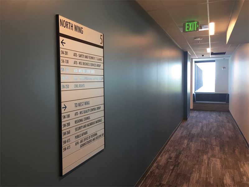 [1]
[1]A person’s wayfinding adventure begins with orienting oneself to his or her current position, asking, ‘Where am I? In what direction am I facing?’
By Charles Kelly Jr.
Industry professionals tend to consider signage as the key to a successful wayfinding program. While this author certainly does not dispute this point, those involved in the design of these types of projects are also required to give a great deal of attention to the human experience.
A person’s wayfinding adventure begins with orienting oneself to his or her current position, asking, ‘Where am I? In what direction am I facing?’ Each step through the process imprints the user with a landmark and provides a point of reference for the next steps. The accumulative effect is the development of a personal cognitive map: a coherent mental image, reinforced by each repeated movement through memorable spaces. This idea has been referred to as ‘spatial problem solving.’
While signage plays a vital, linking role in the wayfinding process, visual cues and inspired design also have a significant impact.
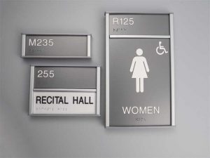 [2]
[2]Today’s signmakers tend to create their own enhancements using designs indicative of a company’s brand, which allows signage systems to become a unifying element.
Where to begin?
The early stages of planning a wayfinding system require the designer to become intimate with the structure, environment, and paths of the site and its facility(s). The goal is to break down the necessary information into manageable and timely bits and provide users with these key pieces of information at points along their journey where decisions must be made.
Airports serve as recognizable examples of locations that operate using the basic fundamentals of wayfinding. These details are reminiscent of essay-writing built around the hierarchy of an outline: title, heading(s), subheading(s), and examples. Using this analogy for air travel, such a hierarchy would look like: Toronto Pearson International Airport, arrivals/departures, terminals, and gates. A hospital can serve as a parallel example: Toronto Western Hospital, emergency room, radiology department, Dr. Smith, and room 123.
The end as the beginning
When designing a wayfinding program, it is helpful to consider the project’s end goal first. While an airport visitor’s end goal might be to travel to Rome, Italy, for example, critical parts of information are needed at key decision-points: first, a traveller must determine their destination airport to establish their direction; then, regardless of the final destination, they should head toward ‘departures’; next, they select their terminal based on the airline (e.g. Alitalia, terminal 3 of 6); finally, they check in with the airline and follow signs
to the appropriate gate.
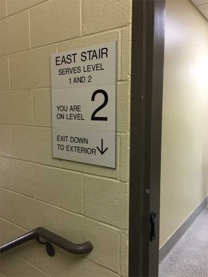 [3]
[3]Signs provide users with the clarity, reassurance, and controlled messaging necessary to make navigational selections.
These fundamentals are sound and, as such, are replicated many times when a person is finding their way, whether in an airport or hospital, for example. Thus, it is critical for a system’s designer to establish the foundational information unique to the destination point, test the breakouts of information along the path, and document the route clearly and concisely.
Using the environment
When it comes to navigating a building, visitors tend to rely on a variety of visual cues; however, the science behind how this orientation is achieved has only recently begun to emerge. Thus, distinct landmarks (e.g. wall graphics, donor recognition walls in hospitals) now play meaningful roles within a wayfinding system. While there have always been elements of building design that enhance the navigability of a space, the small details that once gave continuity to fine design are being sacrificed to bolder statements. Over time, the architectural details once critical to the successful execution of a major project have suffered due to financial constraints and owners who chose to forego these elements of design. The former attention to ‘repetitive detailing’ has been abandoned due to budget, expedited construction deadlines, and labour shortages.
As such, today’s signmakers create their own enhancements using designs indicative of the building’s architecture or a company’s brand, which allows signage systems to become a unifying element.
Expert advice: Six steps for drafting wayfinding signage
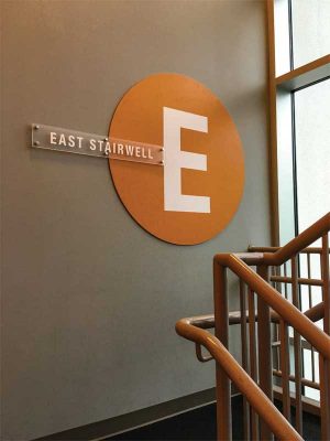 [4]
[4]Clear signage is specifically vital at a wayfinding system’s decision points, beginning with the initial directory or map and proceeding from there.
When creating wayfinding signage, there are six basic steps to consider.
- Discovery
Before beginning a design, it is vital for a planner to gather all of the significant data related to the site. It is often best to survey those who work or otherwise frequent the location. All relevant data should be documented and supported by photos. Designers should also determine the system’s message schedule, location maps, decision points, mounting situations, viewing distances/obstructions, and room numbers.
- Conceptualizing the design
Flushing out the specifics of a wayfinding design is typically done by a task force, along with other project decision-makers. Signmakers report their findings to these individuals and make recommendations based on these observations, and then discuss different approaches as well as review materials options and related budget considerations. User accessibility should be considered, as well as any requirements under the National Fire Code of Canada (NFC), the Standards Council of Canada (SCC), and any other local/federal organizations.
The system’s overall design should pick up on cues from the locations architectural environment, including interior and exterior features, as well as complement the colours and style of the brand. Planners should consider the site’s corporate culture in addition to the age, language proficiency, and education of its visitors.
- Final approvals
Once the design plan has been thoroughly developed, it must be submitted for approval. By this stage, time samples for sign selection would have been provided, prototypes would have been tested in selected locations, and a final budget/timeline would have been set. Further, room numbers (if applicable) have been reviewed and confirmed.
- Sign-off
By this phase, all stakeholders should have signed off on the sign schedule and site mapping. The system cannot move forward without these approvals. As such, a project’s production and installation begins with ensuring all elements and designated phases have been approved in writing.
 [5]
[5]Designers borrow visual cues within the built environment, which leave participants with a permanent mental image. Clear signage is specifically vital at a wayfinding system’s decision points, beginning with the initial directory or map and proceeding from there.
At this stage, the wayfinding team co-ordinates the system’s delivery and installation and production can begin. Temporary signs can be placed, as needed, within the work area, and a pre-determined schedule that co-ordinates with other trades that precede or follow the system’s installation can be posted.
- Review and report
Once all elements of a wayfinding system have been installed, the crew should perform a site inspection by conducting a walk-through. The project’s functionality should be thoroughly assessed, with corrections made when necessary. The team should then provide the site owner with a summary report.
- Sign standards
Sign standards are confirmed in a sign guide and are to be used by the client to maintain the continuity and appearance of the system for any future site changes and/or additions. The guide includes product literature and warrantees, the sign design manual, message schedule, location map, templates, and instruction for the re-ordering and internal permissions process.
The power of visual cues
 [6]
[6]Wayfinding systems should break down necessary navigational information into manageable and timely bits and provide users with this information at points along their journey where decisions must be made.
When planning a wayfinding system, there are three areas of impact relative to visual cues: first, special wall coverings (including super wall graphics) that might be specifically themed to the building’s brand or quickly display important information (i.e. a numeral to identify a parking deck level); next, the value of a handsomely displayed institutional information (e.g. a donor wall in a hospital) to draw attention to a specific location; and finally, a comprehensive directory—which, unlike the modest column-style reference points of the past, serves as a significant, eye-catching element of the wayfinding design.
So where do signs fit in? These communication tools are specifically important at the system’s decision points, beginning with the initial directory or map and proceeding from there. While landmarks and design play vital roles in establishing environment, a system’s signage is the ribbon that holds everything together by filling in any missing information. Signs provide users with the clarity, reassurance, and controlled messaging necessary to make navigational selections.
A decision point generally requires the person to make a choice: if a location leads to a frequently sought destination or is a point of reference for another location, it is considered a decision point. Signage is vital for these spaces, as it helps differentiate these navigational choices and provides users with the information needed to proceed. After all, the ultimate goal of a wayfinding system is to get the person to the desired destination and back again.
Thoughtful design
To paraphrase Italian designer Massimo Vignelli, design is not something to be taken lightly; rather, it creates a solution that must be subject.
Ultimately, signage must be user-focused. Understanding human behaviour and expectations, as well as the principles of good design, are key to successful wayfinding. In the process, the wayfinding experience is as much of an adventure for the designer and the signmaker as it is for the user.
Charles Kelly Jr. is the president of Clarke Systems. He can be reached via e-mail at ckellyjr@clarkesystems.com[7].
- [Image]: https://www.signmedia.ca/wp-content/uploads/2019/03/IMG_0724-1.jpg
- [Image]: https://www.signmedia.ca/wp-content/uploads/2019/03/P1011199.jpg
- [Image]: https://www.signmedia.ca/wp-content/uploads/2019/03/IMG_5044.jpg
- [Image]: https://www.signmedia.ca/wp-content/uploads/2019/03/IMG_4271.jpg
- [Image]: https://www.signmedia.ca/wp-content/uploads/2019/03/DSC_0859.jpg
- [Image]: https://www.signmedia.ca/wp-content/uploads/2019/03/DSC_0856.jpg
- ckellyjr@clarkesystems.com: mailto:ckellyjr@clarkesystems.com
Source URL: https://www.signmedia.ca/establishing-clear-routes/