Getting colour right when printing more than signs
by | 8 June 2019 2:30 pm
By Erik Schmitt
 [1]
[1]To maintain existing customers and attract new, higher-end clients, print service providers need consistent, high-quality output.
With the growth and demand for wide-format and inkjet-printed products, this work now comes from two merging types of print providers: those who originally came from large-format and are expanding their offerings, and those who came from commercial print and have invested in their capacity to include large format. No matter their legacies, anyone involved in large-format print typically produces a wide variety of products. It’s important to not forget colour’s
Large-format print needs a different printing process than those for brochures or packaging. And, along with the rise of adoption rates of digital production systems and wide format, quality demands have escalated. The aspects of a mixed environment with offset, digital, and large format from one facility presents many colour challenges.
Common to all marketing and brand needs is that colour impression has to be accurate and consistent, whether for bus stops, building wraps, marketing collateral, point-of-sale (POS) displays—and even fleet graphics.
To maintain existing customers and attract new, higher-end clients, print service providers need consistent, high-quality output. If one is alarmed at the rate their trash bins and ink waste bottles are filling up while trying to get the customer’s colour right, a more efficient colour management system is likely in order.
What does a company need for accurate and predictable colour? A campaign can stretch across multiple technologies. Whether ultraviolet (UV), solvent, latex, digital toner, or offset, one needs to sync all of these devices and processes for a common print appearance. A print provider also needs to be consistent.
If one cannot repeat the same colour today, tomorrow, or next week, there are risks to customer satisfaction or new business and, ultimately, profitability is at risk.
To guarantee uniform appearance, many prepress technicians have to manually convert and retouch files. This can be quite laborious and means considerable time, material, and costs. Further, there is no guarantee a mistake will not occur. Using multiple print technologies and raster image processors (RIPs), and digital front-ends, combined with a variety of substrates, any print provider runs into the daily challenge of how to address consistenty.
In commercial printing, matching one device to another can be pretty straightforward. Inks and substrates are usually standardized, and target densities and lab values have been defined. However, with wide-format printing, one not only has many different brands of printers, but also a huge variety of media and ink sets that are vastly different (e.g. solvent, UV-curable, dye sublimation, and aqueous have different pigmentation depending on the vendor).
Managing colour from one place
For commercial print, packaging, and wide format to be printed in the same facility, colour management must be able to match to a print standard on press. This does not mean matching a wide-format inkjet printer to another wide-format printer or an existing traditional press. It is imperative to match both traditional and digital print processes and devices to a common reference that is easily accessible to print data suppliers, using generally known methods.
The practical operation of multiple colour management systems from different vendors running a variety of output devices on multiple media can be daunting. The user interfaces and results are often different when setting linearization, ink limits, rendering intents, etc. The less standardization that exists between different print devices, the more likely things can go wrong—and they often do.
A centralized colour management system with consistent print and process control tools offers exceptional control for printing on a variety of devices. While a centralized colour management system assures all print devices will match, it does not mean other systems are imperfect. It just means using non-centralized systems could produce different results unless meticulous care is taken to ensure settings are always aligned on all systems, all the time.
Centralized colour management can also offer additional benefits such as resolving Portable Document Format (PDF) flattening, transparencies, and overprint issues with centrally administrated settings, assuring
the same results. This also reduces errors in interpretation between the proof the customer sees and the final print job.
If one is lucky, he/she can find a colour management system to create unified calibration, and profiling tools that require very little user interaction to achieve colour quality and consistency across all devices. Combining calibration, profiling, transformation (e.g. red, green, and blue [RGB] to cyan, magenta, yellow, and black [CMYK]), and proofing technologies together is the first step to guaranteeing colour consistency and a superior print finish. It directs the operator easily through step-by-step wizard-based technology to create high-quality calibration, as well as creating a unique profile for the substrate being used.
Some systems can provide both colour and workflow controls, all on one station. It is much easier to operate a single application very well than to operate a variety of systems marginally.
Maintaining a standard
 [2]
[2]When looking for common appearance, a more sophisticated, gamut mapping strategy is needed because a major project could include printing on textile, a coated paper sheet, and a rigid plastic.
Using centralized colour management, a file is created in a colour standard space, such as General Requirements for Applications in Commercial Offset Lithography (GRACol). The centralized system converts that colour automatically to the colour space of the desired printer, whether digital, inkjet, toner, or conventional (e.g. screen or offset) processes.
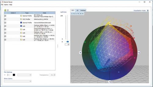
Different devices can actually have a common appearance as long as the correct profile calculation algorithms are used. When looking for common appearance, a more sophisticated gamut mapping strategy is needed because a major project could include printing on textile, a coated paper sheet, and a rigid plastic. A sophisticated tool is required to map any common target colour space to each of those different print technologies and substrates. Of course, spot colours need to be accurate, predictable, repeatable, and controllable if they cannot be reproduced given the gamut of the device.
The big consideration is what target colour space should be used: GRACoL, Specifications for Web Offset Publications (SWOP), standard red, green, and blue (sRGB), or others—or does a house standard need to be matched? One needs to choose a common standard for a common appearance, while also maximizing the capabilities of the equipment. Using a centralized engine strategy to adapt a standard to printing conditions is critical to be able to reproduce intended colour and preserve it across common materials and print processes.
A common practice of commercial printers is to invest in G7 certification, tools, and consultancy in an effort to achieve a common grey balance across devices and substrates. For many, it is the first experience into ‘real’ process control, working with a spectrophotometer to make sure colour looks correct—and learning that measuring densities, LAB values or linearizing CMYK is simply not enough.
Basically, G7 calibrates the grey balance and tonality of CMY inks, as well as the tonality of the black channel. The G7 calibration works fairly well to keep the grey axis very stable, but when it comes to a highly saturated special colour, it depends on where the colours of the printer actually fall. While G7 calibration is better than most, one does not want to look at just the greys, but also the achievable gamut and repeatability of the printing technology. The larger colour gamut of wide-format printers offers challenges and opportunities.
Wide-format printers can produce much more vibrant colours than their offset- or toner-based counterparts, so limiting their colour gamuts to an offset GRACoL standard may not achieve the desired ‘pop’ the print buyer is looking to achieve. At the same time, some common appearance with other printers or project pieces may be required.
The right colour management tools make the best use of this wide gamut. The objective is a methodology that allows a fairly standardized way of working with CMYK documents (files where the gamut has been reduced, using a limited standard such as GRACoL), as well as files that have preserved a larger gamut (such as RGB formats), and custom colours (such as Pantone, or customer specified reference).
Only a proper colour managed PDF workflow allows the correct interpretation of all these files simultaneously when combined with well-profiled or standardized output devices.
A centralized workflow: Making colour management simple
 [3]
[3]With a good centralized colour management system, proofs can be printed that represent the final colour of any printer. This frees up production presses and digital printers to continue to do the production work on the print floor.
Illumination
The first step of a centralized system shuts off colour management on all RIPs in the facility. They will receive colour-managed files, so they do not need to perform this function. However, the RIP still performs basic screening and separation of the file to the output device needs.
Next, the target colour space needs to be selected and the print processes calibrated to make sure they are consistent. Otherwise, the devices are not going to match each other. Calibration is a key component. This involves not only printing a tone scale for each colour, but an entire test chart with patches also for all overprints of the available printer gamut, measuring them, and making adjustments to optimize the match between requested and printed values.
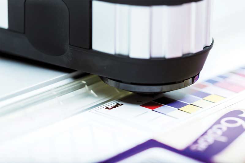
When the software has been updated and calibrated, how does one know it is correct? While some people perform calibrations regularly, it still needs to be verified. Calibration is basically a match of the colours of how they are supposed to be. This means using a spectrophotometer to verify colours are matching the exact colour they are supposed to print. This machine should be in a consistent state where it can return to next week, next month, or next year.
Once the calibration has been verified, it is time to build the profiles. It is how one can be predictable. While a good colour management system will have built-in grey adjustment similar to G7 offset systems, calibration from some colour management systems may not represent a good colour space. Printers typically want to create a profile for every output device to ensure they can obtain pleasing and predictable colour.
This involves creating a reference or ‘profile’ of the printer or press. A reference chart is printed and read with a spectrophotometer. This allows the software to understand what colours the printer can reproduce, as well as how it produces them. Good colour management software takes the printer colour output, compares it to the preferred standard (e.g. GRACoL CMYK or spot colour reference), and creates a link to correlate the printer’s colour capabilities to the colour target. Printers with a broader range of colours (gamut) support a better match to the colour standard or original colour being matched.
That said, colours do not have to be ‘dumbed down’ to the target colour space. A customer’s important brand colour does not have to be mapped into the standard GRACoL CMYK colour space. It is going to use any extra colour that one can get out of the printer to hit it as close as possible.
Note: Some colour technologies operate a bit differently than ICC. The big benefit is the quality of a separation. Device link technology separations can be much smoother in tonality, of a much higher quality while providing a better means of device-to-device matching with added benefit of ink savings.
Manage colour from one place
Therefore, when using centralized colour management, also known as a colour server, one will achieve consistent quality across all devices—conventional or digital presses—day in, day out, without having a lot of interaction with the production systems. This guarantees no matter what a client wants to produce, and no matter when they ask for it, a printer will always be ready to provide consistent, high-quality colour.
Erik Schmitt is director of sales, Canada, and wide-format product specialist, GMG Americas. He can be reached via e-mail at erik.schmitt@gmgcolor.com. Ryerson University is hosting a Specialty Graphic Imaging Association (SGIA) colour boot camp in June, showcasing GMG PrintFactory and ProofControl. For more information, visit www.colormanagement.com.
- [Image]: https://www.signmedia.ca/wp-content/uploads/2019/06/GMG-Image.jpg
- [Image]: https://www.signmedia.ca/wp-content/uploads/2019/06/Gamut.jpg
- [Image]: https://www.signmedia.ca/wp-content/uploads/2019/06/GMG_COLOR_IMAGE_06_2015-7415_PREVIEW.jpg
Source URL: https://www.signmedia.ca/getting-colour-right-when-printing-more-than-signs/