Wide-format Printing: How G7 improves colour management
by all | 22 February 2018 2:42 pm
 [1]
[1]Photos courtesy Inca Digital
By Jim Raffel and Shelby Sapusek
The International Digital Enterprise Alliance’s (IDEAlliance’s) G7 methodology for calibrating inkjet printers and other devices improves wide-format graphic production by ensuring colours are more consistent and repeatable throughout the workflow. The successful implementation of this methodology involves adopting industry best practices as day-to-day processes, starting at the design phase.
Defining the methodology
Many signmakers have never heard about G7, while others have only a limited understanding of it. G7 is not a gadget, quick-fix solution, gimmick or buzzword. It will not fix all of a sign shop’s printing problems or even all of its colour problems.
G7 is a process for calibrating a cyan, magenta, yellow and key/black (CMYK) device to a known ‘good’ print condition, based on a neutral grey point. This calibration process takes into account both the white point and the solid black point of the substrate. Between these two points, a series of curves are created for the CMYK channels to balance them to the black.
About 10 years ago, when the G7 methodology was originally being developed, the calibration was performed with graph paper or a complicated Microsoft Excel spreadsheet. Nowadays, all of the ‘heavy lifting’ is done by software, whether stand-alone or within a raster image processor (RIP).
Designing with colour management in mind
All print service providers (PSPs) inevitably have to do at least a little tweaking with client-supplied artwork as it enters their facilities. After all, most such artwork was not designed with the specific substrate, ink type and output device in mind. What designers can do at the beginning to improve the process, however, is to keep colour management in mind.
Today, almost all wide-format graphic files originate in mainstream design software, such as Adobe Creative Suite, which includes PhotoShop, InDesign and Illustrator. No matter which application within Adobe’s suite is chosen for file creation, the colour management setup is, conveniently, the same—but the default setting is not optimal for printing. So, for sign shops, it is important to edit the settings, paying special attention to the colour space options for red, green and blue (RGB) workstation screens and CMYK printers.
For RGB, the default working space setting for is standard RGB (sRGB) International Electrotechnical Commission (IEC) 61966-2.1, while for CMYK, it is Specifications for Web Offset Publications (SWOP) version 2. The problem with both of these default settings is they greatly restrict the size of the colour gamut.
In printing, it is recommended to change the RGB working space setting to Adobe RGB (1998) and the CMYK setting to General Requirements for Applications in Commercial Offset Lithography (GRACoL) 2006 Coated and International Organization for Standardization (ISO) 12647-2:2004, Graphic technology: Process control for the production of half-tone colour separations, proof and production prints, Part 2: Offset lithographic processes. Both of these will open up the colour gamut, setting the stage for a better print job with more precise and accurate colours. And they can be saved as ‘presets,’ so there is no need to change them at the beginning of every new project.
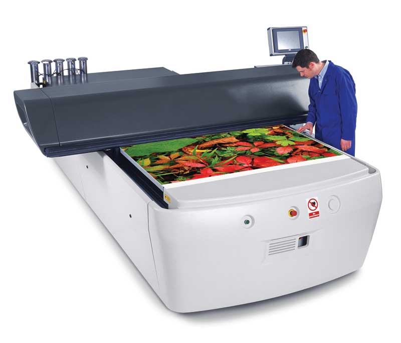
 [2]
[2]Custom profiles are developed for the precise resolution and speed of the combination of printer, ink and media.
A series of choices
In the world of wide-format inkjet printing, colour management ultimately comes down to a series of choices. How signmakers make those choices will have a significant impact on the visual appearance of the graphics they produce using any given device (or series of devices).
One of the first choices is how the design workstations will be configured. At the outset, it is important to make time to calibrate the monitors and confirm all workstations and design applications are using the same colour management settings.
After these design settings have been established, the next big decision is whether to develop a custom colour profile or to use a ‘canned’ International Color Consortium (ICC) profile. Many professionals mistakenly assume going with a canned profile means having to sacrifice certain attributes like G7 compliance, but this is not necessarily the case.
It is quite possible for a canned ICC profile, depending on its source, to have been developed in a way that will result in G7-compliant printed graphics, but to achieve a sufficient level of conformance, it will usually be necessary to change a couple of colour management settings within the RIP software, just like the aforementioned examples within the design software.
CMYK source profile
The first setting to consider is the CMYK source profile, which defines the target colour gamut the RIP should aim for when outputting the file to be printed. Given the G7 methodology is intended to calibrate CMYK devices, the key here is to focus on the input profile for the test image files that will be sent to the printer to assess their conformance.
GRACoL 2006 and GRACoL 2013 are both suggested starting points when checking a canned profile for G7 conformance. If they are not available as selections within the RIP software, then they can be downloaded from IDEAlliance’s website (www.idealliance.org).
The choice between these two versions of the CMYK source profile may be complicated, driven mostly by the particular instrument used to create a profile and measure the test image. When in doubt, it is best to start with GRACoL 2006.
Rendering intent
The second setting to consider is rendering intent, which guides the RIP in terms of how to map out-of-gamut colours from the source profile to the device profile. This can also be a rather complicated matter.
An absolute colorimetric rendering intent is suitable for very precise colour proofing, but is seldom used in wide-format inkjet print production, where graphics are intended to be viewed from further away.
A relative colorimetric rendering intent, which is the default setting in the aforementioned Adobe software, is a more appropriate choice for sign shops that provides consistent, repeatable mapping of colours and ensures G7 conformance most of the time.
A perceptual colorimetric rendering intent is a great choice for photographic work, but does not provide the consistent, repeatable colour mapping necessary for G7 conformance.
Test prints
As mentioned, once the graphic design applications have been properly configured and the RIP’s colour management settings have been selected, it is advisable to run a test print under those conditions, along with another test print with the original settings, so as to compare the results.
At this point, the same canned profile is being used, just with a few colour settings adjusted throughout the workflow to improve consistency. For some clients, this will be sufficient, but in other cases, the test prints reveal the need to develop a custom profile.
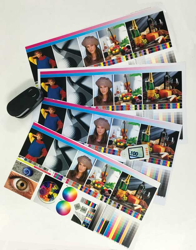
 [3]
[3]Software can be used to set ink restrictions for each colour.
Customizing a profile
When the standard steps do not achieve the expected colour results, the next option is to develop a custom profile. By taking the time to do so with the specific device and production environment in mind, signmakers can ensure the best possible colour gamut is attained.
A custom profile is developed for the precise resolution and speed of the combination of printer, ink and media being used. A canned profile may not support these desired settings.
The process of creating a custom profile involves setting primary or per-channel ink restrictions for each colour. The production department’s specific environmental conditions may dictate using more or less ink than with a canned profile. This step is very important. With some practice, colour managers will learn how to create the maximum colour gamut for a device under a given set of printing parameters.
After the primary ink restrictions are set, the next parameter to define is linearization. This is the process of optimizing control over the variables involved in printing, so as to ensure predictable results. With many RIPs, linearization is what enables G7 calibration to occur.
It can be tricky to determine where specifically to insert G7 calibration into the RIP software for wide-format inkjet printing. For one thing, there is no standard way of doing it. For another, the RIP’s own algorithms for the colour management workflow may generate calibrations that are lacking in image consistency.
So, some practice will be needed. The payoff will come when the grey-balanced and known ‘good’ print condition is achieved, as then a common visual appearance will be seen across many graphics despite their different variables, from fabrics to rigid substrates, from dye sublimation to ultraviolet-curable (UV-curable) inks and from small roll-fed printers to the largest flatbed presses.
Jim Raffel and Shelby Sapusek are co-founders of ColorCasters, a colour management consulting and training company. Raffel is a certified G7 expert and Sapusek is a certified digital colour professional. This article is based on a seminar they presented in October at the 2017 Specialty Graphic Imaging Association (SGIA) Expo in New Orleans, La. For more information, visit www.colorcasters.com[4] and www.sgia.org.[5]
- [Image]: https://www.signmedia.ca/wp-content/uploads/2018/02/G7_Spyder-320-5.jpg
- [Image]: https://www.signmedia.ca/wp-content/uploads/2018/02/G7_Feature-Image-Shows-Results-of-G7-Profiles.jpg
- [Image]: https://www.signmedia.ca/wp-content/uploads/2018/02/G7_DSC8582-17-9.jpg
- www.colorcasters.com: http://www.colorcasters.com
- www.sgia.org.: http://www.sgia.org
Source URL: https://www.signmedia.ca/how-g7-improves-colour-management/