
Letters: Appear simple to create but not so easy to perfect
By Craig Berger
Drive down any main street in North America and you will notice the domination of brands integrated into the architecture. Digital screens, large-format graphics and, of course, dimensional illuminated channel letter signs—all reaching out to you. The goal of these elements is to communicate brand value, consistency, and quality. However, the one difference you will also find is the quality of the display is not consistent.
Their aim is to reinforce the brand iconography, colour, and quality while also maintaining a strong image during different daylight and evening conditions. Signs also must be built to withstand environmental rigours with little to no maintenance, while maintaining consistency of brightness across the face.
Dimensional illuminated channel letter signs appear simple to construct, but are difficult to get totally right. They have to suit the demanding conditions of indoors and outdoors, of varying light conditions and, of course, the cost versus quality considerations.
Key lighting factors for channel letters
Powerful brand-oriented illuminated channel letters require an understanding of the balance between illumination, colour, materiality, and design, including the following factors:
LUX and brightness
LUX is lumens per square foot and is the key determinant for measuring brightness. While there is one measurement for LUX, actual visible brightness on signs is determined by a variety of issues, including exterior and interior lighting conditions, contrasting nearby lighting, the context for how the sign is being used, and the colours. Without field testing, a simple LUX measurement is not enough to determine the brightness of a sign.
When LEDs are specified, the output of the individual LED is important, but so is the depth of the letter and its placement. More LEDs do not necessarily produce a brighter sign, and more complex channel letters require careful selection of the LED, and most importantly, the placement.
Colour and light consistency
Colour and light consistency are also major factors. LEDs in most cases are white and filtered through a substrate to achieve the proper brand colour. That substrate is usually acrylic, but can also include vinyl, mesh, or fabric. Matching a brand colour to an illuminated sign starts with a colour match, but then delves into material properties, light approach (reflective or transmissive), and the gloss level of the surface.
Optix by Plaskolite for smaller letters or polycarbonate and vacuum-formed plastic for larger letters, are acrylic surfaces used for both indoor and outdoor channel letter and cabinet signs. Colour consistency can be influenced by not just the colour of the acrylic, but also its thickness, the depth of the channel letter, and the colour temperature and power of the LED itself. By selecting the correct substrate, the channel letter can both achieve colour match and light output. These examples show the difference between translucency levels of the same colour acrylic.
Hotspot and shadowing

Colour consistency is important, but light consistency across the sign determines overall quality and look of the sign. Poor LED placement will result in shadowing around the edges and details, while improper depth and acrylic specification can result in hotspots or pinpoints of light that break the consistency of the sign. Low quality LEDs or acrylic can also lead to hotspots by degrading over a period of time.
Shadowing is a common problem in complex signs that use flourishes and serifs, particularly with thinner channel letters.
Day and night effects
Channel letters must be effective both during the day and at night. There are specific acrylic and mesh products that allow signs to change in colour between day and night, but even if the colours are meant to stay the same, the appearance will change with the dimming or absence of illumination. In addition, many white LEDs today are now ‘tunable’ meaning they can adjust colour temperature based on daytime, dusk, and evening/night conditions.
Quality
Generally, top brands use tier 1 LEDs which are higher quality engineered products that have lower lumen depreciation, high binning quality (illumination consistency across large numbers of LEDs), and layout support services. In addition, the quality of the surface and base materials effects overall letter quality, particularly when the element is meant to be seen up close.
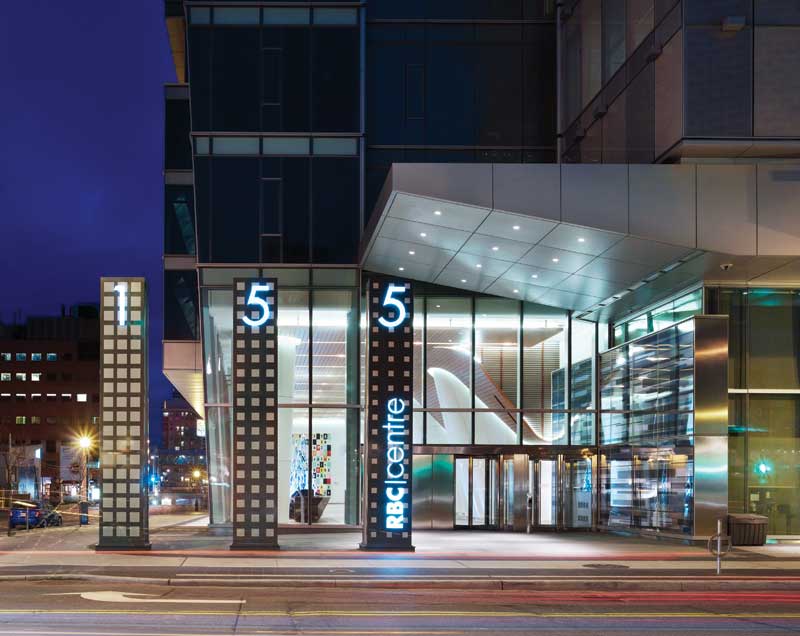
RBC Centre by Kramer Design Associates illustrates the importance of higher quality materials for landmark projects. These channel letters not only must meet the vigour of an exterior environment, but they must also be tactile and seamless.

Sign up for our newsletter
Featuring breaking news from Canada's sign and graphics industry.
Products

Read the Latest Issue

