
Letter effect
A channel letter is not just about light, but about effects. A basic illuminated ‘trimless’ face letter or icon is most common, but there are dozens of effects that are popular including faux neon and reverse illuminated letters. Even for traditional channel letters there are endless letter effects that affect the quality of light output, including depth, tactility, and complexity.
Low profile trimless channel letters are a big trend. This illuminated letter is being tested by Urban’s Signs D2 brand. However, there needs to be an increase in the number of LEDs to compensate for the shallowness of the letters.
Designing a channel letter sign for brands
Designing an illuminated channel letter is beyond the abilities of one person, but a strong collaborative process can create powerful letters for dozens, if not hundreds, of locations. What needs to be done is to form a close relationship with a LED company or lighting specialist.
Most designers and sign fabricators are not lighting experts. Lighting experts are people who work, not just with LED lights, but understand the entire ecosystem of channel letters including acrylic, depth, specific effects, and how all these factors affect the brightness of the sign. Forging a strong relationship with a LED partner must start before there is a specific project, and all the details and issues that must be considered before designing a sign, must be clearly communicated.
Toronto-based Brandactive has a close working relationship with the Bitro Group. The two work closely together on projects, starting with educational outreach, followed by sharing project guidelines and design. Bitro proposes lighting solutions (optimal product and layout), and finally prototype samples. For institutions like Cytiva, this process had to be repeated across the entire sign vocabulary to ensure consistency.
Prototype before implementation
It is difficult to prototype for every small project. However, for any multi-facility effort, prototyping is important and should include mockups of the complete element including depth, acrylic face, and LED population. Fine-tuning the prototype is critical for creating a tight specification.
Tight specification
After prototype approval, it is important to create strong documentation and tight specifications for the channel letter, including LED selection, layout, depth and materials. For ongoing brand rollout, a combination of product and performance specification is a must. That means including both exact product descriptions and overall performance goals such as lumen output and colour temperature and consistency. This will ensure fabricators will meet the standard established by the prototype.
The City of Ottawa employed Entro to design their illuminated icon for the OC Transpo system. Tight documentation for vacuum-formed coloured acrylic ensured every sign met the high-performance standards including colour matching and brightness.
It is important to create strong documentation and tight specifications.
Guidelines
Guidelines are important for any ongoing project. They include final documentation, but also establish procedures for design review, sample letter, and installation procedures. Guidelines can even include operational information for fine-tuning illumination to meet specific exterior conditions. They also enshrine design intent when expanding to multiple locations and creates a clear line of communication between the client, designer, and the fabricator.
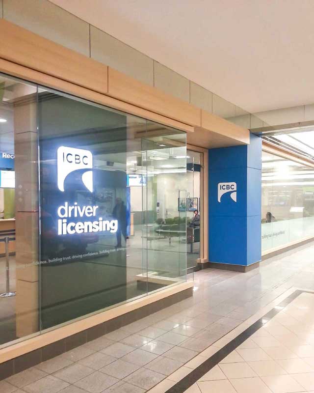
Cygnus created comprehensive guidelines for ICBC focused on maintaining consistency across all sign types including illuminated letters and icons.
Craig Berger is chair of the Visual Presentation and Exhibition Design Program at the Fashion Institute of Technology in New York City, as well as a consultant on professional, manufacturing, and academic projects. He has been a researcher and writer for the Society for Environmental Graphic Design (SEGD), International Sign Association (ISA), and Sign Research Foundation (SRF).


