
Managing colour for success
When developing a profile for a given type of media, signmakers should make sure enough ink will be put down for good coverage without excessive buildup that could lead to banding or oversaturation in the print. This is where RIP feature sets and performance will come into play.
RIP performance
For commercial wide-format inkjet printing, RIPs should offer a feature set that allows for calibration, media profiling, the use of conventional printing profiles and spot colour libraries and the ability to edit job colours if needed.
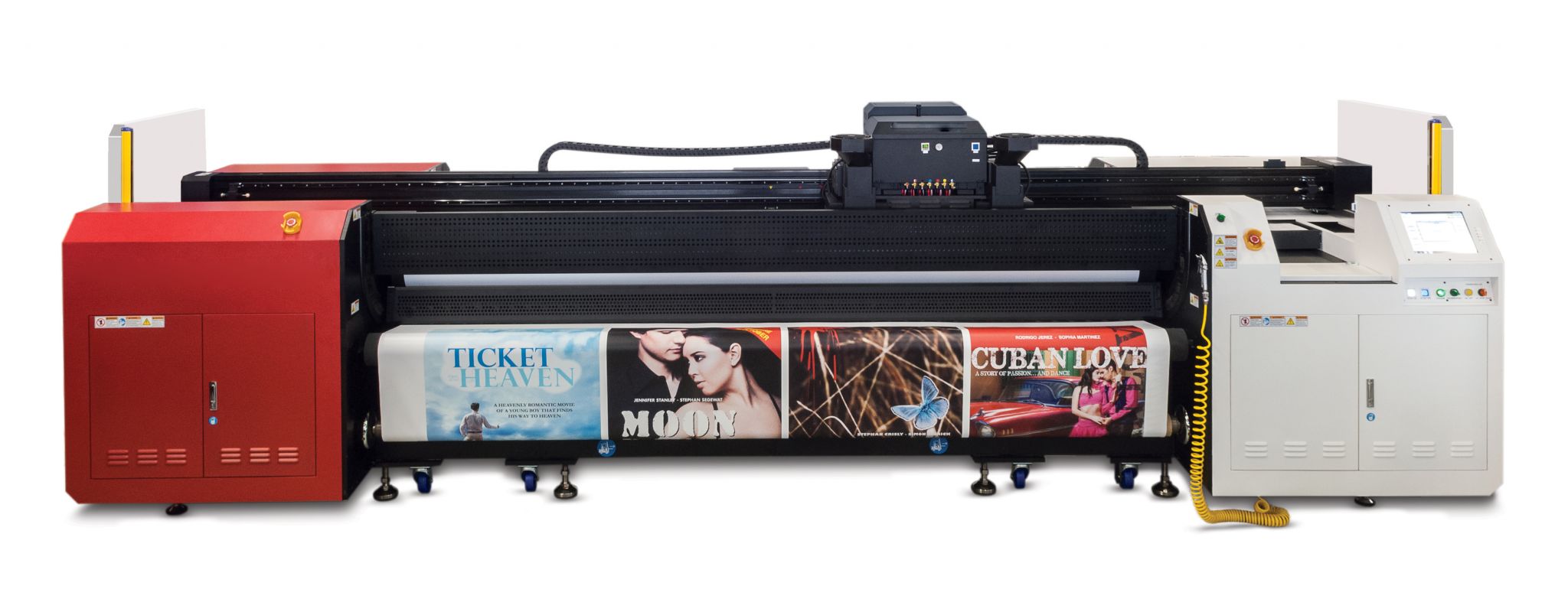
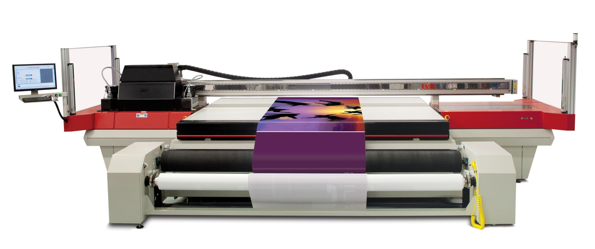
Some of today’s wide-format printers use both the primary CMYK inks and lighter,saturated cyan and magenta inks to provide smoother transitions for RIPs when handling CMYK and RGB reproduction. Colour saturation is particularly important for colour management of graphics that will be backlit.
Some also add a white ink channel, which in turn allows more accurate top-surface spot colour reproductions on virtually any substrate. Printing with a white undercoat will give spot colours a greater chance of meeting agreed-upon accuracy expectations when printed on off-white media.
Further efforts to expand the print gamut will include other colours, like orange and violet, in the future.
A media profile can be created using the RIP’s own profiling option or third-party software. In each case, the user must determine the individual limits for each channel of ink, so as to achieve optimal coverage per channel, and then set the total ink limit for four-colour (or more) combinations. The goal is to achieve adequate coverage and matched colours without wasting ink or causing too much saturation. When multiple inks are laid down together to create darker colours, for example, too-saturated coverage can cause uneven banding, undesirable ‘overglossing’ and too thick a film of ink.
Once the total ink limits are satisfactory, the next step is to adjust the media profile for a specific printing resolution and speed. These factors will vary somewhat, since solvent inks are typically printed onto more absorbent materials than UV-curable inks, so a spectrophotometer should be used to read all of the colour patches and determine the Delta E variations between expected and actual printed colours. If these variations are too wide, then adjustments must be made using the RIP’s colour manipulation tools.
Once the media profiles have been created, the easiest way to predict the appearance of spot colours is to print the full Pantone library on a profiled substrate, to be used as a reference for future jobs. Third-party software can also be used to fine-tune specific colours for certain jobs, but some RIPs will allow users to print colour iterations, so they can see how minor changes in CMYK ink percentages will alter spot or brand colours, without having to bring in third-party software.
Media profiles are also beneficial in that they can be used as a working space or preview space for a variety of applications, providing a sort of ‘soft proofing’ that allows operators to preview jobs as they create or preflight files (as long as their computer display monitors have also been calibrated for optimum colour matching).
The aforementioned offset and web printing industry standards have helped balance overall colour by providing a starting point once media profiles have been developed and selected. Signmakers will want to make sure all of their raster-based CMYK output uses the same source profile—e.g. Specifications for Web Offset Publications (SWOP), General Requirements for Applications in Commercial Offset Lithography (GRACol) or Forschungsgesellschaft für Druck- und Reproduktionstechnik (FOGRA)—while vector-based CMYK output should be set to the media profile that achieves the most colour gamut with the given printer/substrate combination.
One exception to this rule is when graphics feature a gradient vector blend, which can result in visual ‘stepping’ in the gradation, depending on the number of colour patches that were read to create the media profile. When there is both a gradient vector blend and a raster image, using the same source profile is preferred.
Some RIPs provide recalibration tools. These should be used if printer operators notice colours drifting or other visual differences over time. And if there is a further need to match offset lithographic printing, the International Digital Enterprise Alliance’s (IDEAlliance’s) G7 calibration methodology can also be applied to wide- and grand-format printing to help neutralize grey output and maintain visual consistency within the print shop.
That said, a certain degree of continuity can certainly be achieved by using offset print standards like SWOP, GRACol or FOGRA.
The colour equation
Whatever printing technologies a shop uses, its goal will be to produce stable, predictable and repeatable full-colour output. By following best practices, not only is consistent colour reproduction within reach, but shops can also save time, materials and money.
David Tung is a colour systems specialist in Agfa Graphics’ global services business. This article is based on a seminar he presented at the 2013 Specialty Graphic Imaging Association (SGIA) Expo. For more information, visit www.agfagraphics.com and www.sgia.org.
Sign up for our newsletter
Featuring breaking news from Canada's sign and graphics industry.
Products

Read the Latest Issue

