
Matching spot colours on digital presses: How to make sure the brand strikes the right colour
By Birgit Plautz
Whether it is marketing collateral, packaging, or displays, brand colours must always match. Just a few years ago, one could have walked through a wide-format trade show with only a few (if any) colour management vendors. Many digital press companies only talked about calibration, and expectations from brand owners were less. However, this is not the case anymore.
Today, brand colours are printed on many different types of presses. In a retail outlet, one can see a logo printed using a flexo (packaging), offset (labels, tags, or marketing collateral), or a wide-format inkjet press (signs and displays)—all at the same time. That said, how can one ensure brand colours are consistent with different print techniques, ink sets, and gamuts? How can one match a specific ink colour with process colours?
Fortunately, there are ways to match spot colours on digital presses and proof them accurately. Colour management software helps to make sure brand colours are reproduced accurately and consistently on any digital or traditional press. Software can also create precise proofs on dedicated, smaller digital printers, so larger production presses are not interrupted from their primary, revenue-generating jobs.
Gamut size
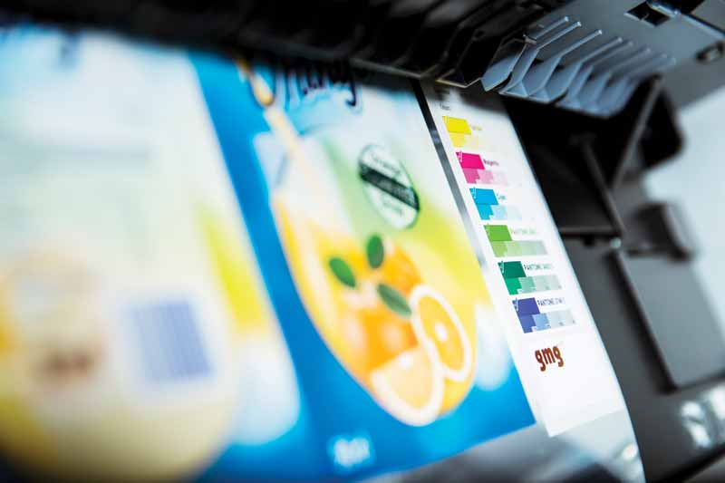
A larger ink set is the first requirement to increase the potential gamut of a press. An extended ink set results in greater gamuts that are physically able to expand those covered with four-colour process printing. The reason why many printers have more than four (typically cyan, magenta, yellow, and black [CMYK]) inks is simple: they offer a wider gamut, which means more reproducible colours. This is particularly true for shades that are difficult to achieve, such as brilliant orange tones and some greens. A good rule is to operate a print system with seven colours, delivering the greatest number of additional spot colours with a manageable system. Colour management software can show how large the gamut has become with more ink units on the printer.
One benefit of digital inkjet printers is graphics are not printed using traditional halftone dots; they typically use FM (frequency modulation), or stochastic, screening. As one adds colours with traditional halftone screens, there is a greater likelihood moirés will appear. However, with FM screening, it is much more forgiving.
Choosing inks
An interesting exercise is determining the right ink set for a specific job. Of course, this depends on how many ink units there are on the printer. Many professionals focus on CMYK plus a combination of orange, green, and violet. The arrangement of these inks can offer reasonably close numbers of Pantone matches (within 2 Delta E [∆E]) for a majority of brand colours.
Better colour control from the centre rather than the front
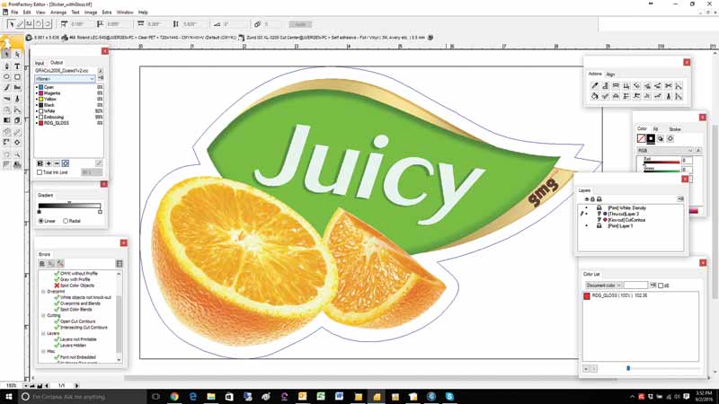
Digital inkjet printers used for signs are often driven by a front-end raster image processor (RIP), which is delivered with the piece of equipment. Unfortunately, if the responsibility of colour management is placed individually on each RIP, the translation of colours may not be interpreted the same. Different printers could use different front-end RIPs—or, simply, they could be set up differently. Thus, the colour output may vary.
That said, a centralized colour management system ensures colours are interpreted accurately. The software handles spot colours—as well as process image colours—and sends them to each RIP with the same colour interpretation. If the colour management role of the RIP driving the inkjet printer is shut off, the representation of colours cannot be destroyed. This does not mean other functions of the front-end system—bleed, nesting, folding, and sometimes cut files—need to be turned off, too.
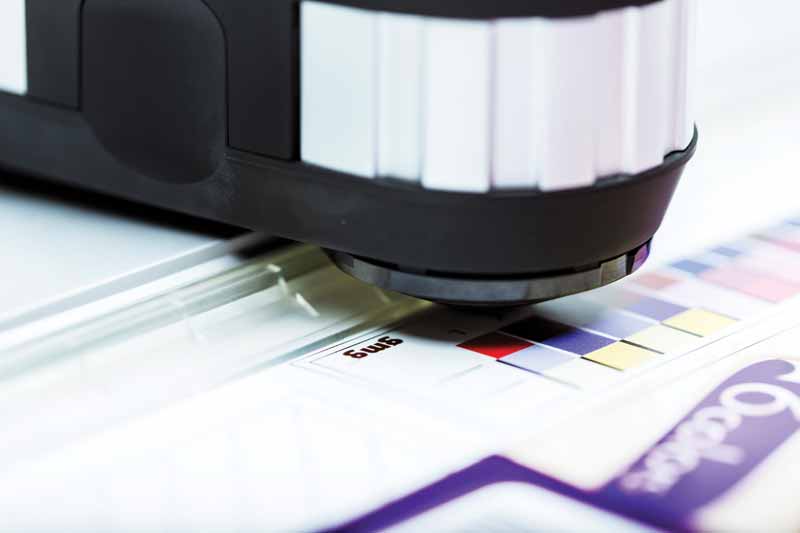
A centralized system provides a consistent, colour-matched file to any device. Each output system can be calibrated to the same reference standard. With a common reference point, all remote systems can use the same colour transformation profiles (device link profiles) that define the colour match between the target data and output proof. Any number of printers can be aligned and matched, even if they are using different substrates. Spot colours can be matched precisely to the printer’s colour gamut and remain consistent even if the printer shifts. The base calibration is more elaborate and consistent than International Color Consortium (ICC) linearization.
ICC or device link?
RIPs are almost always set up with printer profiles. Many contain ICC linearization and ink limits. When input profiles are created, files or images will be tagged with the respective profiles (red, green, and blue [RGB] images with RGB input profiles, CMYK with CMYK profiles, etc.) and converted to the ICC printer profile using the rendering intent. This means the colour values are converted to achieve an as-close-as-possible match to the input, taking into account the limits of the printer. However, there are a couple of problems that may occur in the process:
- Colours may look different because the input profile might not match the ICC profile the designer intended. For example, when an image with text on top is processed and the text colour is derived from a part of the image, changing the profile or intent with the image changes the colour of the image relative to the text.
- Since perceptual intent changes all the colours in a file (not only those outside the gamut), colours might appear very different, depending on whether the user converts to standard General Requirements for Applications in Commercial Offset Lithography (GRACoL) specifications or the printer profile. The same job on different printers will vary on output, since the gamut of different devices can differ significantly, and the perceptual intent adapts all the colours to the output profile.
Some colour management companies have created ‘device link’ technology, which offers more control than ICC profiles. One of its biggest benefits is the quality of separation. The goal of the device link iterative process is to achieve the closest match possible—a common or target colour space. For this, a chart is produced and measured, and the profile is updated. This process is repeated to ensure the best colour output. It does not convert from CMYK directly to CMYK, and there is no conversion to three-colour in between, which is typical for ICC. When converting to a three channel from a three-to-four channel, a lot of information is lost and then reinterpreted. The separations are much smoother and of a higher quality when using the device link technology. The result is a more neutral grey balance and accurate colour reproduction.
Unique gamut mapping means print-service providers (PSPs) can achieve both—accurate colour reproduction as well as chromatic adaptation, even when the equipment’s gamut is smaller than the original. Instead of having to choose between colorimetric (accurate colour) or perceptual (image detail) as in ICC, device link technology offers a dynamic mix, providing the most accurate colour without losing any image detail. Of course, detail is not often required for brand colours within logos—but one can never know for sure.
Since the device link profile defines the separation—also of how a spot colour is being reproduced—and the link is only created once, spot colours print much more consistently over time. The only element that gets updated is the recalibration and, as such, the colour is corrected, and the separation in inks remains the same. This delivers a higher consistency than reprofiling, which is required in ICC based systems.
Finally, while many colour management systems perform a good job when sending a CMYK file, the brand colour is much more accurate if the software can send an eight- or 10-colour file. If a CMYK file is delivered, then one must rely on the quality of the printer’s RIP to separate the spot colour.
Sign up for our newsletter
Featuring breaking news from Canada's sign and graphics industry.
Products


Read the Latest Issue
