
Navigating St. Lawrence Market
Post production
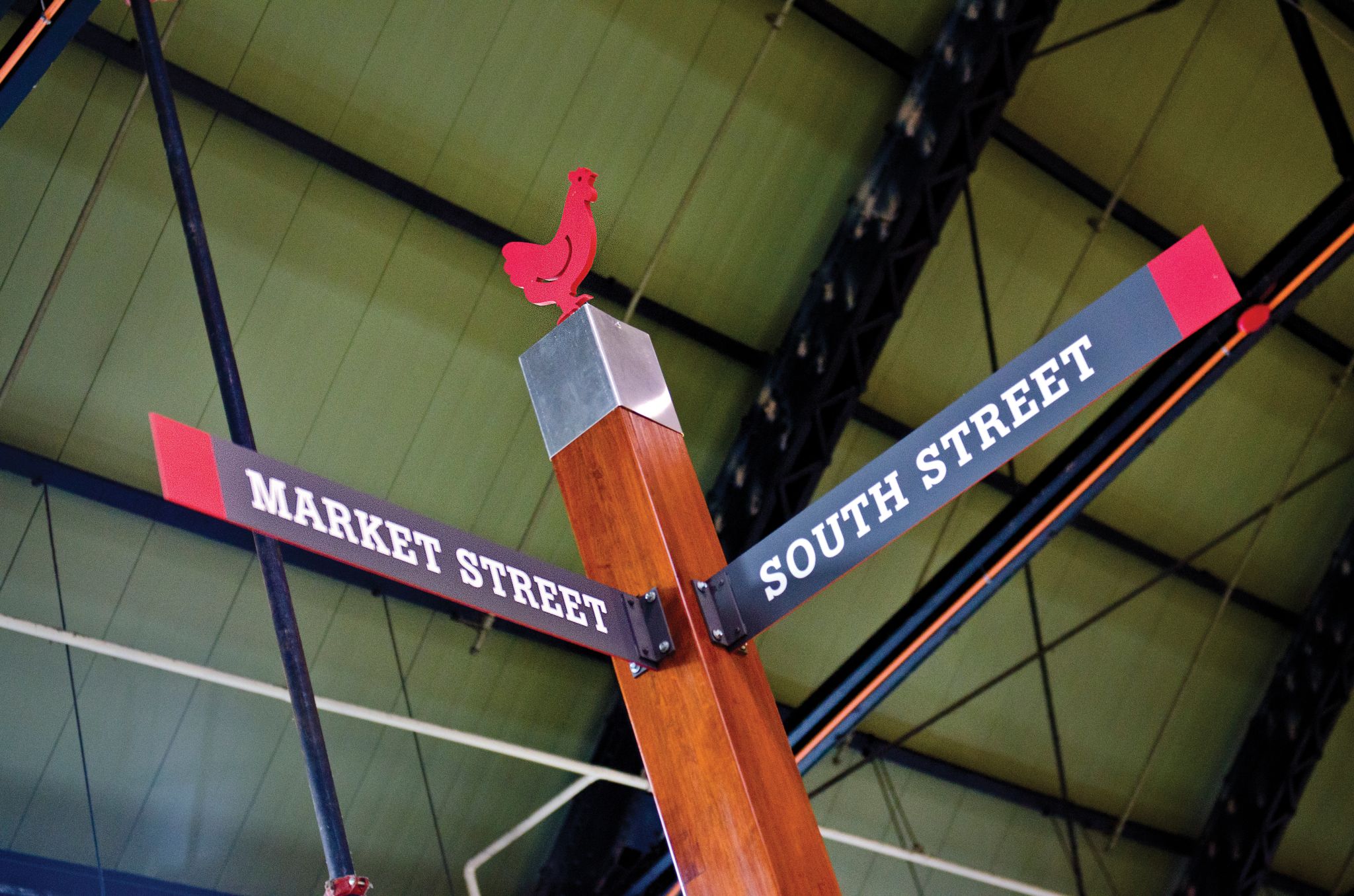
The post signs echoed the names of the streets surrounding the South Building (Front, Market, Jarvis and Esplanade), as well as adding a ‘Main Street’ through the middle and representing the city’s major ‘King’ and ‘Queen’ Streets. The ground-floor naming system was then reflected in the basement level with Lower Front, Lower Market, etc.
“It’s both a replacement system and an add-on,” Ziesmann says. “The existing system was missing consistency in sign colours, shapes, fonts and messaging, so it all blended into a clutter, rather than becoming recognizable as a system. The market’s manager felt a new system was really needed and had been after the city for funding for a long time. Visitors look for consistency and we pushed a simple red and grey scheme.”
The indoor street posts were topped with shapes representing the various sections of the market—including silhouettes of a rooster, fish, flower, sausage, cake and wine bottle—to add personality and break through other visual clutter, as the more than 50 specialty vendors in the South Building all have their own non-standard signs.
“Our clients—which included the city and the manager—didn’t have a specific idea about what they wanted,” Ziesmann says, “so we had a lot of freedom, as long as the signs fit into the esthetic of the market and were somewhat subtle. They didn’t want them to stand out and ‘scream.’”
The sign posts were manufactured and installed by Zip Signs, based in Burlington, Ont. To ensure the weathered wood posts would be sufficiently sturdy, a steel pole was inserted into each and then into the floor beneath. The positions of these signs were chosen based on common walking paths and decision points.
“The clients were very happy with the sign posts,” says Ziesmann, “and the vendors are already getting asked less frequently about the washroom locations.”
Downstairs, meanwhile, given the lower ceiling, some directional signs were hung instead of posted in the floor. Illuminated washroom signs were replaced with non-illuminated—but still bold and eye-catching—graphics.
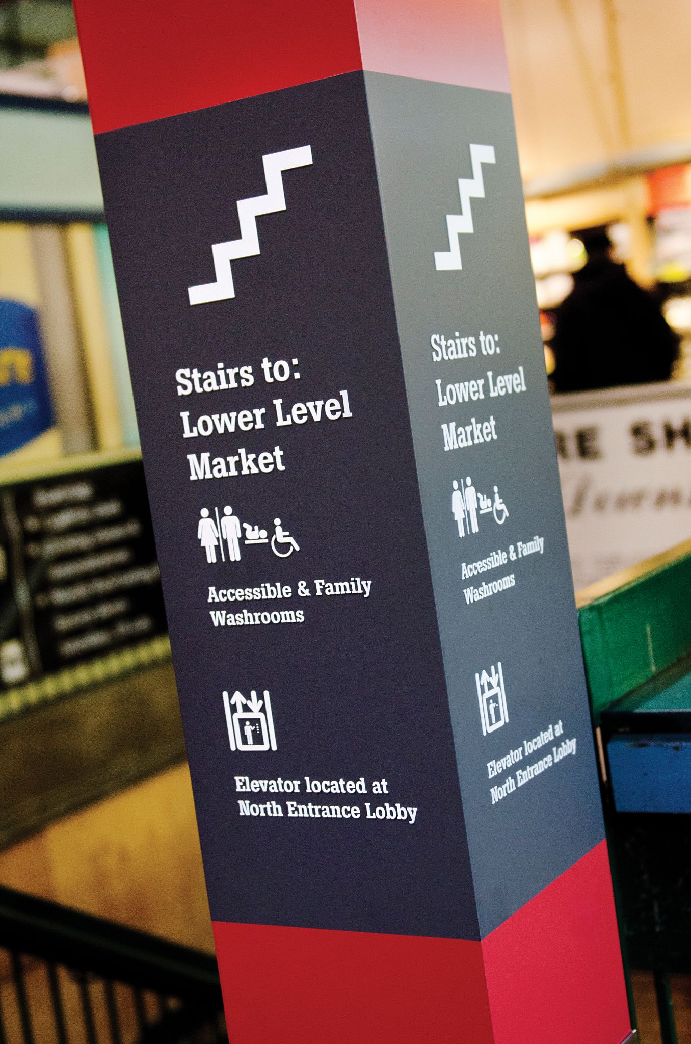
“Due to a lack of maintenance, the older signs weren’t illuminated anymore anyway,” says Ziesmann. “And some washroom doors did not have signs on them at all, failing to meet standards for accessibility.”
Throughout the sign system, the typography was inspired by the market’s original exterior signage.
“The marketing manager wanted the system to fit into the history of the building, which already includes a gallery featuring the city’s collection of historic photos,” says Ziesmann. “One of our goals was to pay homage to the heritage of the site, whereas the new North Building will have a much more modern feel. We feel wayfinding plays a big role in branding; it is so different from project to project.”
Work in progress
At the same time as the wayfinding signs were installed, interior designers renovated the lower-level washrooms and added wood laminate to the main lobby. The redesign process continues today with the implementation of directories and other signage elements.
“Every entrance will have a set of vendor directories and there will also be some exterior ones,” says Ziesmann. “It won’t fully come together as a wayfinding system until it’s all in.”
Graphics will be added to the lobby doors and cut letters will identify exits to each street more clearly. The city, the market manager and SLD all recognize completing the process takes time.
“They had hoped to get this done in three or four months, but instead the project came and went over several years,” says Ziesmann. “That said, we liked working on it in little steps. The market manager made sure the tenants would be happy, while the city handled administration and made sure the signs would be accessible.”
With files from Shikatani Lacroix Design. For more information, visit www.sld.com.

Sign up for our newsletter
Featuring breaking news from Canada's sign and graphics industry.
Products


Read the Latest Issue

