
Niagara Falls welcome sign mimics vintage postcard
By Peter Saunders
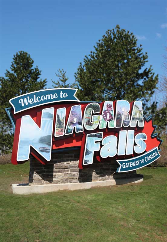
Signature Sign & Image recently designed, fabricated and installed a new dimensional sign that welcomes visitors to its hometown of Niagara Falls, Ont., as they arrive from the U.S. over the Rainbow Bridge border crossing. Inspired by vintage postcards, it adds a touch of bright colour to the side of Highway 420 near Powell Avenue, less than 500 m (1,640 ft) from the border.
A time to celebrate
The project began in spring 2017, when the municipal government asked for design bids. City council would fund the sign as part
of its Canada 150 events, which also had federal support.
“It was strange how there was nothing in the area to welcome the many American tourists who use the bridge to arrive in Canada,” explains Emily Butko, graphic designer and marketing director for Signature Sign. “We had made other ‘welcome’ signs for people coming to the Falls from Toronto and St. Catharines, Ont., so once the city had the Canada 150 funding, they asked us to bid on this project.”
Given the nature of the location, facing east toward the U.S. border, the city’s criteria for the sign included a requirement to integrate the slogan, ‘Gateway to Canada.’ Signature Sign submitted two concepts with its bid in June 2017. One of these, designed by Butko, was selected in September.
“The inspiration came from my mom’s collection of vintage Niagara Falls postcards and other memorabilia, which featured iconic local images within each of the letters spelling out the place name,” she explains. “That style, with big, chunky letters, was very popular in the 1950s and ’60s. I visited antique malls in Niagara Falls, N.Y., and bought a tonne of those postcards for reference.”
Selecting images
With a combination of stock, client-supplied and newly purpose-shot photos, Butko used graphic design software to add a ‘painterly’ effect to the images.
“It also took a lot of tweaking in Adobe Photoshop to make the images fit well in the letters,” she says. “Then we had to go back and forth with the city over the content in each letter. That was the most challenging and time-consuming part of the project.”
A volunteer committee led by Chris Dabrowski, co-owner of the Niagara Falls Comic Con, was in charge of organizing local Canada 150 events and legacy projects throughout 2017. The sign was this committee’s final project and all members had input for the design, especially the photos in each letter. In one case, for example, an outdated photo of the Maid of the Mist boat tour was replaced to showcase the newer Hornblower Niagara Cruises vessel.
The final selection of images also included the Horseshoe Falls, fireworks, the Skylon Tower, the Niagara Skywheel and dice to represent both Casino Niagara and the Fallsview Casino, among other iconic images.
“I designed the sign through February 2018,” says Butko. “During that time, while the actual contents of the letters were revised, the original technical drawings did not really change. It was fabricated and installed over a one-month period, from February into March.”
Sign up for our newsletter
Featuring breaking news from Canada's sign and graphics industry.
Related Products
Read the Latest Issue
