
Photo courtesy Samsung
By Adam Mitchell
When customers approach a storefront, one of the most important questions for the retailer is: what do they see? Do they see the brand? Do they see the merchandise? Do they see the front windows and what is displayed in them?
Customers actually see the entire retail environment, not just a single aspect of it in isolation. As such, one of the most effective ways to emphasize the visual appeal of a retail space is through dynamic lighting and integrated graphics.
When independent market research agency CQM tested dynamic lighting over a 21-week period in a co-op supermarket group, the study showed sales increased within the affected areas. (A special tracking system, installed in grocery baskets, was able to trace shoppers’ specific movements within each store, including the routes they took and how much time they spent in each department. It turned out they spent more time near ‘warm’ lighting than near ‘cool’ lighting.)
In other words, dynamic lighting not only improves the in-store experience for customers by making it seem more inviting and engaging, but also demonstrably increases revenue for the retailer.
A complementary concept
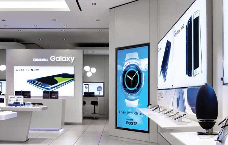
With respect to in-store lighting, one of the most important—and easily overlooked—aspects is the proper integration of lightboxes. As the sign industry is well aware, the combination of lightboxes with rich, colourful graphics can capture people’s attention, but perhaps less-known is the importance of complementing other existing in-store illumination, in terms of the type, intensity and colour temperature of the lighting.
Traditionally, this matching was difficult to accomplish, as lightbox components were specified with a ’one size fits all’ approach. With today’s light-emitting diode (LED) technology and constant innovation, however, better visual experiences, greater durability and lower costs have been achieved.
Colour temperature
It is important to note ‘colour temperature,’ which is measured in kelvins (K), differs from the aforementioned context of ‘warm’ and ‘cool’ lighting.
Temperatures with high K values represent cool colours, such as bluish white, while those with lower K values are warm colours, ranging from yellowish white to red.
LED lightboxes often use a cool colour temperature, as this the most economical option and has been widely accepted by the sign industry, but it may not fit the characteristics the retailer desires. A warmer colour temperature is a better choice for accentuating and enriching skin tones in printed images, for example, and in some cases for matching a store’s current ambient lighting. It is worthwhile to ask suppliers for a range of alternatives.


