
How signs implemented between September 2023 and April 2024 at The Well in Toronto contribute to the development’s visual identity and functionality across its varied facilities and spaces.
By Robert Ascenzi jr.
The project, which began in September 2023 and was completed in April 2024, involved a meticulous approach to meet tight deadlines and a range of requirements. Photos by Marika Gabriel
The Well stands as a prominent mixed-use development in Toronto. Designed to enhance the cityscape with modern architecture and amenities, it caters to both residents and visitors alike with its several offerings and central location. It features a thoughtfully planned design comprising office space, retail and food services, and residential units spread across six interconnected buildings.
Spectra Signs recently concluded a comprehensive signage project for The Well, which is managed by Torque Builders Construction on behalf of RioCan. The project, which began in September 2023 and was completed in April 2024, involved a meticulous approach to meet tight deadlines and a range of requirements.
Scope and execution
The project encompassed various signage solutions.
Interior signage
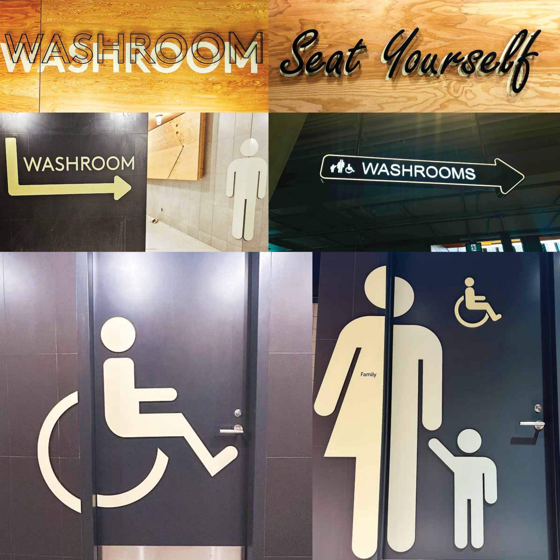
Washroom signage
- Eight washroom signs were pinned with no shadow using aluminum pin mounts.
- Six washroom signs featured aluminum pin-mounted letters with a painted back shadow.
- Sixteen washroom signs utilized pinned aluminum graphics. These graphics, painted on aluminum, identified bathrooms and accessibility through icons up to 1.5 m (5 ft) in height.
This varied mix of signs demanded creative solutions and meticulous execution. Photo courtesy (middle left): Spectra Advertising
These were installed directly onto the substrate, including aluminum doors, tile walls, and concrete corners, with the graphics bent around the corner of the washroom entrance.
Interior wayfinding signage
- Pinned graphics: Eight painted aluminum graphics with messages, mounted with back shadows for added depth.
- Vinyl icons: Thirty-nine white vinyl icons, each approximately 101.6 mm x 101.6 mm (4 in. x 4 in.), designed for waste area labelling the components for organic waste, waste, and recycling.
- Room ID signs: Twenty-five painted finish signs with raised lettering, measuring approximately 101.6 mm x 254 mm (4 in. x 10 in.).
- Washroom signs: Eight overhead painted aluminum washroom signs were illuminated with neon push-through lighting. Electrical work was integrated into the construction process at specified locations.
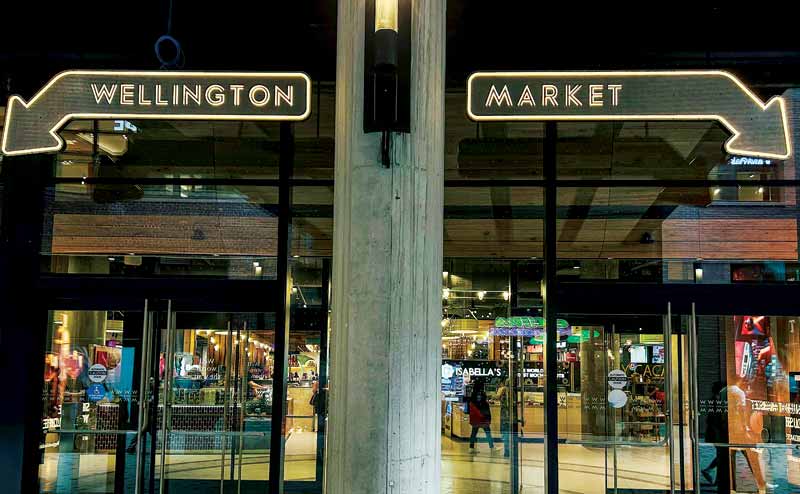
Neon arrows and Wellington Market signage:
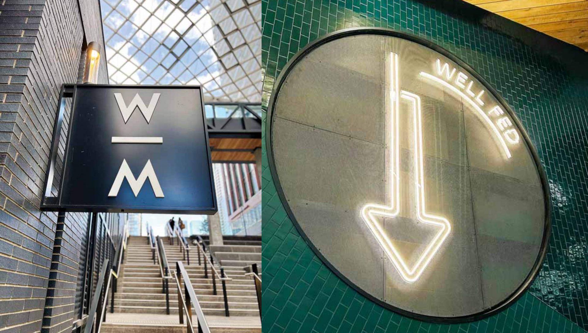
- Neon arrows: Three neon arrows pointing towards the food court at various locations reading “Well Fed,” ranging in size from 2,108 mm (83 in.) to 2972 mm (117 in.). The design required to be installed on clear backers for stability.
- Wellington Market signage: Three designs reading “Wellington Market,” created from aluminum painted channel letters with inlaid neon lighting, required cohesive installation to the substrate. These measured approximately 304.8 mm x 5,080 mm (12 in. x 200 in.) and were an intricate part of the package.
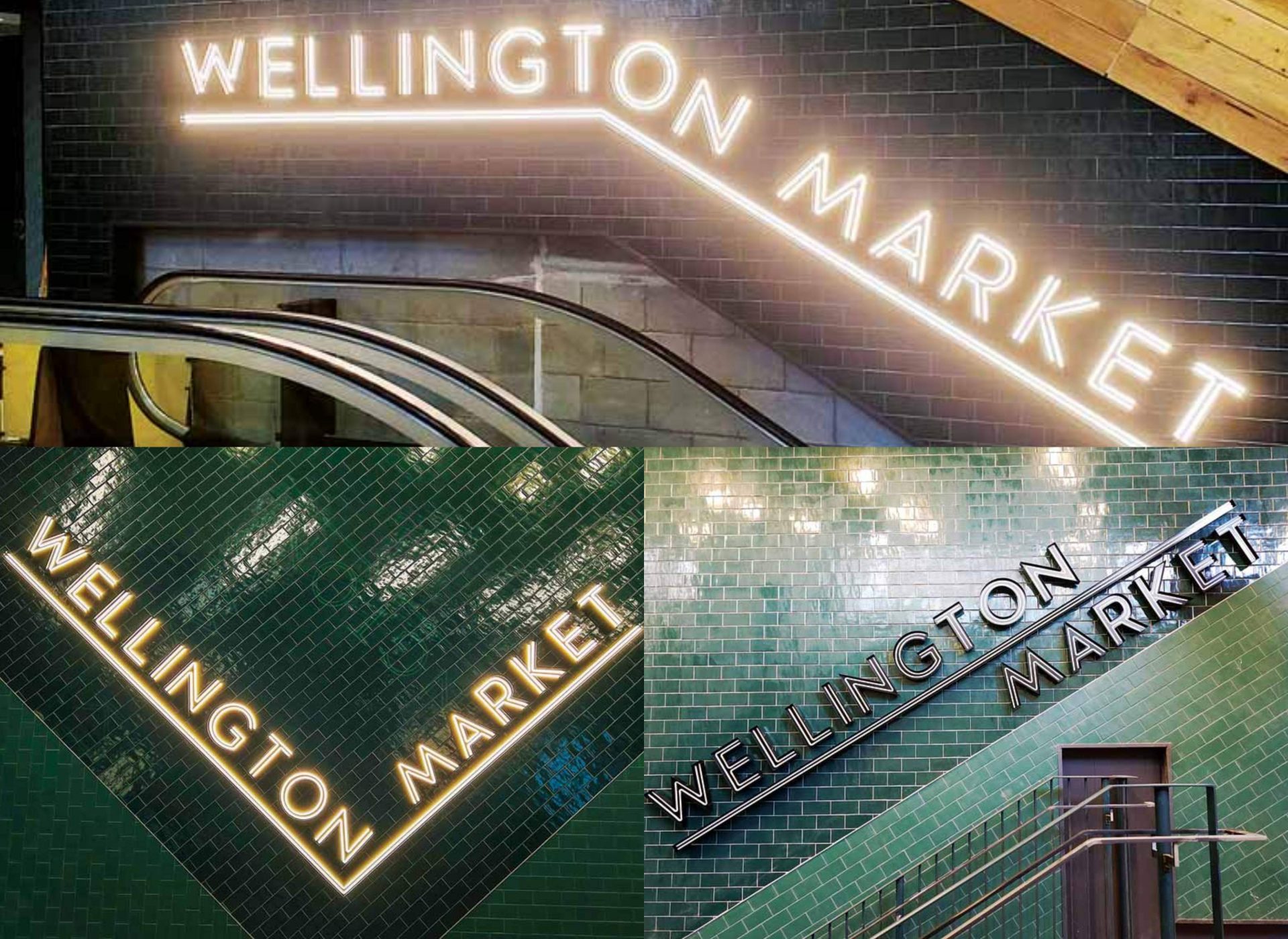
Three designs reading “Wellington Market,” created from aluminum painted channel letters with inlaid neon lighting, required cohesive installation to the substrate.
Exterior signage
The signs were installed at three exterior locations through overhead supports and suspension.
- Perforated aluminum arrows: Four signs suspended by overhead supports, featured painted aluminum letters with neon tubing inlay, ranging from 2.4-3.6 m (8-12 ft) in length. These were adhered to perforated aluminum arrows which were cut and sealed.
- Blade signs: Four acrylic graphics were applied to existing black blade signs, showcasing the “W/M” branding logo.
- Window vinyl: Applied to exterior entrance doors and windows, these signs featured the “W/M” logo and a red dotted applique.
Graphic wall
A creative collaboration unfolded as a team of artists conceptualized artwork, which was then adapted into design for production. This process involved close consultation with the artists throughout the project.
The graphic walls feature in two key areas within the lobby, as well as the hallway and stairwells, spanning approximately 9.1 m (30 ft) in length. These visuals were applied to painted surfaces, from floor to ceiling. Thirty-four stairwell graphics served a dual purpose, not only labelling the floors, but also incorporating uplifting phrases to inspire and motivate passersby.
Challenges
After receiving and pricing the tender package, the design team crafted and finalized signage designs aligned with specifications, reviewed and approved by both the client and architectural firm GPA.
By addressing complex requirements with precision and creativity, The Well stands as a project of functionality and visual appeal.
Navigating tight timelines and material availability challenges required close coordination with onsite teams. Installations required meticulous attention to detail, including concealing wiring on brick walls and integrating illuminated letters on tiled surfaces.
The project presented creative challenges, incorporating materials such as aluminum, painted surfaces, back shadows, perforated metal, acrylic, vinyl, and neon lighting. This varied mix demanded creative solutions and meticulous execution.
Conclusion
The Well signage project delivered diverse and high-quality signage solutions. By addressing complex requirements with precision and creativity, The Well stands as a project of functionality and visual appeal, further elevating its architectural landscape.
Robert Ascenzi jr. is chief operating officer (COO) of Spectra Advertising, a family-owned and operated business, celebrating 31 years in the industry. As COO, he oversees operations, and in doing so, acts as a liaison between the client and his team, facilitating communication, expectations, and product development. He said, “it is always fun to work on a project with high visibility, and this is one of them.”


