
New and old
With a proposal for a grocery store that would look like no other Loblaws location, Landini was tasked with enhancing the customer experience by providing input for interior and graphic design, signage, uniforms and written communications.
“People are increasingly demanding more of an experience from their grocery store,” he says. “Shoppers don’t just want to be presented with aisles of food. They want more of a ‘market’ experience, with visible food preparation, authenticity, tasting and something new happening all of the time. They want to be entertained. Our intention was to create a modern version of a market town square—a super market, rather than a supermarket.”
In addition to bringing the store to the forefront of international urban retail design and creating new elements that could be rolled out in the future at other stores, another primary goal for the firm was to recognize the history of the iconic building.
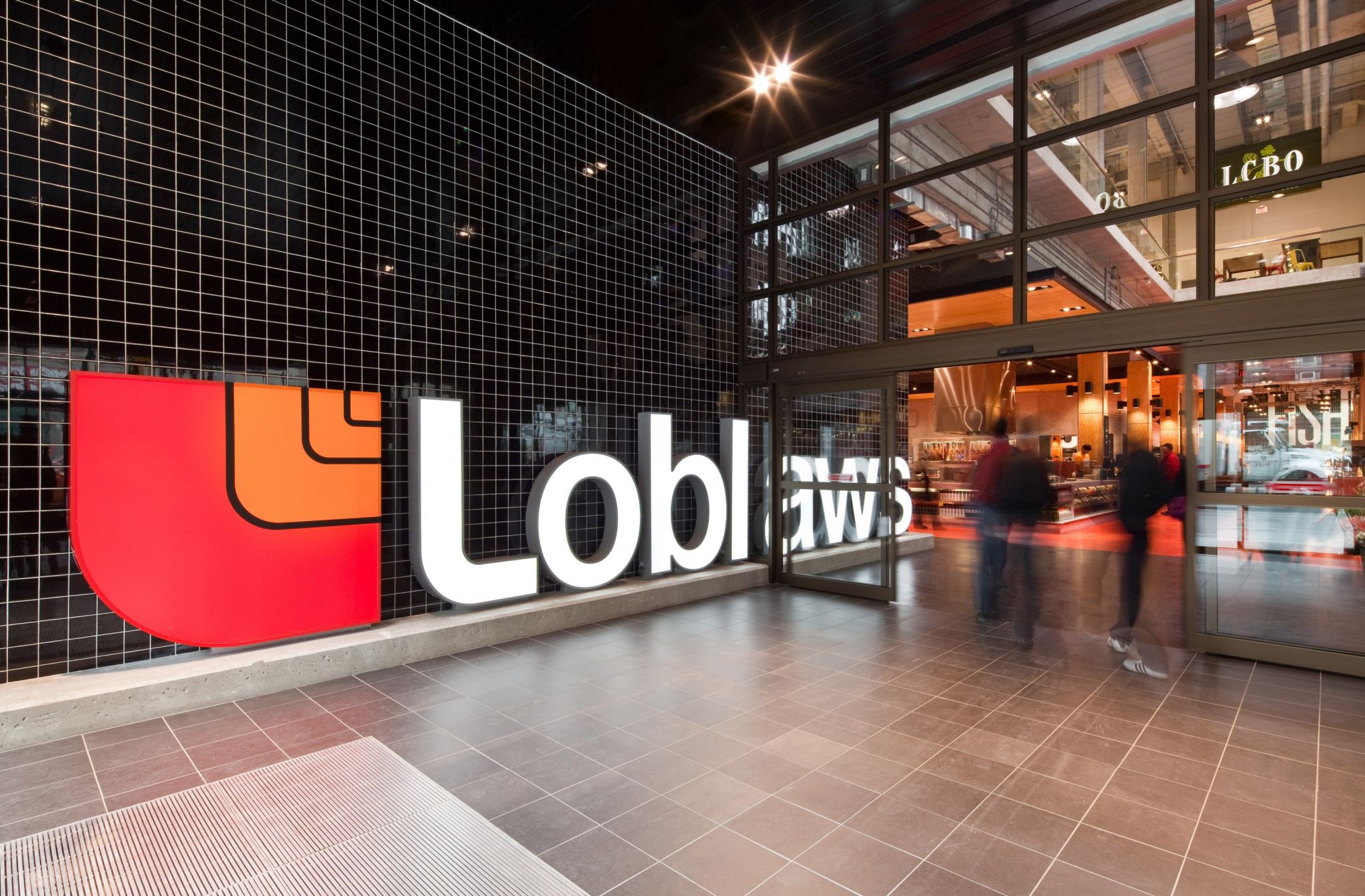
Whether customers enter from the corner of Church and Carlton Streets (left) or from the underground garage, they are greeted by the Loblaws logo. Photos by Trevor Mein
“Maple Leaf Gardens was massive, brutal and ‘ugly-beautiful,’” says Landini. “We wanted to pay homage to the history of the building in a vibrant, living way, making it a part of the design by exposing the walls, commissioning a sculpture of reclaimed stadium seats and reusing lights and signage fonts.”
One of those fonts had been used originally to stencil in seat numbers.
“When we first visited the site, the construction crews had started pulling the insides of the arena out and we saw the stencil font left behind,” says Landini. “It was well worth saving and so we reused it throughout the building.”
The seat-based sculpture, meanwhile, formed a giant blue maple leaf, the logo of the Toronto hockey team for whom the arena was home.
“We came up with the concept with Landini and removed the cushions from the seats before giving them to an artist,” says Mario Fatica, vice-president (VP) of planning and development for Loblaw Companies.
“The leaf is a type of storytelling, using the materials of the building’s history,” says Landini. “Around the sculpture, you can see the ghosts of staircases and radiators past. Old, exposed columns are crumbling. It all adds to the look.”
A font originally used to stencil in arena seat numbers has now been recreated on signs throughout the building.
Other original seats were added to an in-store café, where they can still be used for their original purpose. On the walls, old murals were recreated and new ones added.
Another form of homage was the integration of some of the original ice-rink light fixtures. This and other illumination work was overseen by Mark Schembri, VP of store maintenance for Loblaw Companies.
“This was a very different project for us,” he says. “Landini had a strong vision for lighting the space. We needed big, chunky lighting fixtures to illuminate big, chunky signs. When you walk in, we wanted a streetscape view, with light columns along your path. And we have some of the original light cans from the old ceiling. We took them down and maintained the shrouds but switched them to metal halide lighting. There are six of those near the store entrance.”
When customer use the main entrance at the corner of Carlton and Church Streets, one of the first signs they see is the Loblaws store logo in channel letters. These are internally illuminated with light-emitting diodes (LEDs). For shoppers arriving by car, meanwhile, the underground garage is brightly lit by a strip of LEDs all around its perimeter, lighting wall graphics representing various teams that once played at the Gardens—not just hockey, but also indoor soccer and basketball.
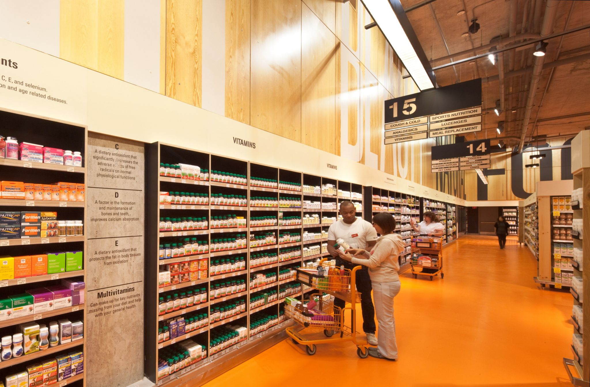
Inside the store, too, most of the lighting is directional, not ambient.


