
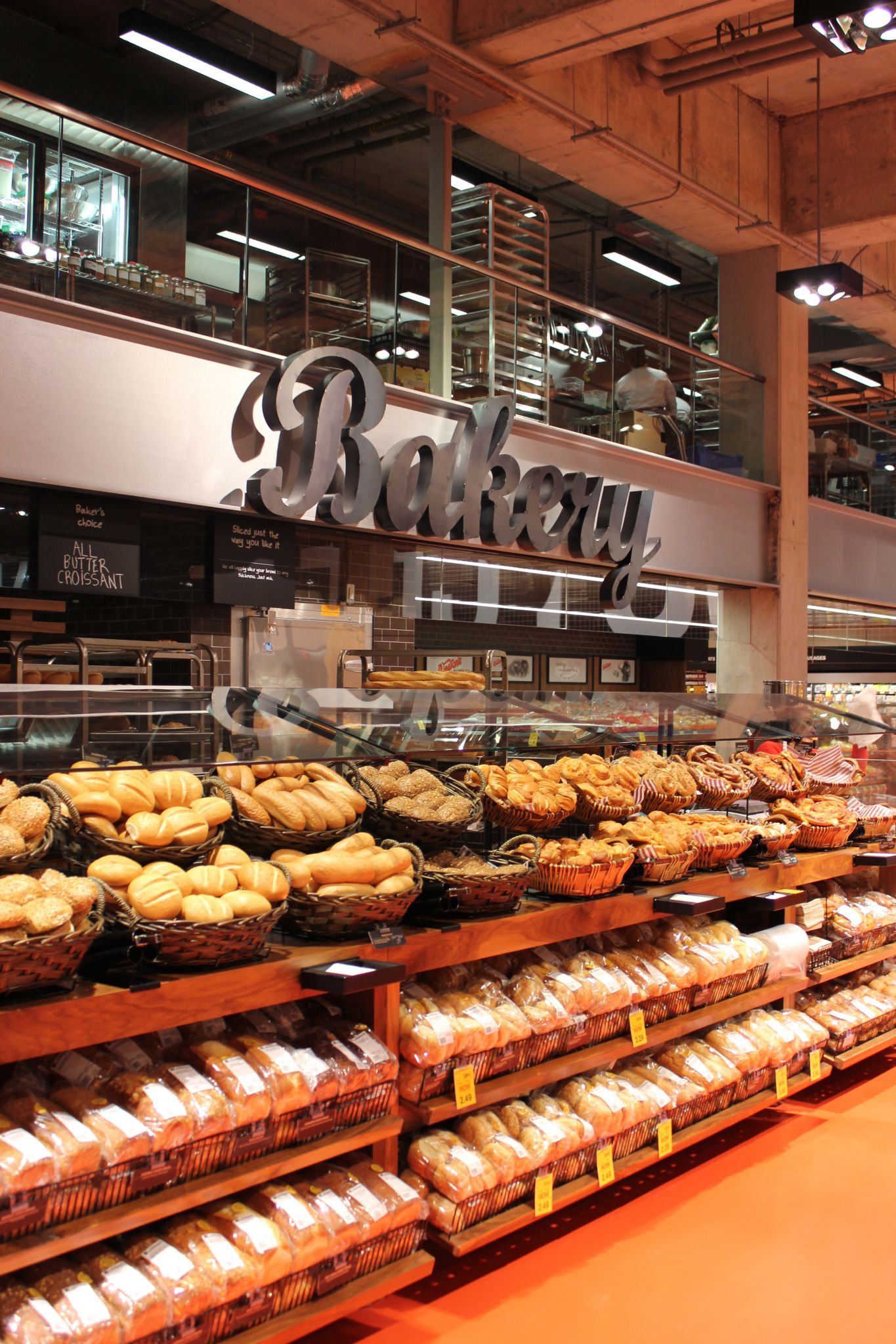
To create the sense of a marketplace with different shops, each department uses a different type of sign, including battered tin for the bakery and impressed concrete for the deli.
“Every light has a home and we had to choose a flood or spot for each,” says Schembri. “The devil is in the details. We have two floods on each aisle and spots pumping onto the aisle end displays. When you drive by the store, you can see very clearly inside. For the cheese wall, most types of lighting would hurt the product, so we used LEDs on each shelf, doubling them up where there was signage in front.”
“The lighting is the unsung hero that helped deliver our vision,” says Landini. “The signage is beautifully lit.”
Developing displays
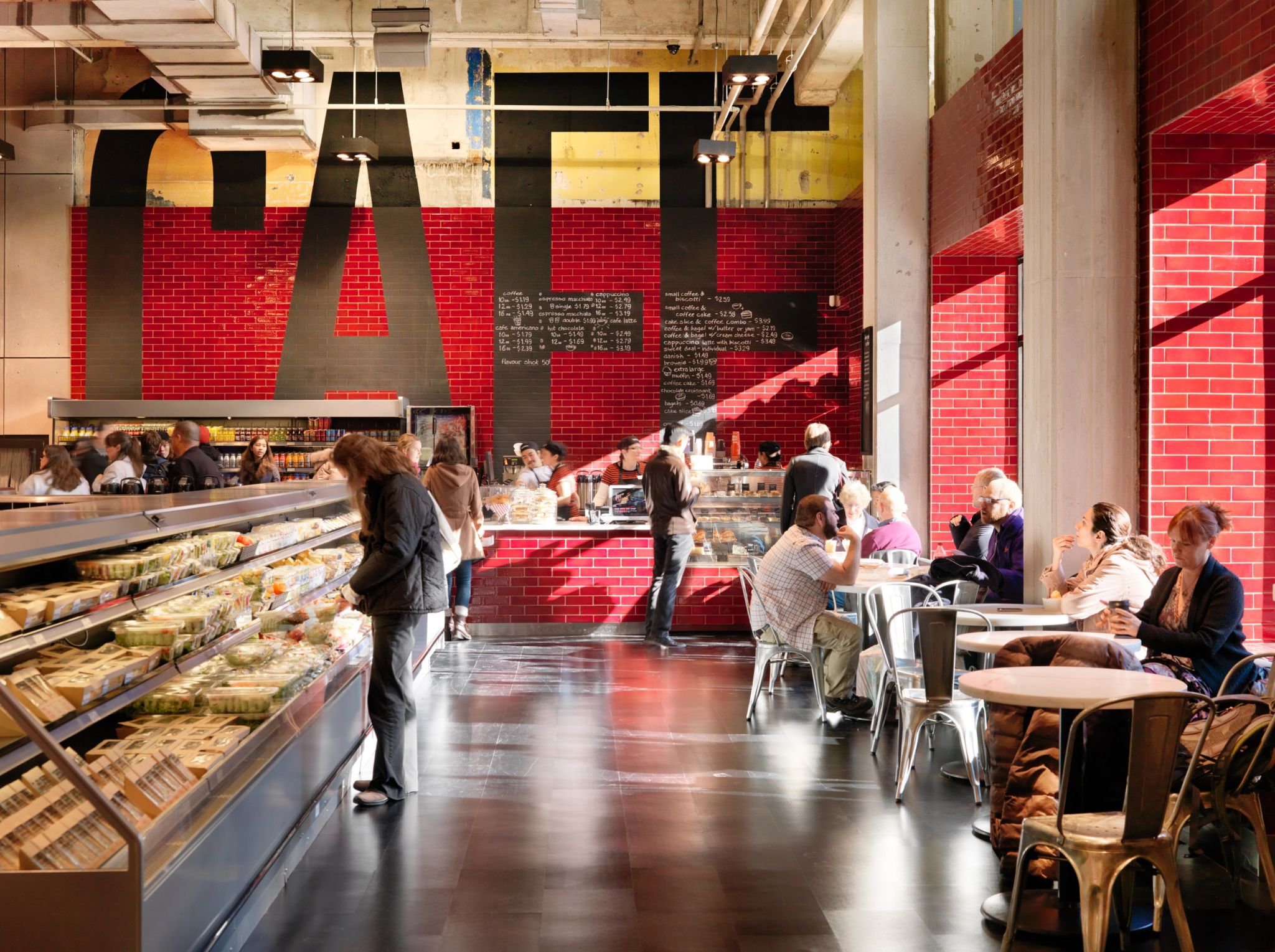
The interior décor scheme used new stainless steel and blond wood grain surfaces, glossy black tiles and a vibrant red and orange floor, inspired by the colours in the Loblaws store logo.
“The architects were responsible for the base building, providing the shell and putting the floor in, and we decided what would go inside that shell, down to the bolt and weld,” Landini explains. “We had a good working relationship with them and with the retailer’s own project management team, which helped source local materials and fittings.”
That said, Landini also took a hands-on approach to the project.
“We handled specifications and documentation in Australia, then sent it to the clients, architects and suppliers, but we also came over on a regular basis to meet with the contractors and look at cardboard and medium-density fibreboard (MDF) mock-ups and final prototypes,” he says. “It wasn’t a case of issuing the drawings and then showing up once the store opened. It had to be more collaborative and iterative. You can’t write a spec for everything.”
This was particularly true for the variety of signs and fixtures that were designed to expose, rather than hide, the building’s age. Welded tin, for example, was intended to draw attention to its welds.
“Much of the directional and departmental signage is outsized to fit within the scale of the building,” says Landini. “Each area uses a different sign type, including battered tin for the bakery, timber for sushi, impressed concrete for the deli and bent copper plumbing tube and neon for the grill. Many of these signs were inspired by what you might see along a city street.”
Further, the large, permanent departmental signs would not be crowded by other POP displays.
“The display areas are product-intensive,” says Landini. “We avoided design for design’s sake. We didn’t want anything to compete with the merchandise. And we didn’t want anything thematic or gimmicky. You want a neutral environment that is still immediately identifiable as Loblaws. You want people to ‘feel’ the design rather than see it.”
Another recurring motif throughout the store replicates chalkboards. Some of these are digitally printed panels.
From vision to fabrication
Fabrication was contracted to Toronto-based Somerville Merchandising, known for custom manufacturing POP displays and retail fixtures. Working with the architects and designers for several months, Somerville produced signs for installation throughout the store, using a variety of techniques and materials, including sheet metals, copper piping and printed substrates.
“We’ve worked with Loblaws for 30 years,” explains Ron March, Somerville’s VP of sales. “When Landini was chosen to work on this store, they looked to supply from within Canada. We started in December 2010, moving from concepts through redesigns, and began to build components in spring 2011.”
Testing various prototypes with Landini, Somerville turned the store vision into reality.
“They didn’t want a typical look,” says March. “Copper pipe fittings, for example, had to be aged to look rough, then clearcoated to seal them. With the bakery sign, we wanted soot marks. We digitally printed panels like chalkboards and applied a parchment-paper effect to the store aisle sign inserts. There is a real new-and-old look.”
Like Landini, March emphasizes this process depended on collaboration.


