
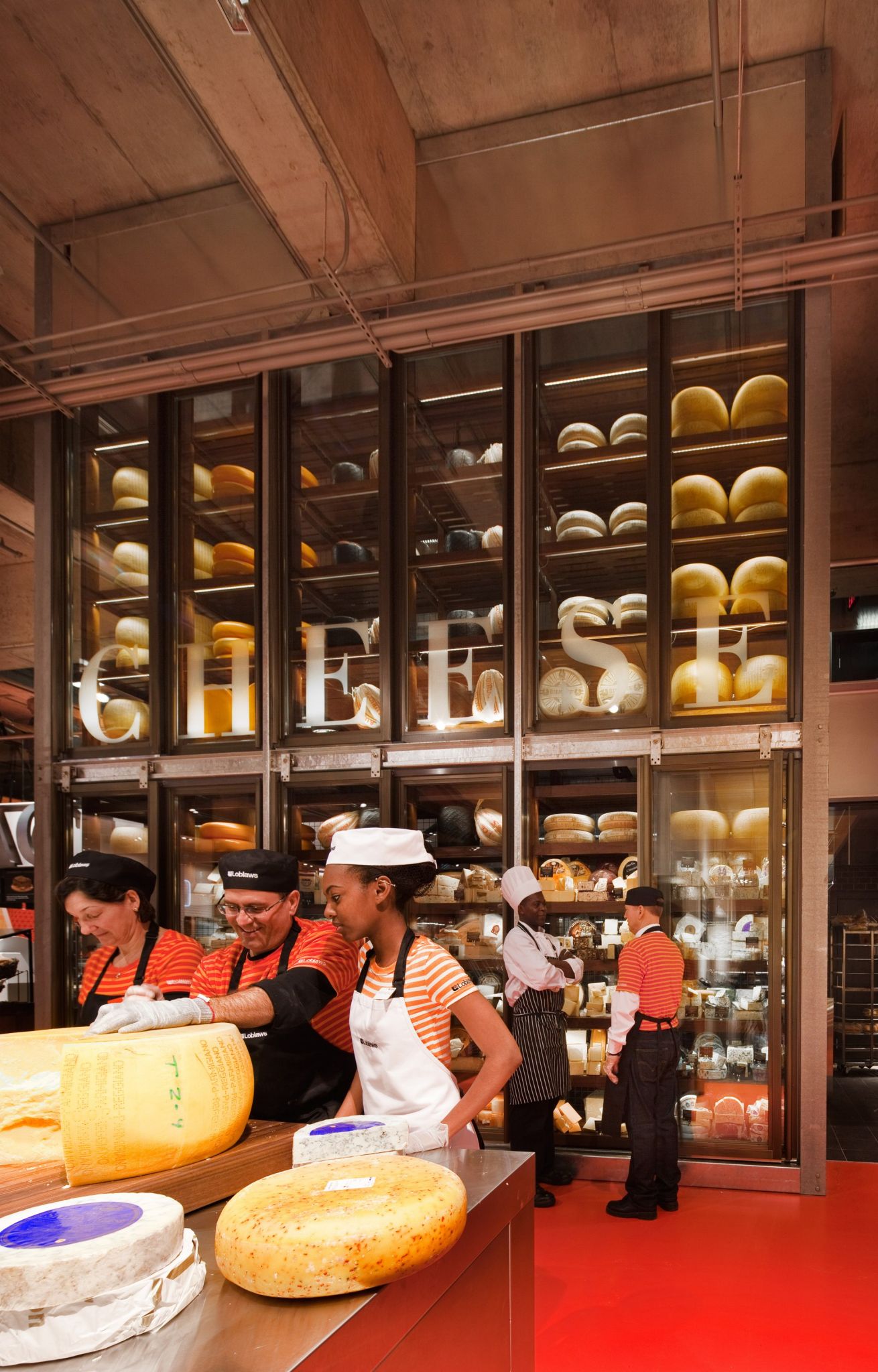
The cheese wall uses LEDs, which are doubled up in areas where they need to backlight sign lettering.
“You can’t get that look from drawings alone,” he says. “We’d get ideas and put together samples. And you need people on-site to get everything right. Each department sign has its own look and feel.”
As Somerville is accustomed to prototyping and one-offs, the company was equipped to handle almost all of the work in-house, other than some finishing that was subcontracted.
“We’re a custom house and can jump from pillar to post,” says March. “We applied brushed brass onto aluminum for the patisserie sign and hollowed out the centres of the sushi sign letters to save weight when they were mounted to the wall. We worked with Loblaws’ regular installers. It was particularly challenging to mount the steel letters of the bakery sign onto giant beams and hide the brackets. They’re more decorative than structural.”
Further, some of the techniques were entirely new to Somerville.
“There are signs with actual loaves of bread stuck to them!” March says. “We preprinted the boards, mounted the dried loaves onto them and then added a sealant to prevent them from decaying.”
While much of the signage was customized to this degree just for Maple Leaf Gardens, some of the modular signs will provide a basis for new Loblaws stores to come.
“It will be possible to create a similar feel in a smaller, less expensive format, based on ceiling heights and other factors,” says Landini. “It’s like a big Lego or Meccano set that can be rolled out.”
Indeed, Somerville carried forward some of the same sign concepts to another downtown Toronto Loblaws store at Queen and Portland Streets, which was being developed at the same time.
Preserving history
Another ‘client’ for the project was Toronto’s municipal government, which had its own requirements for heritage building preservation.
“City officials wanted to ensure the heritage of the venue was protected,” says Fatica. “We made sure to communicate with the city and residents about our plans.”
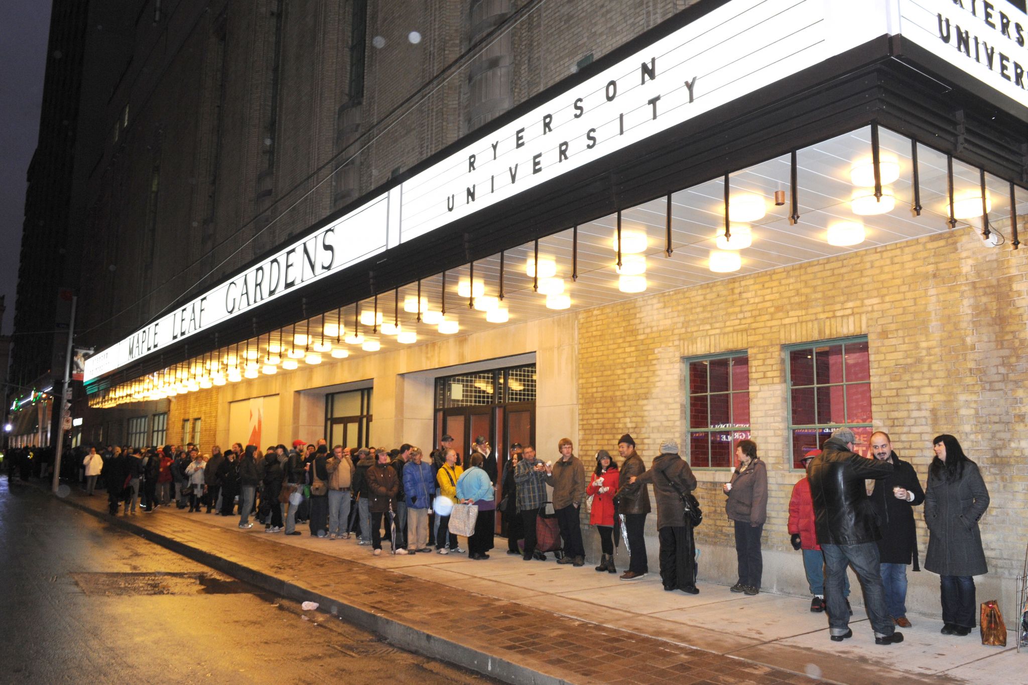
When the building was ready to reopen, locals lined up for hours to see the reworked interior. Photo by Trevor Mein
“At first, the city wanted us to dedicate a small ‘museum’ to the history of Maple Leaf Gardens, but we didn’t want to stick that in a corner,” says Landini. “We felt it would be better to integrate it into the overall design. We marked a red dot on the floor where centre ice was, for example, and now shoppers take each others’ photo there. We also found old images and incorporated them as graphics on pillars, seats and tables.”
“They had researched 20 major events in the building’s past,” says March. “I went through books and the web to find photos from the Stanley Cup, the Ali boxing match, etc., then retouched and resized them for the pillars. So, choosing these images had a lot to do with the right scale for the format.”
In some cases, new images had to be created.
“With the Beatles, for example, we had to create our own for the space on the pillar, says March, “and for the final National Hockey League (NHL) game that was played at the Gardens, which I had attended, we ended up using my own ticket stub, blowing it up.”
These images were simplified and applied to the pillars in a fashion not unlike the aforementioned stencil font.
“We cut vinyl masks for them,” says March. “With this method, when you spray-paint them and then take them off the pillars, you leave the images behind.”


