Rezoning Pearson airport
by Matthew | 14 April 2012 10:36 am
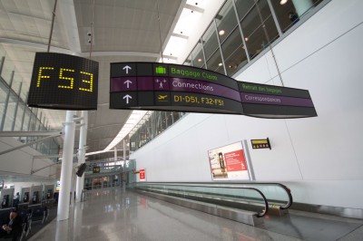 [1]
[1]Photos courtesy GTAA
By Peter Saunders
At the end of January 2012, Toronto Pearson International Airport went ‘zonal,’ implementing a new, uniform alphanumeric system for naming all flight gate lounges throughout Terminals 1 and 3 (T1 and T3). While it was important early on to educate airport employees about the change internally, the renumbering project also entailed the need to retrofit and replace corresponding signs facing airline passengers in both terminals.
The Greater Toronto Airports Authority (GTAA), which manages Toronto Pearson, began the rezoning process in an effort to improve wayfinding in both terminals, especially for passengers with connecting flights.
“The old system used flags and words to indicate where to go for connections, but it became confusing if you were, for example, flying through Canada and the U.S. to a destination in South America,” explains Peter Wiszniewski, GTAA’s signage project manager. “We needed to make it easier for passengers to find their way. And most international airports around the world are already zone-oriented.”
Following purple
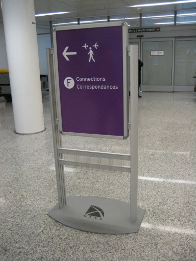
Inspired by London Heathrow Airport in England, for example, GTAA added a new purple colour to its signs. This motif became a handy way to direct passengers to new connection centres that can better facilitate their transfers.
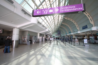 [2]
[2]Inspired by London Heathrow Airport, new purple signs direct passengers to connecting flights.
“Our connections prompted this change,” says Wiszniewski. “Out of 33.4 million passengers per year, about 26 per cent are now making connections. It’s a lot easier to tell them to follow the purple signs to reach their flights. The colour really stands out.”
GTAA’s operations team studied eight shades and worked with Canadian National Institute for the Blind (CNIB) standards to determine which option would be most clearly visible.
The connection centres, meanwhile, were developed to offer gate information to passengers hurrying to make their transfer flights. These new structures reuse existing signs and indicate estimated walking times to each zone—or in the case of transfers between terminals, combined walking and shuttle train time.
“The premise behind this flow is when passengers arrive, they walk up to the connection centres to find their next gate letter and number,” says Wiszniewski. “They work hand in hand with the signs.”
In another similarity to other airports’ past rezoning experiences, Pearson’s gate name changes only affect interior signage, not the airside gate numbers, which remain the same as before.
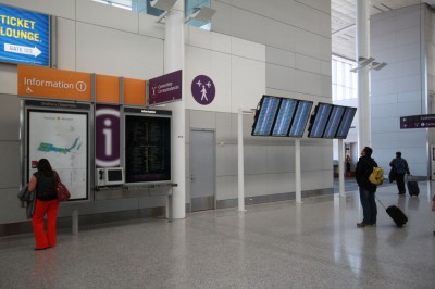 [3]
[3]The new connection centres are designed to help passengers transfer flights more quickly. In addition to gate information, they indicate estimated walking times to each zone.
“The two systems aren’t dependent on each other,” Wiszniewski explains.
Meanwhile, new ceiling-mounted Flight Information Display Systems (FIDSs) switched from 1-m (42-in.) to 1.4-m (55-in.) screens to accommodate more details, including an additional column for each flight’s zone letter. In general, however, GTAA used the opportunity to eliminate unnecessary information to simplify its many directories and maps.
Letters and numbers
The new alphanumeric system, somewhat similar to one that was already in place in T3, combines gate numbers with sector-specific letters.
In T1, this means adding D for domestic, E for international and F for U.S. flight gates, while also maintaining the standard three-digit format. In T3, the revised system comprises zone A for U.S. flights, zone B for a combination of U.S., domestic and international flights and zone C for remaining domestic and international flights.
“We tried to keep the gates similar to before, so Gate 132 becomes Gate D32, for example,” says Wiszniewski. “Some ‘swing gates’ are used for both domestic and U.S. flights, however, so we have added dynamic illuminated signs in T1 that change when their doors switch, while in T3 these signs are still changed over manually. I believe the new alphanumeric naming of the swing gates makes them a little easier to use.”
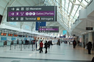 [4]
[4]Terminal 3 comprises zones A, B and C, while Terminal 1 features zones D, E and F.
The alphabetic zones mean some signs could be simplified. A sign face that previously read ‘Gates 101 to 157,’ for example, could now instead read, ‘D Gates.’ With the extra layer of wayfinding information, a passenger is directed to his/her zone first, then to his/her specific gate. There is also less need to use three pictograms to indicate the three types of flights, which can be confusing to passengers from other countries who are used to only seeing two (i.e. domestic and international).
From concept to reality
To design the new signs and retrofits, GTAA consulted with Entro, a Toronto-based environmental graphic design (EGD) firm—now Entro G+A—that had worked on earlier signs for the airport. Its T1 signs could be updated by changing out the ‘blades,’ whereas T3 needed full sign face replacements.
Entro began studying the rezoning concepts in November 2010 and developed a strategic plan and new sign designs, which were finalized by April 2011. One of the most fundamental changes was choosing a pictogram for the purple connections signs.
“We worked with GTAA to adapt an image from those that would appear too small on the overhead blades,” says Vincent Matthieu Gratton, associate at Entro. “The resulting pictogram features a person walking between two planes. Its orientation can be flipped whenever helpful in terms of indicating direction.”
Production of the new signs began in September 2011. Zip Signs in Burlington, Ont., handled all of the fabrication and installation. This meant measuring and dry-fitting every sign to ensure the newly manufactured blades would fit correctly.
WSI Sign Systems in Bolton, Ont., which had worked on earlier Entro-designed components, produced all of the signs for the new connection centres.
In the meantime, GTAA raised awareness of the impending changes by distributing printed posters and training DVDs for its own staff, the airline carriers, the fire department, Pearson’s communications centre and all other tenants of the airport.
 [5]
[5]A new pictogram was developed to indicate connecting flights. Photo by Peter Saunders
The big night
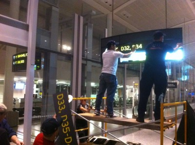
Perhaps the most daunting part of the project was the January 30 overnight installation that marked the changeover from the old system to the new zones. In addition to Zip Signs working in T1, Toronto-based Sign Fix handled installations in T3. In some cases, temporary vinyl sign faces had already been applied over new zonal signs in T3, so these could simply be removed at the last minute.
“Between the two terminals, there were 50 people in four crews changing about 800 signs in one night,” Wiszniewski says. “To facilitate everything, some of us lived here from Sunday, January 29 to Tuesday, January 31. We set up a command centre to help everyone whose work in the airport would be affected by the change. So much infrastructure is dependent on the gate numbers, from the public address (PA) system to the electronic flight and baggage displays to the airport’s website. Our information technology (IT) department had to start its changeover three hours in advance that night.”
Ensuring smooth operations was especially important on the night of the season’s first significant snowstorm, when 50 mm (2 in.) of snow fell within three hours.
“We missed three critical signs out of the 800, which caused some confusion for the first hour in the morning, from 5 a.m. to 6 a.m. on January 31,” says Wiszniewski. “We had to scramble to get those replaced, but we also had extra staff on hand to help passengers find their gates. On that first day of the new system, we had 70,000 people come through the airport and there were no complaints.”
To avoid missing any such errors, the installers took a digital photo of each sign, which then could be checked against the plans.
“We spent the next day comparing these photos against the designs on our computers to verify all of the messaging was correct,” says Entro’s Gratton. “It worked really well.”
As mentioned, the change is seamless for most passengers, who continue to check their gate numbers upon arrival and follow the signs accordingly.
 [6]
[6]Installers from Zip Signs and Sign Fix changed out all of the signs overnight on January 30, 2012. Photo courtesy GTAA
“The most likely to complain at first are the frequently fliers, who are used to the old gate numbers,” says Gratton, “but they’ll also appreciate this is an easier system for people to understand and use.”
Further improvements
While the gate renumbering has entailed GTAA’s largest sign project in years, the process of wayfinding improvement is not finished yet.
“We have a strategy team now that works to help people get through the airport more easily and to make their stay more pleasurable,” says Wiszniewski. “We’re working on a new system for passengers connecting to flights to the U.S., who currently have to pick up their bags and recheck them. Through discussions with U.S. Customs, we hope to instead have those bags screened separately, so passengers can connect more conveniently, i.e. without having to pick up and recheck their bags. This program is in the works and Entro is already designing new signs for it.”
This will be followed in 2013 with a new program to help make wayfinding clearer for passengers walking from T1’s parking garage—one of the biggest in the world—to the arrivals and departures areas.
With files from GTAA and Entro. For more information, visit www.gtaa.com[7], www.torontopearson.com[8] and www.entro.com[9].
- [Image]: http://www.signmedia.ca/wp-content/uploads/2014/02/IMG_9140.jpg
- [Image]: http://www.signmedia.ca/wp-content/uploads/2014/02/IMG_9120.jpg
- [Image]: http://www.signmedia.ca/wp-content/uploads/2014/02/IMG_9135.jpg
- [Image]: http://www.signmedia.ca/wp-content/uploads/2014/02/IMG_9108.jpg
- [Image]: http://www.signmedia.ca/wp-content/uploads/2014/02/IMG_5653.jpg
- [Image]: http://www.signmedia.ca/wp-content/uploads/2014/02/photo.jpg
- www.gtaa.com: http://www.gtaa.com
- www.torontopearson.com: http://www.torontopearson.com
- www.entro.com: http://www.entro.com
Source URL: https://www.signmedia.ca/rezoning-pearson-airport/