Showtime for TIFF Bell Lightbox
by Matthew | 14 April 2012 8:46 am
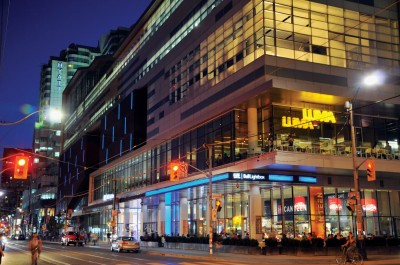 [1]
[1]Photo by Gerald Querubin
By Udo Schliemann
It took almost 40 years to establish a dedicated venue in Toronto for world-class cinema. What began in 1976 as the Festival of Festivals and was later renamed the Toronto International Film Festival (TIFF) finally found a permanent home in late 2010 when TIFF Bell Lightbox opened at the corner of King and John Streets, within the city’s downtown entertainment district but off the beaten path of other commercial movie-screening facilities.
The five-storey, 13,935-m2 (150,000-sf) building was conceived by Kuwabara Payne McKenna Blumberg Architects (KPMB Architects), whose own offices are just across the street, on another corner of the same intersection. Their work on the Lightbox, built by PCL Constructors Canada, has since gone on to win a number of architectural awards.
As TIFF’s new year-round home made its debut during the 2010 festival, signage was an integral part of welcoming visitors from Toronto and around the world into a completely new environment and ensuring large events went smoothly. This system was provided by Gottschalk+Ash International (G+A), a Toronto-based environmental graphic design (EGD) firm (which soon thereafter merged with Entro Communications, another EGD firm in the city, to form Entro | G+A).
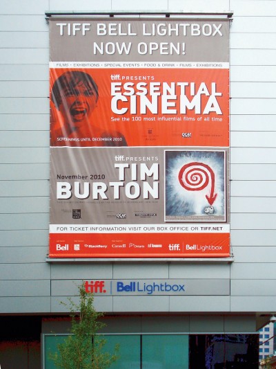 [2]
[2]A changeable banner is used to promote upcoming events and programming. Photo courtesy Entro | G+A
A rising star
Plans for the new building were first revealed in 2003, but construction only began in 2007. There had long been a need for a large-scale facility of this type. In the first year of the Festival of Festivals, 35,000 fans watched 127 films from 30 countries. In 2010, by way of comparison, TIFF featured 339 films from 59 countries and its audience reached 365,000. So, not only had the number of screenings increased, but the audience had become more than 10 times larger.
In response to this need, the Daniels Corporation—a real estate developer—joined with the Reitman family—which includes two film directors, Ivan and his son Jason, and donated the land—to form the King and John Festival Corporation (KJFC), which in turn worked to develop the new building dedicated solely to film.
In addition to serving as the centre of TIFF’s annual series of gala screenings, the facility provides a meeting place throughout the year for film industry professionals, educators and cinephiles from around the world. It is home for all of TIFF’s other existing programs, including New Releases, Cinematheque, Kids, Higher Learning and Reel Talk screenings, along with its film reference library. And it has supported a wide range of new initiatives and exhibits and hosted both community and industry events.
The Lightbox houses five public cinemas with 1,300 seats, two galleries, three learning studios, a centre for students and scholars, two restaurants and an event space managed by Oliver & Bonacini (O&B), a lounge and TIFF administrative offices. In the summer months, the outdoor terrace becomes another venue for parties and events, providing a long view east over King Street and the city’s downtown skyscrapers.
Visual effects
After KPMB Architects won a competition to design the new building, they developed a façade that would provide visual clues for what happens inside. These include exposed cinema boxes projecting out from the building and accentuated in black with vertical bars of light-emitting diodes (LEDs) in changing colours.
 [3]
[3]The building’s façade is accentuated with vertical light-emitting diode (LED) bars that change colours. Photo by Gerald Querubin
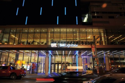
On the ground floor, a TIFF retail shop sits just west of the entrance, while the southeast corner houses one of the restaurants, O&B Canteen. With these pedestrian-level attractions in mind, KPMB tried to keep the south-facing King Street façade as transparent and open as possible.
In a collaborative effort, KPMB and G+A developed concepts for the two internally illuminated ‘fins’ that flank and highlight the entrance leading up to the box office, while a canopy stretching along the King Street façade intersects with light panels arranged perpendicular to the sidewalk and reaching far into the restaurant, thus merging the indoor and outdoor environments.
Inside the main entrance is a three-storey high public atrium. One of its most visible features is a red-framed control centre, which reaches out into the open space over the atrium floor.
The upper exterior surfaces of the building, meanwhile, interweave a series of glass panels with horizontal frits, against which the silhouettes of people inside create a ‘cinematic’ visual effect. The frit pattern along the curtain wall alludes to the sequencing of film strips.
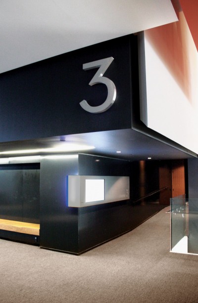 [4]
[4]Each cinema is identified with a brushed aluminum channel number. Photo courtesy Entro | G+A
The building was designed for heavy use, not just the annual festival, and with an understanding of pathways and navigation. The higher the floor, the more intimate the indoor spaces become. The building reflects TIFF’s continued expansion as a cultural institution within the entertainment district and supports substantial new opportunities for additional revenue throughout the year.
In 2011, KPMB won Best in Show at the Pug Awards, which celebrate the best in Toronto architecture and planning, and won the Toronto Urban Design Award for modern architecture.
Subtitles
When working on the Lightbox’s wayfinding and donor recognition systems, G+A’s mission was informed primarily by TIFF’s mandate for the building’s design.
“I want every film lover to feel like the Lightbox is theirs,” said TIFF director and CEO Piers Handling. “Our mission is to transform the way we see the world through film and our new home is an essential means towards achieving this end.”
With this in mind, G+A’s designers felt it was important to help visitors slow down and prepare for the building’s cultural and learning experiences. Rather than use a lot of lighting and cinematic effects for wayfinding, they opted instead to support KPMB’s modern, urban design with elements that are not dramatic but can be found when people need them. They fostered the idea that visual embellishment should come from programming and exhibitions, not from the wayfinding signs themselves.
During the four years between the project’s inception and its completion, one of the challenges with relation to signage came when TIFF’s logo, identity and fonts were changed as the organization grew and evolved. Another was the hectic pace when the final touches were put on the building just in time for its official opening in September 2010.
Exterior shot
Outside, the building’s main identification sign features 625-mm (2-ft) tall aluminum channel letters with acrylic faces mounted atop the canopy over the main entrance. These internally illuminated letters appear to ‘float’ over the canopy, a necessary conceit due to the design of the TIFF Bell Lightbox wordmark, which does not use a common baseline.
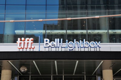 [5]
[5]Internally illuminated aluminum channel letters appear to ‘float’ over the canopy. Photo by Gerald Querubin
Behind those letter forms are larger contoured letters, spaced off by 25 mm (1 in.) and painted to match TIFF’s corporate colours. These offer a backdrop for halo illumination, but also a clean rear surface as seen from inside the building.
The canopy reaches far out over the King Street sidewalk. As such, pedestrians walking along the north edge of that sidewalk cannot see the main building identification sign. So, it was necessary to add building identification to the west and east sides of the elongated canopy. Both sides feature the signature logo in the form of internally illuminated cut-out and push-through white acrylic letters.
Oversized, custom-built aluminum poster holders are mounted on both sides of the prominent columns along the southeast side of the building. These allow TIFF to promote current and upcoming films and events, but can also be rented out by O&B to advertise the restaurants’ fare.
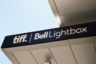 [6]
[6]Building identification was added to the west and east sides of the elongated canopy. Photo by Gerald Querubin
On the west façade, a 6.4 x 9.6-m (21 x 31.6-ft) changeable banner is used to promote upcoming programming and events, reaching both pedestrians and vehicular traffic travelling east and west.
Another communications tool is a 500-mm (1.6-ft) tall programmable LED-based red, green and blue (RGB) ticker that is installed flush into the canopy, running 50 m (164 ft) along the south side and around the east side. The components of the ticker are hinged into the canopy to allow for easy inspections and repairs.
PCL subcontracted most of the exterior sign fabrication to Sunset Neon in Burlington, Ont., except the ticker, which was instead built by Hamilton Digital Designs (HDD), now part of Toronto-based Media Resources. Sunset also handled installation, including the ticker’s integration into the canopy.
Interior shot
After visitors cross the vestibule, the building opens up to them with a cathedral-like three-storey atrium. Even in this broad space, though, wayfinding is simple and intuitive, thanks to a linear progression from the main entrance to the main vertical connection, an escalator straight ahead, while the box office and film gallery are to the left and the bistro, elevator and stairs to the right.
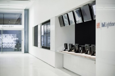 [7]
[7]LCDs near the box office in the main lobby inform visitors about what’s on. Photo by Maris Mazulis
The main directories were assembled using angled, brushed aluminum panels with a blue polymethyl methacrylate (PMMA) cores and vinyl lettering. The colour was chosen to reflect the brand of Bell as the building’s main sponsor, but blue may also be symbolic of cinematic light.
The combination of blue acrylic stripes and aluminum panels was repeated as a pattern in different elements throughout the building, including elevator directories, washroom signs, cinema entrances and overhead wayfinding signs. Some signs are internally illuminated to create blue-glowing edges, while others simply use letters applied on walls or glass surfaces.
Placement, size and colours were all specified to integrate effectively into the space. To emphasize which floor visitors are reaching as they move through the building, for example, oversized numbers are recessed into the drywall at the top and bottom of the escalators, painted out to match the wall backgrounds.
Each of the five cinemas is identified with a 650-mm (25-in.) high brushed aluminum channel number, accompanied by a sign box mounted adjacent to the entrance, housing a 1-m (40-in.) liquid crystal display (LCD) that features updated program information. The front panel is hinged to the box for easy access to the screen, in case repairs are needed.
 [8]
[8]The main donor recognition wall is made of translucent white glass with diffuser panels behind it. A ‘searchlight’ effect gradually highlights all of the names. Photo by Tom Arban
Further LCDs of various sizes are installed to serve as digital signage near the elevators and box office. A six-screen cluster in the main lobby informs visitors about what’s on.
All of the interior signs were manufactured and installed by Marvel Sign & Display, based in nearby Vaughan, Ont.
Craft services
As mentioned, the facility includes two restaurants. Canteen serves bistro fare on the ground level, while Luma provides fine dining on the second floor. Acumen Visual Group in Markham, Ont., manufactured vinyl graphic applications of both restaurants’ logos, as well as an internally illuminated sign identifying Luma on the building’s second-floor balcony.
O&B also operates an event space, Malaparte, on the sixth floor. Its logo uses a stylized image of an iconic staircase leading to the roof of Villa Malaparte in the Jean-Luc Godard film Contempt, which starred Brigitte Bardot. G+A designed the identities and signage elements for the restaurants and the event space.
The filmmakers would like to thank . . .
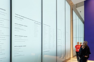
An organization like TIFF cannot function without generous outside support. Indeed, nearly 40 per cent of TIFF’s operating revenues come from philanthropic donations and private-sector sponsorships. As such, donor recognition is another substantial purpose of the signage program for the building.
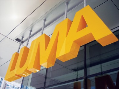 [9]
[9]An internally illuminated sign identifies the Luma restaurant on the building’s second-floor balcony. Photos courtesy Entro | G+A
The main donor recognition wall is a 3.8 x 1.7 (12.4 x 5.6-ft) structure of white translucent glass with diffuser panels behind it. These panels help soften the rough pattern created by a low-pixel-pitch LED-based video wall—supplied by Trans-Lux Canada in Burlington, Ont.—that uses an animated searchlight effect to gradually highlight all of the donor names. This motion also helps bring attention to the donor wall in the first place.
In addition to this donor recognition wall positioned in a key location, two more can be found at the second- and third-floor landings, showcasing names organized on the basis of different donation levels. These names are applied as custom-coloured vinyl letters on the first surface of the building’s frosted curtain wall. Natural light illuminates them by day, while an LED band provides additional contrast at night.
There are also many donor-named spaces throughout the building. These are identified with either brushed aluminum dimensional letters or vinyl appliqués.
World premiere
Given the image-based culture it reflects, TIFF’s brand is highly visually expressive through a variety of print- and web-based media. The opening of its dedicated facility has allowed it to expand as one of the world’s premier organizations in the discovery and understanding of film. For these reasons, TIFF’s public interface through its new home requires a consistent and clear signage program.
Udo Schliemann is principal creative director at Toronto-based Entro | G+A and worked on the TIFF Bell Lightbox project with Michael Kirlew, Roberto Grillo, Jonathan Picklyk, Ian White and Richard Anthistle. For more information, please visit www.entro.com[10].
- [Image]: http://www.signmedia.ca/wp-content/uploads/2014/02/GDQ4300.jpg
- [Image]: http://www.signmedia.ca/wp-content/uploads/2014/02/Banner-west-facade.jpg
- [Image]: http://www.signmedia.ca/wp-content/uploads/2014/02/GDQ4320.jpg
- [Image]: http://www.signmedia.ca/wp-content/uploads/2014/02/cinema_3.jpg
- [Image]: http://www.signmedia.ca/wp-content/uploads/2014/02/Main-Building-ID.jpg
- [Image]: http://www.signmedia.ca/wp-content/uploads/2014/02/Detail-East-side-canopy.jpg
- [Image]: http://www.signmedia.ca/wp-content/uploads/2014/02/Maris-Mazulis-26_LR3-A4.jpg
- [Image]: http://www.signmedia.ca/wp-content/uploads/2014/02/Tom-Arban_TIFF37.jpg
- [Image]: http://www.signmedia.ca/wp-content/uploads/2014/02/Exterior-Luma-sign.jpg
- www.entro.com: http://www.entro.com
Source URL: https://www.signmedia.ca/showtime-for-tiff-bell-lightbox/