
Supporting the vision with signage
As the final layer of design to be fit upon the architectural program, signage also had to communicate the institution’s vision and standards. Interfacing with the public, signs have a unique opportunity to ‘speak’ to an audience—in this case, the community of students, faculty, staff and visitors. It was up to Entro to absorb the esthetics of HPA’s built environment and translate those elements into the signs’ language.
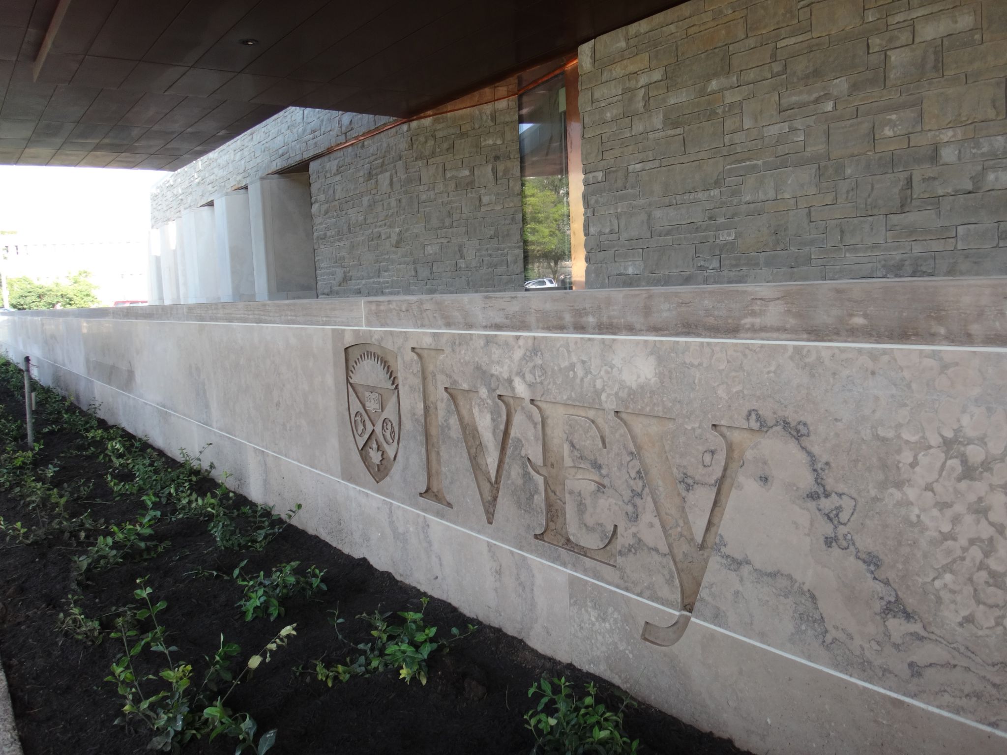
The school’s name was sandblasted directly into the main entrance’s limestone wall.
The first impression is always the most important. Instead of greeting guests with a pylon sign in front of the building, as many other universities do, the Ivey School opted for a more ‘integrated’ sign by sandblasting its name and crest logo directly into the main entrance’s limestone wall and a retaining wall near the south entrance, to a depth of 10 mm (0.4 in.). Intended to communicate the status and tradition of the institution, these treatments were performed on-site by Allan Gane from Allograph, based in Caledon, Ont., for the south entrance and by Ledgerock Natural Stone Products, based in Owen Sound, Ont., for the main entrance.
When guests reach the new building itself, they are subtly reminded of the school’s name through vinyl graphics applied onto the entrance doors’ glass surface, but as the building is an iconic part of UWO’s campus, no other identification signage was considered necessary.
Indeed, given the school’s interior feels more like a living room than institutional décor, there were concerns any sign added to the environment could feel like an intruder upon a sacred space. So, Entro strived to be as minimal as possible in the implementation of signage elements.
For one thing, materials were chosen to match the architects’ work, including Muntz metal in bronze with a dark patina as the primary material, plus stainless steel and vinyl applications.
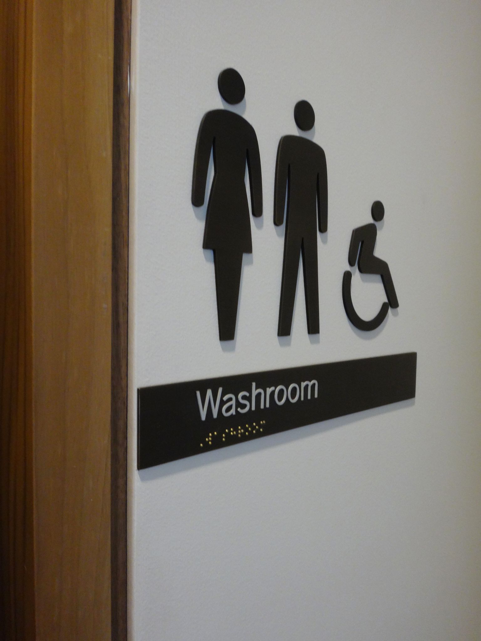 Cut-out bronze pictograms were used for washroom signs.
Further, since the three-storey building surrounds the landscaped quadrangle, which showcases a water feature and a copse of mature trees, any window views onto the inner court provide a handy reference point, so orientation is fairly straightforward. Accordingly, the directional wayfinding system would involve signs installed only at ‘intersections’ and at vertical circulation points like elevator banks.
Cut-out vinyl letters were applied directly onto white-painted drywall. In general, Entro avoided the use of plaques and other objects mounted on walls and instead favoured the application of lettering directly onto surfaces, which felt better-integrated into the environment.
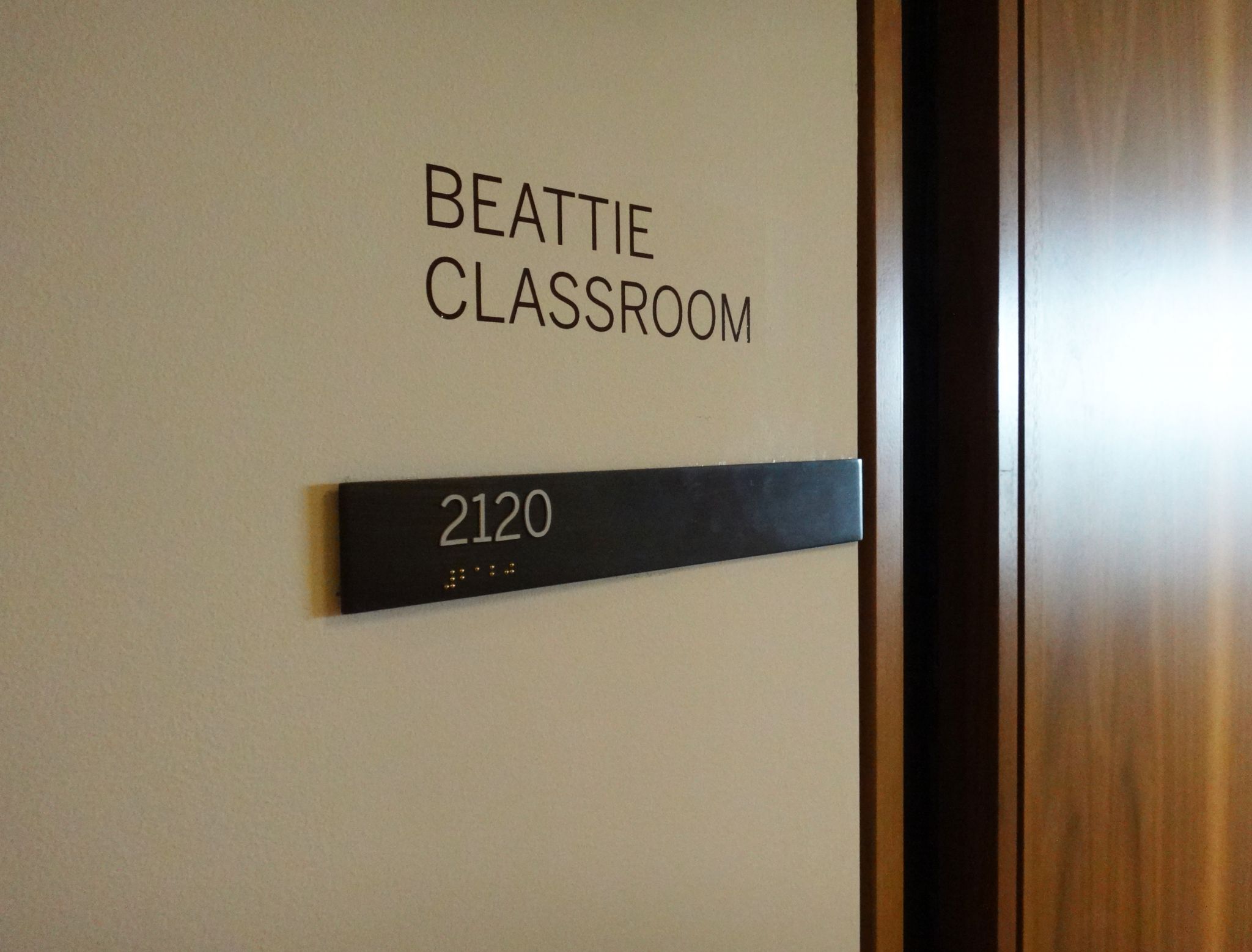
In a similar fashion, room signage was reduced to single horizontal bronze bars, in most cases applied directly onto the side windows of the faculty offices, classrooms and breakout rooms, featuring only the room numbers in both tactile characters and braille dots. Each 51-mm (2-in.) high bronze bar was adjusted on-site to fit precisely into each window frame. Any additional information to be displayed, including donor names, was applied in white vinyl above the bars, in accordance with a predetermined grid.
The same bronze bars were used for washroom signs, using cut-out bronze pictograms to identify and direct visitors to them, and for stair-level signs. Back-of-house signs were crafted from painted acrylic panels to express a lower hierarchy, including the indication of spaces not for public use. Beyond these components, however, no further signs were required for the building.
Any future changes in layout or faculty will not affect the signage, which simply lists room numbers, so costs will be reduced, as in-house staff does not have to deal with sign plates and paper inserts on an ongoing basis. A decision was also made not to list donor names on wayfinding directories, so as to prevent those signs from becoming highly convoluted.
All of the indoor signs were fabricated and installed by London-based International Name Plate Supplies (INPS).


