
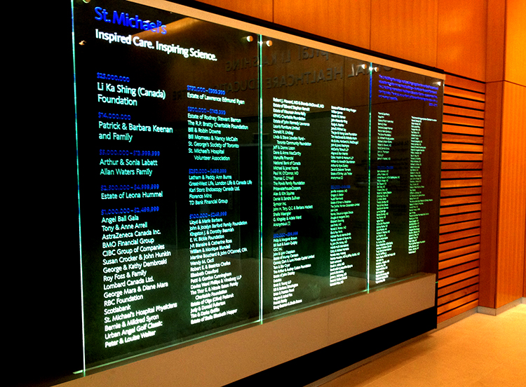
Two large-format donor recognition glass panels were produced, one for each of the new building’s lobbies. Photo courtesy Acumen Visual Group
“When I joined St. Michael’s in 2012, wayfinding had been neglected for so long, some of those old signs were falling apart,” says Josh O’Neil, project co-ordinator. “The printer used for the inserts didn’t even work anymore. We pulled people from different departments together to form a wayfinding committee. By following best practices, including a consistent hierarchy of listed information, we were able to give the other staff a template so all directions given to visitors are the same.”
The hospital commissioned Toronto-based registered graphic designer (RGD) Elsa Yuen, founder of What El’s Idea, to create a guide and message schedule and design the signs. Her drawings were then sent to Acumen for fabrication.
“Different colour standards were established for the different wings,” says O’Neil. “The Donnelly Wing would use green throughout.”
As this was a ‘live’ and very busy environment, not a new buildout, it was not easy to remove the old signs and put up Yuen’s new ones.
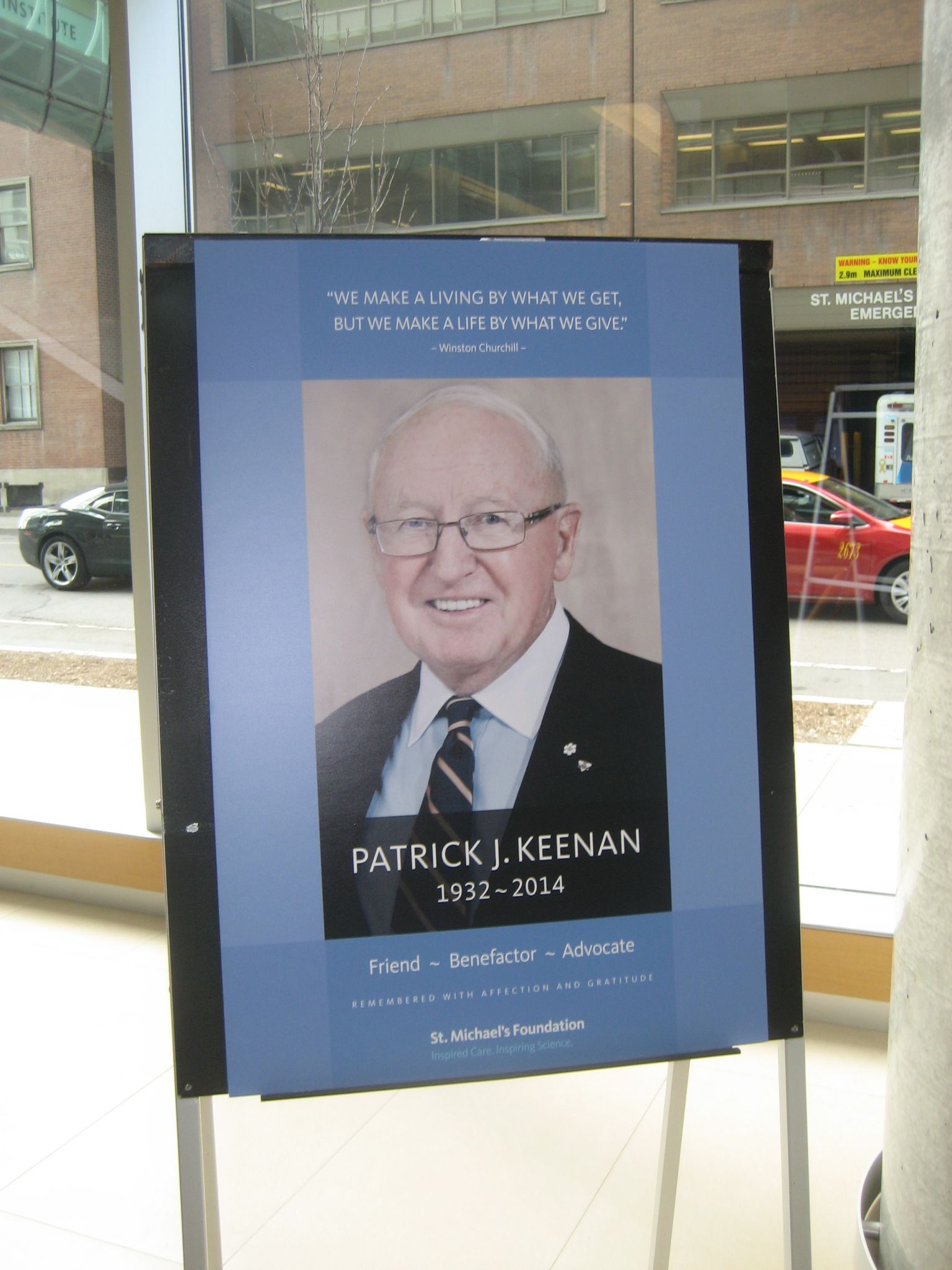
Longtime donor Patrick J. Keenan, who recently passed away, is honoured in the lobby. Photo by Peter Saunders
“The sign removal was the most challenging part of this project, requiring a lot of patching and painting,” says Taso Tsoutsos, president of Acumen. “We went in after-hours and put up temporary signs while we were still finishing the sanding and painting of the walls. It took a few weeks. Then, as the patching was removed, we would go in and install the new permanent signs.”
“There were definitely issues with the paint and it took a lot of touch-ups to match colours around the signs,” says O’Neil.
Besides renaming the wing and establishing a common colour theme, one of the main reasons for the new system was to add braille dots and tactile characters.
“We specified photopolymer braille for durability,” says Tsoutsos.
In total, the system comprised some 762 signs, including 540 wall-mounted room identification (ID) signs, overhead directional signs, large-format directories with ‘you are here’ maps, restricted access designations and digitally printed floor graphics, which particularly help point visitors in the right direction.
Li Ka Shing Knowledge Institute
Meanwhile, a long-planned expansion of the hospital was coming to fruition.
“We had been developing programs with U of T and needed to build a consolidated space for them,” explains Kelly Henderson, the hospital’s redevelopment manager. “While we had the original research centre concept back in 1999, the idea of a full educational centre came along and we wanted to shorten the time between a discovery and when it can help a patient.”


